Former colleague August de los Reyes pointed me to a 1932 typography article by Beatrice Warde posted on Design History:
Imagine that you have before you a flagon of wine. You may choose your own favorite vintage for this imaginary demonstration, so that it be a deep shimmering crimson in color. You have two goblets before you. One is of solid gold, wrought in the most exquisite patterns. The other is of crystal-clear glass, thin as a bubble, and as transparent. Pour and drink; and according to your choice of goblet, I shall know whether or not you are a connoisseur of wine. For if you have no feelings about wine one way or the other, you will want the sensation of drinking the stuff out of a vessel that may have cost thousands of pounds; but if you are a member of that vanishing tribe, the amateurs of fine vintages, you will choose the crystal, because everything about it is calculated to reveal rather than to hide the beautiful thing which it was meant to contain.
Even a tee-totaling Mormon like myself can appreciate the point: the best design is invisible. Warde applied it to typography specifically, but the same applies to design in general. Often, our goal in design should be to get out of the way, so that people can consume the content or perform the task that they came for. I think too often we get caught up up in the decoration and adornment of our own particular golden goblets, and don’t pay enough attention to the content and tasks that are so central to the experience.
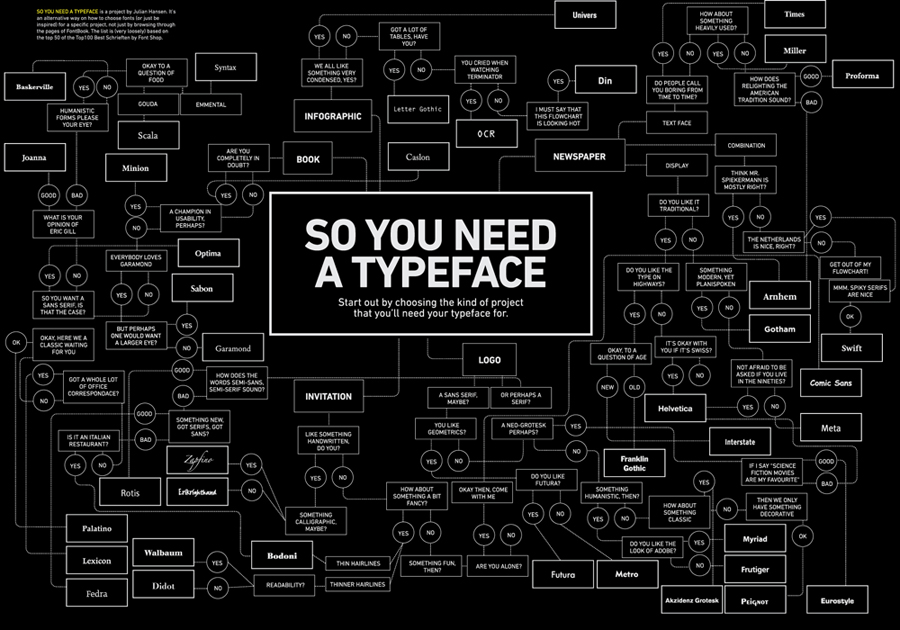
“If Comic Sans MS took on human form, who would it be?
My first thought was Richard Nixon—crooked and unrepentant. I then considered Justin Bieber—juvenile and inexplicably popular. Perhaps Jar Jar Binks? Ill-considered, inappropriate, and despised by hardcore fans.”
More on Comic Sans, the font we love to hate, at Site Point.
“Handcrafted with love by BYU design students and faculty, for the 5th Typophile Film Festival. A visual typographic feast about the five senses, and how they contribute to and enhance our creativity. Everything in the film is real—no CG effects!”
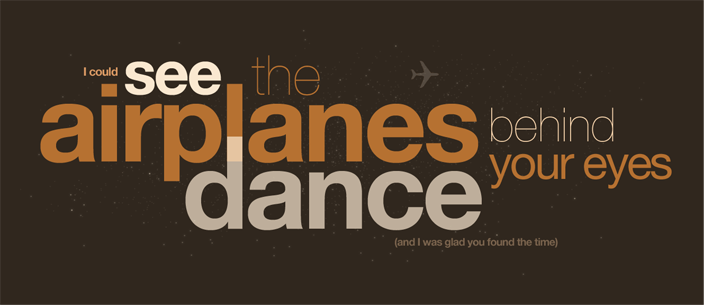
A post from Ryan Simsaudio tumble. He takes a song and produces some great typography to portray the meaning of the song while using the color scheme from the album cover. The above is a line from Along the Road” by Radical Face
For anyone out there who ends up creating images for titling (because sIFR is too complex to set up or otherwise) I recommend Cufón (pronounced koo-fone, like “I love the features of the iPhone.” “Yeah, it’s a pretty koo-fone.”)
It creates an image of your text on the fly with javascript. It uses the canvas element in all browsers that support it and for IE it uses VML.
I haven’t run it though any extensive tests but in everything I’ve tried it seems very promising. They are aware of some current limitations, foremost among them being selectable text. They’re working on a solution. Check it out; it may save you some Photoshop time and bandwidth costs.
“If anyone is interested, I’m thinking of doing a type poster representing the Church Office Building, set in Hobo and Impact. $200? Let me know if ur interested.”
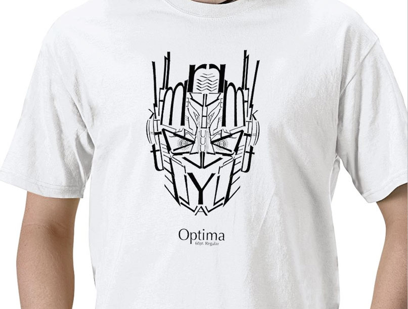
I’m one of the least typographical guys in our group. But even I can appreciate a good cross between typography and 80’s cartoons with the Optima T-Shirt :)
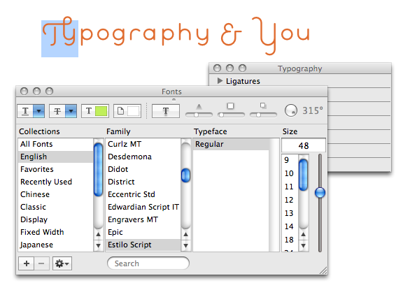
Just learned from PRINT Magazine that iLife and iWork have an OpenType palette. Though it seems you can’t access all open type features (e.g. stylistic alternatives), you can still get to ligatures, small caps and old style & lining figures.
To access the Typography palette: from the Fonts palette, click the gear icon in the lower-left and select Typography.
Oh, and don’t forget the Glyphs palette in Illustrator & InDesign
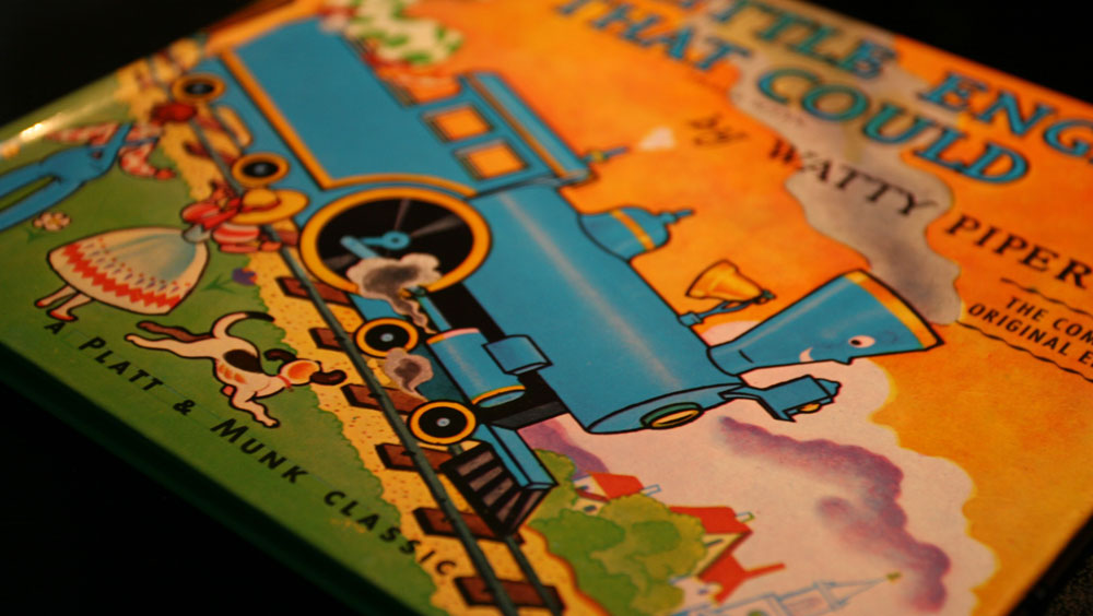
Reading stories to my kids this morning, I was impressed by the hand-drawn type on the cover of The Little Engine That Could and found it interesting that you can still see the rules the artist drew to guide his baseline and x-height. It’s interesting how typography has been both blessed and injured by advancements in technology. Even the best designers among us get lazy and let the computer do too much. Here’s a casual reminder for you this morning to not forget that it’s just a tool and that it’s still up to you to make sure that your type is set perfectly. An example of this is the introductory line in the book that our team is currently reading. I was shocked to see that the last word was hyphenated. It looked horrible. It’s sad that the publisher let that go to print.
“Graphic design is an organic process that uses type and image to create a visual solution for a communication problem. Much like leaves make up the shape of a tree, a graphic design solution is made up of many elements working together to create the whole. Research and knowledge are at the root of design. Formats and grids offer structure—the branches. But it is the smallest elements of design—the letterforms—which bring a design to life.”
“There’s a very thin line between
simple and clean and powerful
and simple and clean and boring.”
Graphic designer David Carson, former art director of Transworld Skateboarding and Raygun magazines, and former professional surfer, in this clip from Helvetica.
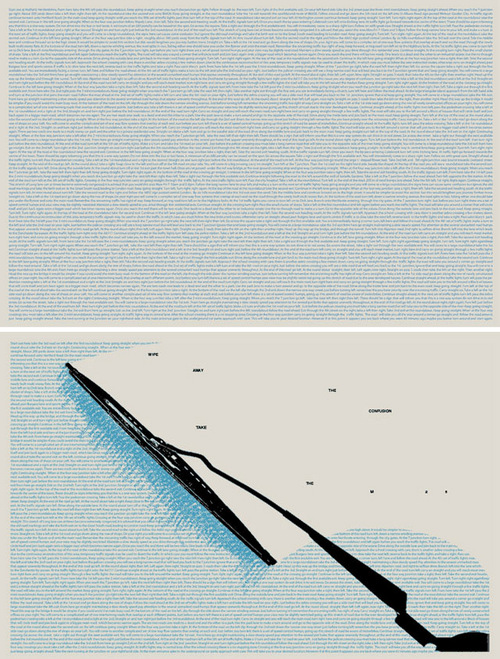
A response designed to promote the M25 motorway. On one side the poster gives exact directions that would have to be taken in order to travel from one side of London to the other illustrating the complexity and confusion involved in taking alternative routes through the center of the city. The reverse side reads: “wipe away the confusion take the M25″.