
Scott Hansen just posted a synopsis of Olympic logos, both new and old. Some good, some really good, and some just weird.
Cultural differences to blame?
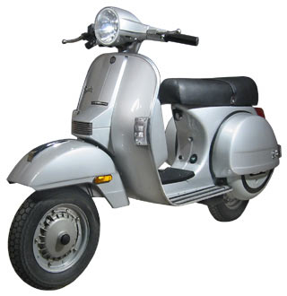
Speaking of scooters, please accept the awesomeness that is vintage Italian two-wheeled goodness before it destroys you. I named her “Wanda.” She gets 80mpg. More info on this fine Italian beauty can be found here.

Scooter popularity has been rising nearly as fast as the price of a gallon of gas lately. With this in mind, some former co-workers of mine have built themselves a scooter they would actually be willing to ride around town.

Love these old Blue Note record covers. The type, treatment, everything is beautiful. Via ISO50.


Love the design of Method’s blog called “Thoughts.” Posts have their own URLs, too.

Cool picture of how the Olympic torch has transformed over the years.

This innovative shadow signage on a Hotel in Florence is a great example of originality and an intelligent use of materials. The letters are formed by the shadows created by the overhead spotlight. The effect makes its own statement in a simple, beautiful way. (via core77).

Apple opened its first retail store in China today. I’m sure Tim and Christine, our two Chinese team members, would approve. :)
(Photo courtesy of 变脸.)

Apple just reached 3rd place in market share in the U.S. PC market (Gartner via AppleInsider). They are still dwarfed by HP and Dell, but their growth is getting attention. Note how this is PC market share, independent of their iPod and iPhone products.
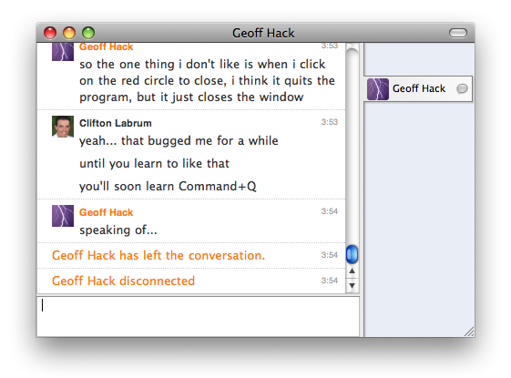
A buddy of mine recently switched to Mac and had to learn the difference between hiding an application and quitting it.

Meet Cornerstone, the newest Subversion client for Mac. Looks pretty nice for those of us that hate the command line.

Rob Thomas (our design manager) and Pete Lasko are both competing today in the Ironman. The Ironman triathalon includes a 2.4 mile swim, a 112 mile bike ride, and then just for fun, they run a full 26.2 mile marathon after that. We wish them the best of luck.

So, this must be a Jakob Nielsen approved button arrangement. More usable = more ugly? Shouldn’t have to be that way. :)
What is going on here? The most commonly used button on a browsers toolbar was made a little easier to see and given a bigger hit area. Probably good for the general population who uses it often (alt/apple-left arrow people!). For those that don’t like it luckily you can easily make it the same size as the rest of the buttons. (/me waits for John to come throw something at him)

This is created with MS Paint?
Remind me why I purchased the Adobe Creative Suite. Oh, maybe cause I have a Mac.

I really miss Hong Kong lately, specially its skyline at night. So romantic…
What is going on here? I thought that the UI in FireFox 3 was broken, but I guess this is what they wanted it to look like. However bad it looks, it is a great example of misplaced dissonance.
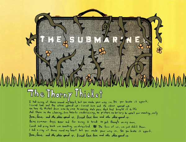
Are you seriously not listening to the Submarines yet?
The first taste is free: KCRW · Facebook · iTunes.

Top Gear fans rejoice! You, too, can now be a star in a reeeeeeasonably priced car. Let’s see if you can beat Simon Cowell!