Be sure to go get Firefox 3!
(good luck with that)

Friggin’ brilliant.

Water bottle design for a luxury hotel chain. Min.i.mal. Check the rest of the images over at The Dieline.

Singing the Vista blues.
He he.
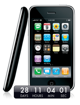
Get your 3G iPhone countdown widget.

This isn’t a real interface, but if it were, what would it do? And where’s the wasabi dispenser?

The Earth and Moon as seen from Mars.

Emeril’s Mobile Recipes. No need to write down recipes any more (but don’t drop the phone in the sauce pan though, bam!)

New ATM UI for Wells Fargo by Pentagram San Francisco. I’m not sure I like all of their design decisions but I think the new design gives me more confidence in using it as a consumer.


The photography of William Hundley, thanks Evan.

Beautiful P22 Operina Pro. 1284 glyphs! Go to page 3 of the glyphs and scroll to the bottom. Mmmm.
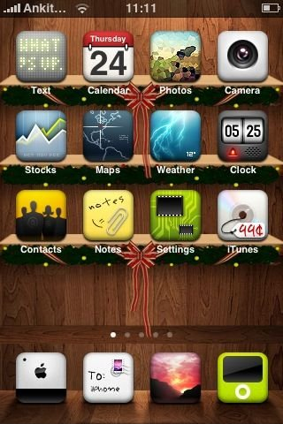
When a designer has too much free time.
Via TUAW.

Yeah, sadly, that’s me. Scanned for the introduction to last Friday’s in-house workshop (First Principles of Visual Design). I think I’m about 15 in this photo. Sweet mother of hair!

2004 Honda Valkyrie Rune. I am selling my blood to save up money for this. $14,000 to go.

Beautiful knit pattern on this letterpress business card for Etsy.
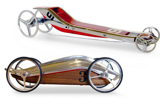
My pinewood derby cars were usually whittled with a jack-knife. Luckily, I never had to compete against a design firm.

An alternative, rotary traffic signal designed by Charles Marshall in 1936 & used from the 1940s through 1970s in Australia. 2 rotors pointing at colored sections denote whether traffic in either direction should proceed, prepare, or stop. Based on a traditional clock face, it has the advantage of clearly showing signal phase timing.
It’s downfall was apparently the ability to cope with changing traffic loads. Wikipedia Entry

Teh Factionz?

The Faction circa 1992 (original photo restored)