
“Does this bother anyone else? I feel like an embarrassed second grader who just pooped his pants.” – me
My instant reaction after viewing jQuery’s recent redesign

Armin is digging this new HP logo, but I’m pretty baffled at why. The shading is anything but subtle, and the glowing orb and lighting on the HP seems logistically impossible. Wouldn’t the glow from the orb (can an orb glow from the inside?) reflect on the shiny HP? It’s cliche, easy, and about 10 years too late. Maybe if it were spinning, I might feel a bit different..

Nikon’s announcement of D-Movie makes flickr’s video potential a little more interesting. Yet another reason you shouldn’t have bought a Canon :)

Matt Brett launches his new do. Call me a girl, but pink is in right now, and I’m not afraid to love it. Nice chocolates too, and lots of nice little touches. Matt’s always been reliable for great design insight and plenty of the gaming nerdery I’ve been known to indulge in.

Communication Arts Interactive 14 is now available online. The screen above is from FirstBorn. I love the layout and typography of the titles. So simple. They also have Vision Street Wear on the list this year. No website can top that at the moment.

“1 million design students will graduate this year in China, the United States will graduate 40 thousand.”
On September 9th, Christopher Liechty from the AIGA XCD (Center for Cross Cultural Design) will be presenting findings from a recent field trip to China. The presentation will take place at the Art institute in Draper (121 W. Election Road) at 7:00 pm ($5 for AIGA members, $10 for non-members).
This sounds like a great opportunity to get a look at the state of design in China, especially after seeing all the great design and work from the Beijing Olympics.
Additional request: Can someone please fix the SLC AIGA web site? I’d love to link to some official information, but can’t find anything about this particular event online.
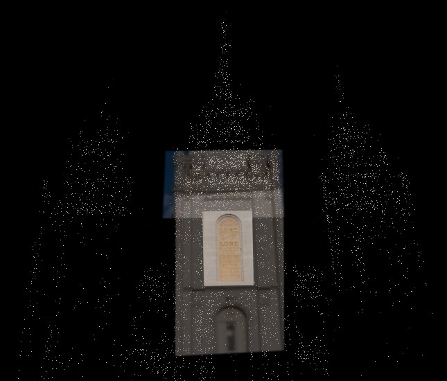
So Microsoft finally released the coolness that is Photosynth that we saw in video form over a year ago (yes, Microsoft has the occasional cool thing).
The first thought that came to mind was how cool it would be to have the LDS Temples done as “synths” so that anyone could see all the details of the beautiful architecture.
So I did a quick attempt of Manti and Timpanogos temples from pictures I had taken over the years… which came out so-so.
This morning I dropped by temple square and took quite a few pics of the temple for the specific purpose of using them in a synth. This time the result is much better.
Presenting Salt Lake City Temple Photosynth attempt #1. It has 3 large groupings and then a few rogue photos. Not bad for the first try =)
I’m by no means hinting at any project, but how cool would it be to have official synths of all the temples so we can dive in and see the details from across the globe. Hopefully they will get the social aspect going, and the community can provide that coolness.
(windows only browser plugin required. parallels won’t work. they say bootcamp and vmware 2.02beta will work, but I had no luck with vmware. didn’t try bootcamp. ymmv)

Finally, there’s something we can show you that some of our designers worked on. A new and improved way to find a chapel: maps.lds.org

Yesterday we started using Balsamiq Mockups to mock up some new ideas for Lds.org. Great stuff. Its allowing us to quickly comp up ideas for discussion and feedback without overinvesting too much time. Peldi, the owner/developer, has put together a great little tool here and he’s very responsive and helpful with questions. Note, this screenshot is not one of our mockups, its a sample from the Balsamiq site. We’re not creating another version of YouTube.

The Diver’s View – a New York Times interactive piece with diver Thomas Finchum describing the view from the 10-meter platform in Beijing. Not only are the photos breathtaking, but the piece is well designed and produced, and different than the other ho-hum Olympic coverage you tend to see. What a great way to put the viewer into the action.

Love this. Maybe I need to quit making websites and just focus on posters.

ISO50’s poster for an upcoming Tycho show. You can never blame him for being too broad with design elements (nature, motion, and overexposed color permeate his catalog), but he always finds a way to make each new work fresh and inspiring.

All this talk of Rock Band playing and shirts reminded me of the Guitar Hero spoof shirts… Band Geek Hero. My favorite being the Cowbell Hero (above) which is a great nod to the hillarious SNL skit with Christopher Walken.
More cowbell anyone?

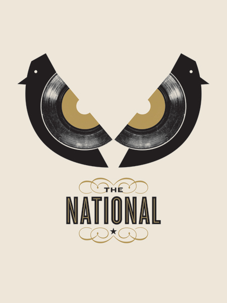
I’m so sick of lame little birds.

Nerdy or not? In response to Jason’s post the other day, I present my workspace, cars and all. So, is this really nerdy? You be the judge.

When I first started reading this review of the Blackberry Bold, the home screen UI looked promising. But the further you scroll down and the deeper you dive into the OS, it starts feeling too much like File System Land.
It’s almost as if the designers only had time to make a good-looking home screen so that the phone would sell well (and meet the obligatory marketing requirement of looking iPhone-ish). The rest of the phone’s OS ungracefully degrades the further you explore.
(via Jared).

Use the best available ampersand. Nice charts over at SimpleBits on the different fonts & ampersands available by default on Mac, XP and Vista.

We’ll forgive Eskil Olsen for his use of Comic Sans in this
photoset of amazing Norwegian lights.

Fun little tool for making sweet background patterns, at bgpatterns.com.