design archives

Veerle threw in a nice surprise in on her new business site for peeps with larger monitors.
posted by
jason
on Wednesday, Oct 29, 2008

Typeface is a new documentary about the Hamilton Wood Type Museum in Two Rivers, Wisconsin. Wonder if we can get a screening in SLC?
posted by
tyhatch
on Wednesday, Oct 29, 2008
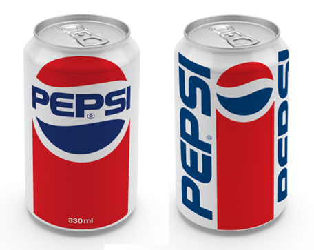
I’ll take these cans any day over the new ones.
posted by
jason
on Tuesday, Oct 28, 2008
Are Designers also Marketers? I’d say yes. And that includes personal marketing. I’ve said no to many an interviewee (and hire) based on bad ties, hair, shoes,.... If you’re a designer, should you know how to market? Love this excerpt: “when designers are tasked with selling their product they make better products.” Word.
posted by
jason
on Tuesday, Oct 28, 2008
“In the Shaker world, the appearance of a thing or person mattered only to the extent that it revealed its underlying function. Whatever did not interfere with function, served function. This is different from saying that whatever did not serve function interfered with function.”
A few weeks ago, Kaleb posted a bit about the Shaker Design Philosophy. This post inspired me to look back through the book Shaker Built where I found this subtle shift in thinking. Thinking this way about your designs allows you to create something simple without being plain. It also allows the artist or designer an incredible amount of freedom within what may otherwise be considered hefty constraints. As long as a design element doesn’t interfere with the essential function, there can be an argument to keep it, even if it doesn’t serve any purpose itself.
posted by
john
on Tuesday, Oct 28, 2008

While Apple has a healthy amount of attention on profit, product features, and competition, they seemed to pause this week to make a clear statement about their company. Steve Jobs passed around a Macbook chassis in their media event and Jony Ive, SVP of Design, emphasized careful craftsmanship in their product showcase. Apple has communicated what drives their company. They, the CEO and his fellow business-minded executives, respect the balance of form and function and embrace beauty and innovation. They notice nuances and foster a culture of design excellence. Leaders that love design are the foundation of an experience-driven organization.
posted by
clifton
on Wednesday, Oct 15, 2008
This is a message from Tom Valletta who is the lead developer for our Open Source effort:
Your programmers are showing!
The LDS technical community is beginning to get traction on some cool projects. The “Home Teaching and Visiting Teaching” application has code behind it now. The “Church History Timeline” does too. But because we have no designers contributing yet, our programmers are showing. Only you can prevent this opprobrium. Please get out and donate a design or two to the LDS technical community .
So if you have some free time and would like to contribute your design skills to the Church, go let Tom know. There are some great projects that are in need of some sweet design lovin’!!
posted by
aaron
on Wednesday, Oct 08, 2008

The Professor, Mr. Dil, has unleashed his new beast at johndilworth.com. Nicely refined, John. No naked cherub babies, but well done. Who can name his title font?
Keep your eyes glued, as John will be displaying much of his MFA work, and if you’re lucky you can get in on these ridiculously cheap fine art prints he’s hocking. One of my favorites is on sale now, his Act Well Thy Part print. Now I’m just waiting for the Pants of Truth to come out, wherein John asks the vexing question, “Why is the truth concerned with getting its pants on?”
posted by
jason
on Wednesday, Oct 08, 2008
New in Gmail Labs: Stop sending email you later regret. This isn’t a joke, and it’s genius. Enable “Mail Goggles,” and Gmail will ask you a few math problems before it sends your email to make sure you’re sober enough to really mean what you just wrote. The feature is only active late at night in your timezone, and only on weekends, when some people might be prone to doing things they regret.
Love this idea, of designing things to be harder to encourage a certain behavior. We did something similar in our new Mission Office application here internally, making certain financial actions harder by requiring extra clicks or making the controls slightly obscure to discourage using them. Speed bumps are another example of using “poor” design to lead your user to act a certain way.
posted by
jason
on Tuesday, Oct 07, 2008

Speaking of color, here’s a sweet Guide to Choosing Colors for Your Brand. The graph above was created by Dmitry at Usability Post using a new website called Cymbolism, which “attempts to quantify the association between colors and words.” Nice resources no matter what your color background.
posted by
jason
on Wednesday, Oct 01, 2008
“There’s a very thin line
between
simple and clean and powerful
and simple and clean and boring.”
Graphic designer David Carson,
former art director of Transworld Skateboarding and Raygun magazines,
and former professional surfer, in this clip from Helvetica.
posted by
jason
on Monday, Sep 29, 2008

A slide from Daniel Burka’s April 2008 Future of Web Design presentation, called “Iteration & You”, and it looks like a good deck of inspiring slides (except for the Cameron one).
posted by
jason
on Thursday, Sep 25, 2008

Click to view contemporist.com
This is my new favorite site as of late. The design of the site itself is not terribly impressive, but the content is fantastic. Great design inspiration.
posted by
rick
on Wednesday, Sep 24, 2008
Looking for some inspiration today, and hoping you guys can help me out. I’m looking for websites that make extensive use of color. Non-white, full color websites that buck the NY Times or Apple (or Northtemple) clean but sterile style of black type on white background.
What are your favorite colorful sites?
posted by
jason
on Wednesday, Sep 24, 2008
Jared Spool has written a great article on what goes into a well-done critique . We have several design team reviews each month, plus many additional reviews with customers and stakeholders on specific projects. The points reviewed here about respect, design ownership, and tact are highly relevant to both kinds of reviews.
posted by
ted
on Tuesday, Sep 23, 2008

We’re happy to announce the new Mormon.org today, the newest Church website launch from our group. Pepe Sustaita and I worked on this site, with hours of help from many other designers on our team.
This project will definitely be written up for a case study at some point, as we encountered so many crazy problems and challenges. This final product represents over a year of hard work, and includes thousands of design decisions and compromises based on technology, client taste, feasibility, content constraints, and other unique circumstances.
The site also represents the work of not only many designers, but our excellent teams of Java developers, QA engineers, Flash developers, program managers, product managers, infrastructure teams, and many others. All in all, over 50 people had a hand in getting this product off the ground and in front of the millions of monthly visitors.
Challenges aside, Pepe and I definitely can stand behind our work and we believe it will bring our church’s most basic beliefs to the world in ways it never has before. One huge feature is the ability for any visitor anywhere in the world to chat live with a member of our church, any time of day. The site is also designed to coordinate with a national print and broadcast advertising campaign around the “Answers to Life’s Questions” theme.
Pull it up and take a minute to browse through it, and please let us know what you think. More details and insight coming soon, for sure.
posted by
jason
on Thursday, Sep 18, 2008
“Tap’d NY is a bottled water for the new age: an honest and local alternative for all New Yorkers. We purify and bottle New York City’s famous tap water, leaving out the malarkey and far journey included in other bottled waters.” Ah, the honesty tactic.
posted by
jason
on Wednesday, Sep 10, 2008
northtemple journal of design ~ September Issue

Chinese philosophers and graphic designers in equal tow, John pulls off at a rest stop to lift a signpost on the road to becoming a design expert.
posted by
john
on Tuesday, Sep 02, 2008

Armin is digging this new HP logo, but I’m pretty baffled at why. The shading is anything but subtle, and the glowing orb and lighting on the HP seems logistically impossible. Wouldn’t the glow from the orb (can an orb glow from the inside?) reflect on the shiny HP? It’s cliche, easy, and about 10 years too late. Maybe if it were spinning, I might feel a bit different..
posted by
jason
on Thursday, Aug 28, 2008