design archives
case study
Last week Cameron sent an e-mail to gather some ideas about how to succeed as an in-house designer. Aside from the more obvious (and individual) necessities of technical skill, graphical ability, and general smarts, how do you succeed in a team environment, where people have different ideas, biases, and approaches to meeting the team’s common goals?
In thinking about this, I focused on the following questions from Cameron:
- What soft skills are important to our craft and why?
- What does it take to overcome obstacles, make concessions, and push through a successful project?
- How do you define “successful” when you have to make concessions on your preferred design?
What follows is a moderately more polished version of my response to Cameron.
“Skills” vs. “Attitudes”
When we talk about “having skills,” we are really talking about proficiency at manipulation—whether of the medium, of our tools, or of the people we work with. If someone says I have “people skills” or “soft skills,” they might mean I am a good manipulator; I can apply my “skills” in such a way to make others behave the way I want them to. This Machiavellian approach might get results… but there is no guarantee they will be the right results for the customer or end user.
So while soft skills are important, I think motivations and attitudes are even more important, at least if you are really in it for the proverbial Greater Good. Hence my focus below is as much on attitudes as on actions, or skills.
Develop humility
This attitude enters in to almost all of the other points I mention below. “What is right” is more important than “Who is right.” This perspective is core because without it, you hold on to the wrong ideas, or hold on too tightly to the right ones, without being able to see successful variations that might meet more needs, or the same needs better. Executing perfectly on the wrong idea is worse than executing “just OK” on the perfect idea.
Look for the good
By this I do not strictly mean optimism, though that is certainly helpful. Rather I mean actively searching for what is right in my co-workers and their ideas, instead of looking for what is wrong with them or their ideas, or focusing overmuch on my own ideas.
For example, find the kernel of truth or value in a co-workers “bad” idea or criticism, rather than tossing it out because the way it was communicated was not precise, or aesthetically pleasing, or 100% user-focused—or whatever. I frequently find that even when I do not fully agree, I am able to refine my understanding of problems and possibilities when I get past my knee-jerk reactions and look for the good. Every idea (including your own) has pros and cons; honestly examining alternatives not only improves your own decision-making, but also builds political capital that you may need down the road. Stakeholders can see that you are really weighing their ideas rather than shutting down the ones you don’t like. Later on, they may extend you the same courtesy, to everyone’s benefit.
I think it is also important to look for the positive motives of your co-workers, even when you think their idea or approach is wrong. This is easier to do here at the Church where I find it much easier to believe that everyone means well and wants the end product to serve real needs, more than they care about how they come out looking or some other hidden agenda. But I find this is a good approach in any situation, because when you treat people like they care about the right things, I find that many of them truly start to care about the right things. If on the other hand you assume others are motivated by self-interest or some other negative agenda, it quickly poisons team dynamics, creating a self-fulfilling prophecy where each team member assumes the worst—and sure enough, gets the worst.
Think “Synergy,” not “Compromise”
“Compromise,” implies that someone gets something they really don’t like, but are willing to put up with. I prefer to think in terms of synergy. Working together, the whole team can come to see what is rock-bottom required, vs. nice-to-have, vs. not-really-that-important. This requires aligning to the same goals; if team members don’t have the same vision, they will naturally feel that deviation from their own vision is to some degree a failure. If we work instead toward building a common vision, then priorities start to align and most conflicts smooth out with sufficient communication.
“Making a concession” should mean that the team together agrees than X is truly less important than Y, or that approach A will really meet the core need better than approach B—even if there are other (less important) advantages to approach B. There are of course times when one discipline or another has to make a decision contrary to the consensus, because they have that stewardship and have to be accountable. But if that trump card is played too often, morale goes down, team members retreat to their own domains, and silos get erected. Far better to persuade than compel (see Doctrine and Covenants 121:39-46).
Success is when the customer is happy
Customer happiness is highly correlated with whether they feel “listened to,” and that in turn has a high correlation with whether they can see their ideas filtered through your design process and manifested in the product. That doesn’t mean that the customer designs the product, but it does mean that they can see their concerns and ideas have been addressed. Good communication skills help, but you must also be able to transform what you hear into what you design.
This matters more than met timelines, executing exactly to plan, or anything else. Failing on those measures could certainly affect customer satisfaction, but it is important to me not to confuse those things with the ultimate goal, which is people happier using your product than they were before. The more happy, the better.
Wear the hat that needs wearing
Each project and team is different, even in-house. So wear the right hat for the job, and don’t get too used to your favorite one:
- You may need to focus on one area of design more than another (mapping the workflow, or graphic design, or interaction design, or typography, or whatever) depending on project needs.
- Maybe you should let someone else (like a front-end developer who is an HTML, CSS, and javascript wiz) run with the technical side of things while you focus on interaction design.
- Sometimes, for the good of the project, you can pick up the slack in areas where other roles are typically primary (business analysis and project management come to mind). This might be because that role is not represented on the team, or because the person in that role is still growing into it. Don’t run rough-shod over them, but offer help, accept delegated assignments, help them succeed— because in the end, it is not the “interaction design” or “project management” or “data architecture” that earns accolades or dissatisfaction. It’s the product as a whole.
That’s how I see it. What do you think?
posted by
ted
on Thursday, Aug 28, 2008

Matt Brett launches his new do. Call me a girl, but pink is in right now, and I’m not afraid to love it. Nice chocolates too, and lots of nice little touches. Matt’s always been reliable for great design insight and plenty of the gaming nerdery I’ve been known to indulge in.
posted by
jason
on Wednesday, Aug 27, 2008
“In typography neither the old style nor the new style matters; quality does.”
Jan Tschichold, On Typography (1957) — Jason Santa Maria provides a nice little piece about Tschichold’s change of heart, from his youthful days of san-serif only typographic rebellion in Nazi Germany to his latter years of classical inspiration as the head designer for Penguin Press. Tschichold’s writing and design work is something that every designer should be familiar with.
posted by
john
on Tuesday, Aug 26, 2008
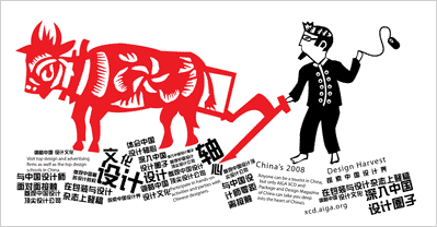
“1 million design students will graduate this year in China, the United States will graduate 40 thousand.”
On September 9th, Christopher Liechty from the AIGA XCD (Center for Cross Cultural Design) will be presenting findings from a recent field trip to China. The presentation will take place at the Art institute in Draper (121 W. Election Road) at 7:00 pm ($5 for AIGA members, $10 for non-members).
This sounds like a great opportunity to get a look at the state of design in China, especially after seeing all the great design and work from the Beijing Olympics.
Additional request: Can someone please fix the SLC AIGA web site? I’d love to link to some official information, but can’t find anything about this particular event online.
posted by
john
on Monday, Aug 25, 2008
case study
I am my own worst client. Designing for yourself is always an interesting exercise, and I find that not only am I increasingly more difficult to work with, but lately the process is taking longer than ever. It may be just as awkward as a doctor operating on himself, or a hair dresser cutting her own hair, or a baby changing her own diaper. Our process for rebuilding Northtemple was about as exasperating. Here’s how we did it.
Northtemple started two years ago as the public face of our little six-member design group, as a way to contribute to the design community and shed light on our efforts as designers at the LDS Church.
We’ve now grown to over 30 designers, and our group dynamic has changed pretty dramatically. The site needed to change with us.
As well, the need to band our group together culturally has never been greater. Working for a church, we are expected to apply our creative strengths in a very conservative environment. Yet that often crazy, eccentric creativity is what makes us who we are, and an environment of stuffy ties and dresses (no, not worn together) is rarely friendly to those tendencies. Our group has been a reliable refuge from those surroundings, and we look to each other to recharge our creative batteries.
So our goal with this redesign was to solve some of these issues: build a site that better represents our group and better reflects and reinforces our culture and personalities. A creative watering hole, if you will.
We also wanted to improve the content. While a stream of inspiring linkage is often perfect for surf’s up Fridays, we wanted to better establish our designers’ talents and knowledge of design, and expand beyond a regurgitation blog (while adding revolutionary features like an archive and comments). So we aimed to refocus the site on great content, and build a community around it to discuss design and how we all become better designers.
Frustrations
Heading up the redesign, I went through several months of casual design iteration to try to find this new look. Nothing fit. I tried playful, I tried conservative. I tried building upon our fixed footer, and I tried ditching it. Nothing worked, and I grew increasingly frustrated at the process.
The identity was the hardest part to nail down, as our identity hits on this mixture of creativity and religious seriousness or reverence. None of these first iterations hit it.
Pirates
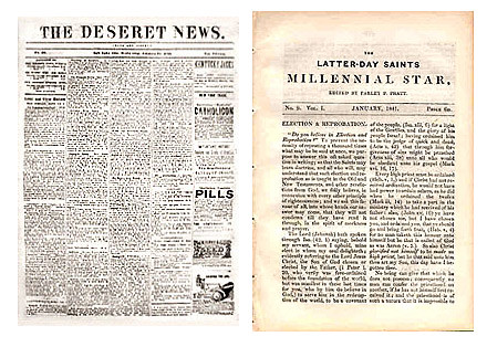
Finally, last month I buckled down and dove in. I had an epiphany of sorts as to how the site should look and feel, so I went crazy on it. And it felt great. I had this big idea that the site should hearken back to the early days of Mormon publications, with the same energy and passion that those early writers had with their self-published newspapers and magazines, like the Deseret News and Millennial Star.
I even found a sweet new type family – Mayflower, from Veer. It was old world, and the italic was perfect.
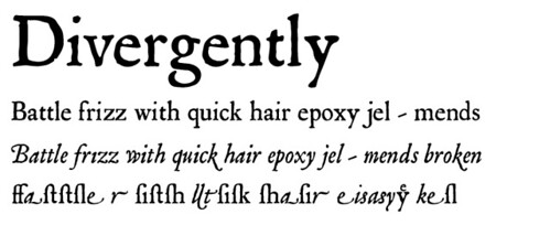
I put it all together, wore it out in Photoshop, and was pumped. Here’s how the header came out:

Then I realized something. Not only did this new masthead look like a big-budget Johnny Depp film, but the site had become the exact opposite of what I wanted: stuffy, conservative, and serif.
Disgusted, I went back to the drawing board.
The Battle
Struggling over this same problem for months now, I finally hit upon something key. Everything about the site, and our group for that matter, was this battle. A tug of war between creative and conservative. Between the suit and tie and wakeboarding on the weekends. Between Mo’ Tab and NIN. Between good and evil? Maybe not so dramatic, but the battle was there.
It finally occurred to me that we should embrace the struggle, and illustrate the internal battle that has defined us individually and as a group.
That realization in hand, I set out to visualize the struggle. It should be creative and conservative. Irreverent and religious. Rebellious, but just slightly.
I started with the logo. I went huge, and it felt dirty. Dirty, but good.
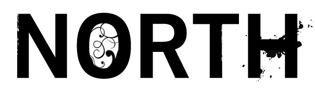
I separated the NORTH from the TEMPLE so as to put a bit of space between the two – after all, the site isn’t a temple site, just our location on North Temple Street in Salt Lake City. Yet by book-ending the content like this, it helps bring the two together and define who we are.
For the logotype, I chose Trade Gothic, after being inspired by Jason Santa Maria’s post on If you were a typeface. It was perfect. Thick and authoritative, and even somewhat conservative. Responsible. Yet it’s still a sans, and is characteristically modern and versatile. Sweet.

To further reinforce the duality of our personalities, I styled the logo with a bit of mess, a bit of wear, and just to confuse matters more, a bit of flourish.
Behind the words I mashed together bright images to bring even more definition to the personality. It’s both warm and cold. Bright and dark. It’s crazy, but presentable.
Do you recognize anything familiar in there?
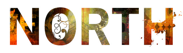
Success! This was right. Finally, it felt good. It felt like us.
Obviously I wasn’t done there. But simply getting the logo right set me on a path to make a million other decisions on the site, from the front page typography to the journal and about pages. Those tiny design decisions are so much easier to make once you have a solid direction and a solid understanding of what you’re designing. If you can’t get a handle on the personality of the site, you will flail about like I did for so many months. Defining the site’s personality, and finding ways to illustrate it, will set you on a path to build a complete site that’s just right.
posted by
jason
on Monday, Aug 25, 2008
On the LDS tech web site, Michelle writes a nice follow-up to a recent in-house design workshop: Solving Design Problems at the Church.
posted by
john
on Monday, Aug 25, 2008

ISO50’s poster for an upcoming Tycho show. You can never blame him for being too broad with design elements (nature, motion, and overexposed color permeate his catalog), but he always finds a way to make each new work fresh and inspiring.
posted by
jason
on Thursday, Aug 21, 2008
You can imagine the client meeting for the mint.com redesign – “I want gobs of web 2.0. No! Web 3.0! Shadows, fadients, reflections, bevels, handwriting, huge fonts, huger buttons, glassy Apple effects, the brightest green and the brightest orange you can find, and plants everywhere.”
This is about as hard to look at as Blinksale..
posted by
jason
on Wednesday, Aug 20, 2008
northtemple journal of design ~ August Issue
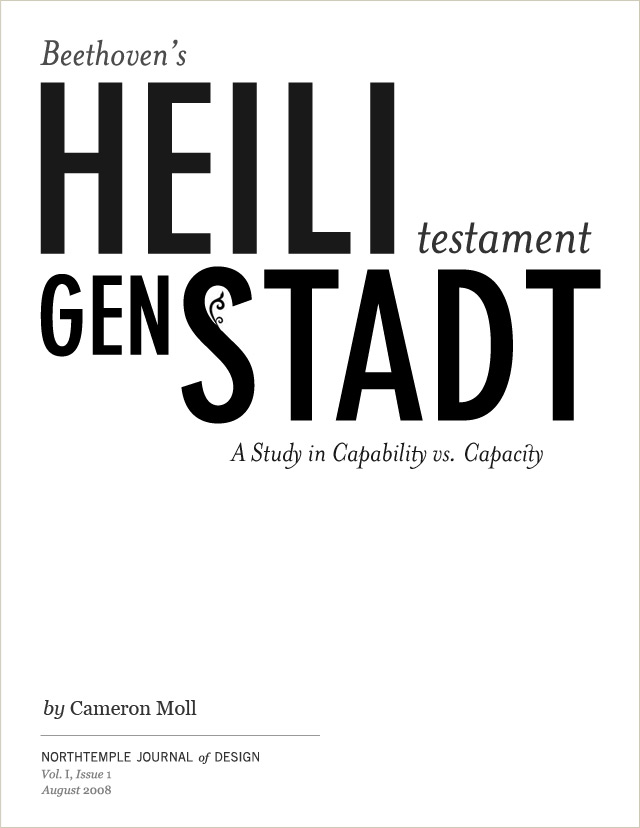
Reflecting on perhaps one of the greatest works of Beethoven’s career, Cameron finds an answer to the question, “What does it take to go from good designer to great designer?”
posted by
cameron
on Monday, Aug 18, 2008
Cameron Moll sent me an article from A List Apart on Deafness and the User Experience. I found the explanation of the difference between Deaf and deaf quite interesting. However, I think the most valuable piece of advice the author gave is to write clearly.
Font style and size, page layout, graphic choice and placement, and all the other elements which are traditionally the meat of design are useless if your page isn’t written clearly. Good writing all too often is given much too low a priority in the design process. Yet I submit that it is just as important as any other aspect of design, and perhaps even more important.
posted by
cannona
on Friday, Aug 15, 2008
case study
As a team, we hold regular design reviews to improve our work and the quality of our projects. A formal design review with our complete staff is held every other week, where selected presenters showcase their projects and are able to solicit feedback from other designers who are not members of their immediate project team.
The reviews are a great educational opportunity, a chance to make your work better. They also provide rare opportunities to see what everyone else on the team is working on, as well as providing a forum for us to discuss larger initiatives such as visual consistency, our design process and accessibility.
Although we can’t share publicly all the work that we review, I’m planning to provide a weekly update of our design reviews, highlighting some projects, as well as some principles that are discussed in them.
This week’s recap
Receiving Feedback: This week’s design review included a short discussion about how to take feedback. Anyone who puts themselves up regularly for critique knows that it is not easy to have people tell you what is wrong with your work. If we get defensive about our work and have a rebuttal or opinion for every single comment, we may effectively be telling them that we don’t want their feedback. There is a time to defend your design, but not in the forum where you are asking people for their opinion.
Roadmap: Todd Eriksen presented a small project that he’s developed to help facilitate some of the work related to project management. The projects that we work on are often complicated, including hundreds of prototype pages, thousands business rules, and detailed processes that are all surfaced in a visual user interface. Our role as interaction designers often requires us not only to design the screen, but to organize, keep track of and communicate the work we’ve done to other teams. This part of the effort can take as much (if not more) work than the design itself. Todd showed us some things that he’s created to help make that part of the work less laborious.
NorthTemple: Jason Lynes led a discussion around NorthTemple.com, and the direction we hope to take the site as a team. The design review provided an opportunity to get input from the other contributors on how we can make northtemple.com a better resource. We’ve received both good and bad feedback from the design community. Some things that were discussed included respecting copyright laws, the need to stay positive, to stay on topic (design related), avoid “inside jokes”, explain ourselves better, and to contribute original thoughts and ideas rather than just re-linking from other blogs.
posted by
john
on Thursday, Aug 14, 2008
I know TV is all about advertising, and what with DVRs all the rage these days, TV studios are scrambling to figure out how to make money. Hulu.com seems to be getting it right, with totally unobtrusive ads that don’t get in the way of watching TV. But on NBC.com, home of one of the founding studios behind Hulu, totally obtrusive and irrelevant ads litter the site like the offerings my neighbor’s little dog left in my yard before he mysteriously disappeared. I even had to watch an ad before I watched one of the new Olympic-themed ads for the Office.
Yes, I had to watch an ad before watching an ad.
I have to think NBC is getting paid way more for ads on full episodes of the Office than the small annoying ones they show before ads of the Office. Taking 8 minutes out of my half hour to show ads is one thing – taking 20 seconds before a 30 second ad is another. Is NBC a little too focused on making money?
Perhaps they are falling victim to a classic blunder – target fixation. Being so focused on an end goal can make you forget to pay attention to what’s happening around you, and what you might be doing that is detrimental to achieving your goal. Oftentimes target fixation can result in actually colliding with the target (not applicable to archery).
How could NBC fix things up? Maybe NBC.com doesn’t have to generate revenue on its own, maybe it can simply advertise NBC’s core business of making good television. Or maybe following a simple rule can help us all avoid a similar fate: paying attention to our surroundings and how our work is effecting people. Does NBC know their website reminds me of my backyard?
Do you know how your work is being perceived? How many people has your product alienated today?
posted by
jason
on Monday, Aug 11, 2008

This innovative shadow signage on a Hotel in Florence is a great example of originality and an intelligent use of materials. The letters are formed by the shadows created by the overhead spotlight. The effect makes its own statement in a simple, beautiful way. (via core77).
posted by
john
on Tuesday, Jul 22, 2008
A month ago, in preparation for an in-house design workshop, we handed out 30 copies of Brian Lawson’s Book “How Designers Think:The Design Process Demystified” to our designers. I first came across the first edition of this book nearly 10 years ago when I started a job at a small design firm in Salt Lake City. I had just moved from a large fairly structured company into a small, very organic company with very little structure at all. I found a first edition book on the company bookshelf and started reading.
I’ll have to admit that the first read was very difficult. The book is quite academic – the author approaches the subject from the perspective an architect who also happens to have doctorate in psychology. Most of the examples in the book discuss architecture and it can take some extra mental work to draw parallels to the profession of graphic and interaction design. In many ways, I found Lawson’s book to be very refreshing.
Lawson’s unique background allow him to approach design from a unique “scientific” perspective, while his design background from architecture, a design discipline provides a balanced perspective. It doesn’t go to far into esoteric design theory that is often discussed by practicing designers, and it doesn’t try to be to prescriptive, a fault which often appears when scientists and engineers write about design. He is able to talk in the language of design, where other authors like Don Norman and Jacob Nielson seem to speak about design in the language of science. There’s actually a great chapter in the book where Lawson illustrates the difference between the scientific approach, and the “designerly” approach. It’s especially comforting to hear it from someone who has practiced both disciplines.
I think that this unique perspective makes the book especially interesting and useful to any practicing designer. Lawson covers the essence of design, the definition of problems, and artfully describes different approaches to the design process. His model of the design process is the best I’ve ever found (chapter 3). He describes design as a “negotiation between problem and solution through the activities of analysis, synthesis and evaluation.” Other essentials deal with strategies for measuring the success and value of design (Chapter 5), and chapter 7 provides an excellent overview of the nature of design solutions, problems, and processes (chapter 7).
My favorite chapter, and the one that has influenced my work perhaps the most, is chapter 13: Design Traps.
Lawson outlines several common traps that designers find themselves in. You can’t read this chapter and not have an “aha” moment, or cringe at the things which might be affecting your design right now.
I consider this book a “must read” and believe that it is one of the best books on the subject. The viewpoint is unique, and it provides beneficial knowledge that will help you in all aspects of the design profession.
We’re looking forward to the discussion next Friday.
posted by
john
on Thursday, Jul 10, 2008
“For the most part, the creation or effects of design, unlike science, are neither measurable nor predictable, nor are the results necessarily repeatable. If there is any assurance, besides faith, a businessman can have, it is in choosing talented, competent, and experienced designers.”
Paul Rand, A Designer’s Art
posted by
john
on Wednesday, Jun 25, 2008
“We don’t even have a 5 minute plan.”
Jim Coudal, in Mike Rohde’s sketch notes (flickr set) from this month’s Seed Conference. Required faction reading.
posted by
jason
on Wednesday, Jun 25, 2008