design archives
Good design is Innovative
It does not copy existing product forms, nor does it produce any kind of novelty for the sake of it. The essence of innovation must be clearly seen in all of a functions of a product. The possibilities in this respect are by no means exhausted. Technological development keeps offering new chances for innovative solutions.
Good design makes a product useful
A product is bought in order to be used. It must serve a defined purpose – in both primary and additional functions. The most important task of design is to optimise the utility of a product.
Good design is aesthetic
The aesthetic quality of a product – and the fascination it inspires – is an integral part of the its utility. Without doubt, it is uncomfortable and tiring to have to put up with products that are confusing, that get on your nerves, that you are unable to relate to. However, it has always been a hard task to argue about aesthetic quality, for two reasons.
Firstly, it is difficult to talk about anything visual, since words have a different meaning for different people.
Secondly, aesthetic quality deals with details, subtle shades, harmony and the equilibrium of a whole variety of visual elements. A good eye is required, schooled by years and years of experience, in order to be able to draw the right conclusion.
Good design helps a product to be understood
It clarifies the structure of the product. Better still, it can make the product talk. At best, it is self-explanatory and saves you the long, tedious perusal of the operating manual.
Good design is unobtrusive
Products that satisfy this criterion are tools. They are neither decorative objects nor works of art. Their design should therefore be both neutral and restrained leaving room for the user’s self-expression.
Good design is honest
An honestly-designed product must not claim features it does not have – being more innovative, more efficient, of higher value. It must not influence or manipulate buyers and users.
Good design is durable
It is nothing trendy that might be out-of-date tomorrow. This is one of the major differences between well-designed products and trivial objects for a waste-producing society. Waste must no longer be tolerated.
Good design is thorough to the last detail
Thoroughness and accuracy of design are synonymous with the product and its functions, as seen through the eyes of the user.
Good design is concerned with the environment
Design must contribute towards a stable environment and a sensible use of raw materials. This means considering not only actual pollution, but also the visual pollution and destruction of our environment.
Good design is as little design as possible
Back to purity, back to simplicity.
posted by
foster
on Tuesday, Feb 10, 2009
“
“No fair! You get to come here every week?”
“I want to live here…”
“Wow. Woah! WOOOW!!!”
”
Top three quotes from my kids at the Draper Temple Open House tonight, from my 9 year old, 4 year old, and 2 year old respectively. The final quote was especially memorable because it was pronounced quite loudly in the Celestial Room, a sacred space where silence or whispers are the norm. But somehow I think God smiled and accepted the compliment.
Less important, but maybe more to the purpose of this blog, the design of the building was wonderful. It is striking from the outside, but it was the interior that shone brightest. I loved the reintroduction of murals into the ordinance rooms, something I have always appreciated about the Salt Lake Temple. I also thought the Celestial Room was wonderful. The room is so much taller than it is wide in either direction that your eye is almost inexorably drawn up to the gorgeous chandelier and then to heaven.
Reservations are still available; come see for yourself. Everyone is welcome, member or not.
posted by
ted
on Saturday, Jan 17, 2009

If the Friend magazine isn’t your cup of tea, take some time to browse through this great gallery of vintage sci-fi novel cover designs.
posted by
john
on Friday, Jan 16, 2009

PK at BibliOdyssey (one of my favorite blogs) digs up digital images of the Ripley Scroll which reminds me that the web is more like a “scroll” than it is like “pages”. The integration of text and illustration carry you from one scene to another as the scroll is revealed. The format of the scroll is used to tell the story. The images provide visual excitement, and a rest from reading text between passages.
High resolution images of the scroll are linked from the BibliOdyssey site.
posted by
john
on Monday, Jan 12, 2009
case study
Here in Northtemple Land, as in many parts of the United States, we’ve received slightly more than our fair share of precipitation in the last week. I have a long driveway to deal with and no snow blower (something I may need to remedy this year with Grandma’s Christmas check). The combination of heavy snow and a long driveway has resulted in an inordinate amount of time spent outside, with nothing to do but shovel and think.
What I’ve learned: Shovel smart, shovel soon, and shovel often. And what’s more, I think this applies to design as well as driveways, and maybe to any problem-solving effort.
First, let’s define some terms. When engaged in snow-shoveling, the stuff I’m trying to clear out is of course snow. What I’d rather be doing is building a snow fort or sitting inside under a warm blanket on the couch, reading that new book I’ve gotten for Christmas.
When I’m engaged in designing or building software, the stuff I’m trying to clear out is a messy combination of poorly understood requirements, technical problems to surmount, and depending on where I am in the product life-cycle, bugs. What I’d rather be doing is visual and interaction design of the “fun parts” of the system, not requirements gathering, trouble-shooting, or designing the more mundane stuff.
Lesson #1: Shovel soon—before anybody walks on the driveway or worse, drives down it. Often this is inconvenient. You or your spouse may have to stay in the car while the other clears an initial path. Your kids might have to clear the way before they head to the park, sleds in tow. But make sure you shovel before you travel; otherwise, you will have packed snow to deal with. And not just for today, but potentially for weeks and weeks, because once it’s packed, the results will be in your way until it melts or you buy a jackhammer. It’s uneven, slick, and hard to shovel. It also can also interfere with your ability to clear adjacent areas.
In design terms, make sure you uncover and understand the real needs before you design anything, and that you design those basics before anybody builds anything. Otherwise some less important or ill-understood requirement gets implemented first. Or you let loose a developer with a sense of aesthetics that doesn’t match the product vision or user needs, or any number of other problems intrude. Once code is laid down it is much harder to change the design—even if it is the wrong code. I’ve seen too many instances of “this is simple, it doesn’t need Design” turn into “oh, I hadn’t thought of that, but I guess we’ll just stick with what we’ve got, since it’s already built.”
Shovel first, travel second.
Lesson #2: Shovel smart—clear an initial, full-length path before attacking the full width of the problem. On my long driveway at least, I find it a good strategy to clear myself two long paths the full-length of the driveway, an axle-width apart. This gives me a clear path to drive on, even if I don’t accomplish anything else. If I decide to clear the rest of the driveway, it also gives me a clear place to stand without getting too wet, without slipping, and most importantly, without packing the snow under my feet.
In design terms, this means I should figure out what that initial path looks like. What is the bare minimum that can be delivered in the product and still have it meet the core requirements, even if there are other rough spots or missing bells and whistles? Figure out those requirements first, then design and build a bare-bones system to meet those requirements. You will probably have a good idea of other requirements and how they should be implemented, but don’t fully design or build it yet. Make sure you can just get the vehicle down the driveway before you worry about whether you can pop a wheely or perform other fancy maneuvers. (This one is so important that I’ll probably write up more specific design experiences with this later on. Thanks to Jeff Patton and UIE 13 for this one. And of course 37Signals and anybody else involved in actually agile development.)
Lesson #3: Shovel often—before problems get too thick to deal with. There are parts of my driveway where the snow can drift up to 3 or 4 feet unless I keep it cleared after each snowfall. If I get behind, maybe sidetracked by the fun stuff I’d rather be doing, I always pay for it in the long run when a 30 minute job takes 3 hours instead. The additional time is often longer than the sum of the time it would have taken had I just gotten to it earlier and more often. Why? Because the snow packs itself down, partially melts and re-freezes, and a single shovelful gets too heavy to lift, because of both increased volume and density.
So too in design. Combining Lessons 1 and 2, you have to keep the path clear—especially the essential path— not just once, but throughout the process. As design progresses to the important but not crucial features, it’s easy to forget that getting out of the driveway is paramount. As you clear the way for those secondary but still-important features, take care that you don’t accidentally make the main path harder to negotiate.
Also, as implementation begins, don’t allow bugs to accumulate for too long before getting them cleared out. This applies not just to the big important show-stoppers, but also the accumulation of lots of small issues. While each flake or bug might be inconsequential on its own, there comes a point when the whole product can bog down under the collective weight of a mediocre implementation of a great idea. The workarounds developers use to get around these problems end up breaking themselves when the bug is fixed; the developer leaves and the next guy can’t figure out the workaround; the user puts up with the problem long enough that they resist the fix, on the grounds that “it’s different.”
Some of this is just bound to happen on any project; bug-free code doesn’t exist, not at a reasonable cost on a reasonable-sized project anyway. But try to limit it to the non-essential periphery, and don’t allow it to clutter the key functions necessary for success.
* * *
Those reading only for design’s sake can stop here.
For those who want to carry this a step further into “real life”, I find that these principles apply to lots of other situations:
- Interpersonal communication. Remove obstacles to communication early and often. “Clearing the air” once is not enough to maintain important relationships!
- Repentance. Sorry to go religious on you, but the longer moral and ethical lapses fester unresolved, the harder they are to clear them up. Much better to straighten up and fly right now, than to let a matter of a few degrees of error land you in dangerous and unfamiliar ground later on.
- And I bet you can think of others and tell me about them via the comment link below :-)
The End.
posted by
ted
on Friday, Dec 26, 2008
“The art of architecture is really the art of constraint. It’s the art of compromise in many ways. It’s not about a brilliant man or woman working in his or her studio and producing a design and then getting it built. It’s about negotiating a whole series of constraints or challenges, whether those have to do with budget or site or the community.”
Christopher Hawthorne, architecture critic, quoted in an interesting NPR piece on modern museum architecture. This reminded me about a great design discussion we had sometime last year about Bryan Lawson’s great book, How Designers Think. Negotiating that series of constraints and challenges is hard… but FUN! Rob mentioned this same concept as he worked with me on some map icons that needed to work well on widely varied map backgrounds in a 10X10 pixel space. (Thanks Rob!)
posted by
ted
on Saturday, Dec 13, 2008
“If you want a successful product, test and revise. If you want a great product, one that can change the world, let it be driven by someone with a clear vision. The latter presents more financial risk, but it is the only path to greatness.”
Donald A. Norman – Don’t freak out agile fans, He states in context that you still need to iterate it’s just a difference in what is driving the project.
posted by
chris_mayfield
on Wednesday, Dec 03, 2008
“Our design and editorial teams are storytellers. Design begins in a laboratory
atmosphere where we create ideas from scratch. We develop the recipes, the crafts, even the
decorating ideas, we design and build the sets, we choose the colors, we choose the photographer, then we finally after all of that sit down to design the story and that’s why for
us design is both the creation and execution of the idea from start to finish.”
The process that Gael Towey explaines Martha Stewart uses to tell stories.
posted by
chris_mayfield
on Wednesday, Nov 26, 2008
“Anthropology is too important to be left to the Anthropologists.”
Grant McCracken talks about the opportunity for designers to add extract value by helping shape culture and adding anthropology to the core competency of design.
posted by
chris_mayfield
on Wednesday, Nov 26, 2008
“It’s about whittling. It’s about taking something and whittling and whittling and getting it sharp and perfect. Then you’ve got something.”
James Victore – Designer
posted by
chris_mayfield
on Monday, Nov 24, 2008
“It’s so hard to find things.
I’m finding it hard to not blame you.”
My wife Caryn, experiencing the joys of using lds.org.
posted by
jason
on Tuesday, Nov 18, 2008
Jared Spool just posted an interesting article on the ideal makeup of a UX team . He makes a useful distinction between a specialist and a compartmentalist:
While the former is about having the majority of your experience in a single discipline, the latter is about only having experience in that discipline… . A compartmentalist isolates themselves from the other disciplines around them, not really learning what they do or how they do it. Compartmentalism is bad for teams, because it means you have to have enough work to keep that individual busy within that discipline, and if needs shift or emergencies crop up, their value is dramatically diminished.
I would also add that a compartmentalist tends to make decisions that cause problems for other team members—the compartmentalized user researcher makes design recommendations that don’t meet the needs the business analyst identified previously; the designer designs something that will take $5 million to implement; the HTML coder who transforms those ultra-accessible semantic forms into screen-reader nightmares for the blind.
So I agree with Spool that compartmentalism is bad. But he also says that the main reason to choose a specialist over a generalist is economic; if a specialist is available and affordable, you would hire a specialist, according to the article. But aren’t there times when specialization is a negative for the project? Even if I could afford a specialist HTML coder, business analyst, interaction designer, and user researcher… isn’t there some inherent value in having the same person play one or more of those roles, depending on project size, complexity, or a host of other factors?
I don’t think economics is the only factor.
posted by
ted
on Monday, Nov 17, 2008

Carsonified launches their site for the Future of Web Apps – Dublin.
They’ve taken a page’s worth of information and blown it up to three and a half pages of design. Web 2.0 goodness, or a bloated excuse for a brochure? I can’t decide if I like it or not..
Just a note – I love these Carson workshops. I don’t exaggerate when I say they are the most professionally produced conferences out there. This note isn’t meant as criticism of their biz, just a note on the design direction of these latest sites of theirs.
posted by
jason
on Thursday, Nov 13, 2008
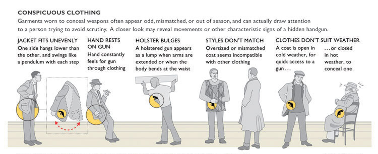
How to spot a hidden handgun, a sweet infographic from Megan Jaegerman, as analyzed by Ed Tufte.
posted by
jason
on Thursday, Nov 13, 2008
northtemple journal of design ~ November Issue
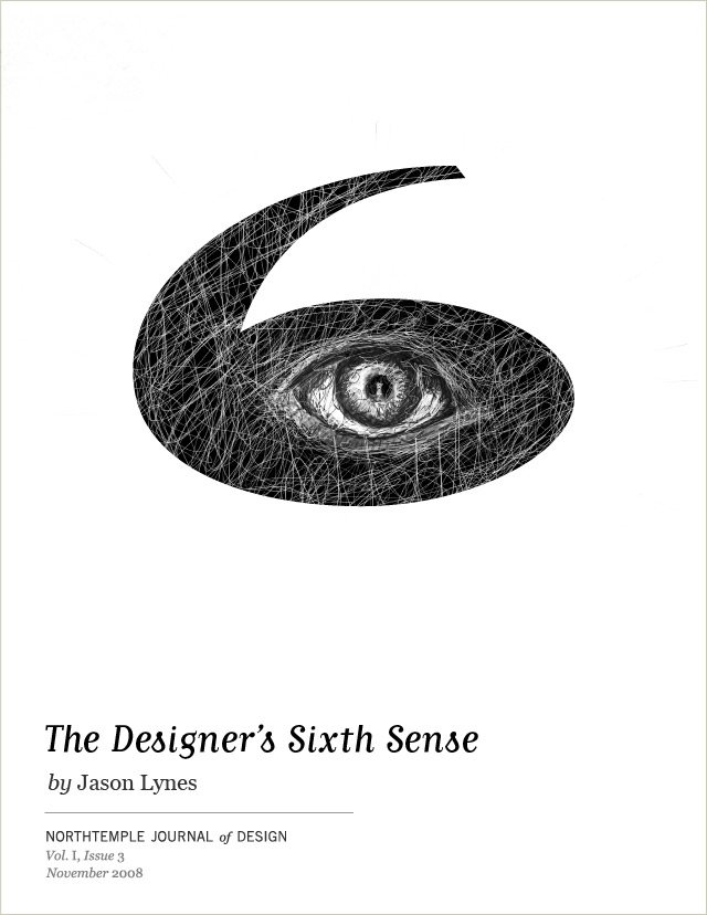
Exploring the inner workings of a designer’s mind is no picnic. Stop over-analyzing and go with your gut.
posted by
jason
on Monday, Nov 10, 2008

Love this new Museum of London logo, dissected over at Brand New. I don’t agree with his small bits of criticism at all – I love the type, the shapes, and the whole feel of it. The website, on the other hand, seems to dilute the vibrance of the logo by splashing those colors across the header and nav and such. But the logo, I love.
posted by
jason
on Thursday, Oct 30, 2008