design archives
Carsonified goes Cooper and monochromatic. Also ThinkVitamin isn’t a magazine anymore, it’s just the Carsonified blog. Just whatever you do, don’t click on Team. Ouch!
posted by
jason
on Thursday, Jul 09, 2009

Gadi Amit introduces Three Client Types and How to Work With Them in an article for Fast Company. Not an exhaustive treatise, but covers some common cases and how to work with the hand you’ve been dealt. Recognize any of these from your own work?
Via my friend August de los Reyes’s Facebook page. (Yes, I’ve finally taken the FB plunge, with a little trepidation at adding another timewaster to my life. Which is why I’m checking only infrequently and haven’t added everyone I ever met to my Friends list, so don’t be offended if I haven’t accepted every offer!)
posted by
ted
on Monday, Jul 06, 2009
“People don’t want to buy a quarter-inch drill.
They want a quarter-inch hole.”
Theodore Levitt, quoted in The Innovator’s Solution, sequel to The Innovator’s Dilemma, both recommended to me by John as I’m in the early stages of defining what a proposed product should do.
Timely reminder that customers “hire a product to do a job,” not to fill a slot on their shelf reserved for an artificial product category. (Of course they don’t really just want a hole; they want to build something, drain something, see through something, etc. We need to get down to real intents and desired outcomes, or we’ll never understand what we should build to meet real needs.)
posted by
ted
on Tuesday, Jun 09, 2009
“Design is not just what it looks like and feels like. Design is how it works.”
~ Steve Jobs
posted by
kaleb
on Tuesday, Jun 02, 2009
Burned out? From this week’s A List Apart article by Scott Boms:
You may be flirting with burnout if:
- Every day is a bad day
- You are no longer emotionally invested in your job or the work you’re doing
- You feel unappreciated or do not feel like you’re making a difference in your job
- There is a clear disconnect between your personal values and what is expected of you
- Self-defined goals or those imposed on you are unrealistic or unreasonable
- A significant amount of your day is focused on tasks that are not fulfilling on a personal or emotional level
See the full article for a well-written look at how burnout happens and what to do about it.
posted by
jason
on Wednesday, May 27, 2009
“Something is elegant if it is two things at once: unusually simple and surprisingly powerful.”
Also from the same article by Matthew May.
What, in your experience, fits this definition?
posted by
ted
on Wednesday, May 27, 2009
“Complexity isn’t the enemy to a chessmaster—without it they’d be playing checkers. But there’s times when we look at the stuff we buy or experience and we swear that the design and engineering weren’t even playing checkers.
They were playing Whack-A-Mole.”
A memorable image from a great article on elegant design by Matthew May. (Via Good Experience)
posted by
ted
on Wednesday, May 27, 2009

New portfolio from Chicago-based We Can’t Stop Thinking. Some beautiful concepts and work despite the sad, tired use of Flash for layout and navigation.
posted by
jason
on Friday, May 22, 2009
“In the competitive and sometimes rather commercial world of design, the novel and startlingly different can sometimes stand out and be acclaimed purely for that reason. But being creative in design is not purely or even necessarily a matter of being original. The product designer Richard Seymour considers good design results from ‘the unexpectedly relevant solution not wackiness parading as originality.’”
Bryan Lawson, in How Designers Think.
posted by
ted
on Monday, May 11, 2009
Some people talk as if you can make a product “without designing it.” That’s silly. You can’t make a product without designing it any more than you can raise a child without parenting him or her. You may parent poorly or well, but only in cases of extreme neglect could it be said that you didn’t parent at all. Same thing in making products; you either design haphazardly or deliberately, well or poorly, carefully or slothfully—but you can’t avoid Designing.
Designers are often compared to protective parents, watching over “their baby,” reluctant to take criticism of “their baby,” being proud of “their baby.” That’s all well and good—as long as you don’t spoil the child. Good design, like good parenting, requires discipline.
In parenting, one of the biggest risks is that you indulge your child’s every whim under the guise of “loving him or her.” It makes you feel good in the short term. It makes you feel liked. You may enjoy feeling like you’re a good provider because your kids “have it better than you did.” But if you overdo it, you end up with kids who can’t work for themselves, don’t respect you, and are very demanding. Not good for you, not good for them—because you won’t be there in a few years to defend and provide for them. They need to be able to stand on their own merits. The same applies to your design babies.
There is little risk that your design will start making demands on its own, but your own whims (and sometimes even good intentions) must often be curbed. Every time you add a feature, a decoration, a “little something extra”—does it really advance the design functionally or even aesthetically? Or are you “spoiling the child”? Are you adding bells and whistles in order to “keep up with the Joneses,” or are you really just building what’s needed?
Disciplined Design means knowing your audience and their needs.
It means prioritizing and setting limits (to scope, to budget, to resources).
It means saying, “No, you can’t have that right now. Maybe when you’re older.”
It means having a vision of what a product will be when it grows up, but having the patience to realize that it will take time to mature and reach that potential.
It’s saying “No” to some Good things to make room to say “Yes” to the Best things.
It’s applying tough love when your child goes astray, reining in when the design wanders off the straight and narrow path of meeting audience needs and out into the ever-shifting mists of fad and fashion.
So here’s to bringing up a design in the way it should go. Be kind and thoughtful, but also provide discipline, and maybe your “children” will bring you honor and joy, in good Biblical fashion.
posted by
ted
on Monday, Apr 27, 2009
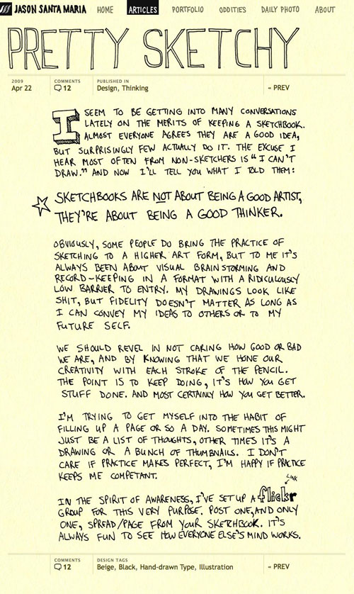
Latest article from Jason Santa Maria, taking his per-post art direction to a new level. Pretty spiffy. Jason’s doing more for blog and web design with just his own site than anyone else I’m aware of. Browse through his last few articles if you’re not convinced.
posted by
jason
on Wednesday, Apr 22, 2009
“Unlike the artist, the designer is not free to concentrate exclusively on those issues which seem most interesting. Clearly one of the central skills in design is the ability rapidly to become fascinated by problems previously unheard of.”
Bryan Lawson, in How Designers Think.
posted by
ted
on Wednesday, Apr 01, 2009

I was pondering whether to replace an Options dialog with a beefier-than-normal dropdown this very morning, when up pops Jakob Nielsen’s latest Alertbox. In it he argues in favor of “navigational mega-dropdowns” like the one above. This surprised me, given his past disapproval of the simple kind.
But he says the beefier versions actually overcome the deficiencies of the simple ones. Worth a read. He discourages their use for more robust interactions, though at least one of the positive examples he cites (Office-style ribbons) is used for a simple interaction like selecting a style, not just purely for navigation. So… hopefully that gives me the wiggle room I need to justify my “Options” mega-dropdown…
What do you think? Have you seen success with this kind of thing? Especially for more than basic navigation?
posted by
ted
on Monday, Mar 23, 2009
“I won’t miss a design philosophy that lives or dies strictly by the sword of data.”
Stop Design Stops Google
posted by
john
on Friday, Mar 20, 2009
The Dexo UX design conference survey might help you get an idea of what that conference you plan on attending will be about. I can’t verify the accuracy of the data, but it looks like it has potential to be an interesting and potentially helpful resource.
posted by
john
on Thursday, Mar 19, 2009
northtemple journal of design ~ March Issue
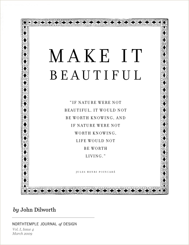
If we can all agree that we like things that are beautiful, we should also agree that we should try to make things beautiful. But what does that even mean?
posted by
john
on Tuesday, Mar 17, 2009
“Because design problems are so multi-dimensional they are also highly interactive… . It is the very interconnectedness of all [of the relevant] factors which is the essence of design problems, rather than the isolated factors themselves. In this respect designing is like devising a crossword. Change the letters of one word and several other words will need altering necessitating even further changes… .
If there was one single characteristic which could be used to identify good designers it is the ability to integrate and combine.”
Bryan Lawson, in How Designers Think, which I am now finally getting back to finishing. I am encountering this almost every day now. Tweak the background, up the contrast of the text. Up the contrast of the text, fix the associated icon to match. Fix that icon, tweak this icon to better distinguish it. Etc., etc., etc.
posted by
ted
on Tuesday, Mar 10, 2009
case study
In October, I attended a session by Jeff Patton at UIE13 on doing user experience work in agile environments. I found it extremely helpful in understanding how to improve the process on my current team. I have not yet “arrived,” but the principles learned there have had an actual impact on my processes, as opposed to the “feels good but what do I do now” impression you sometimes get from conferences.
In a “re-print” from last August on UIE’s newsletter, Jeff outlines 12 principles for UX in an agile environment. Here’s a summary of the points in his article (originally broken into part 1 and part 2), with notes on how I have applied these principles to my current project:
- Drive: UX practitioners are part of the customer or product owner team.
This one has been part of my philosophy for many years, but it was good to get some validation. I work with a “product manager” to discover and confirm requirements, meet with end users to see how the product will actually be used, and in other ways act as a proxy owner. The product manager has the final say, but the interaction design role has significant input and is the dev team’s interface to product management.
- Research, model, and design up front—but only just enough.
I found in my current project that cartoons, spare wireframes, etc. that run the breadth of the product, but don’t dive to the pixel really helped the team focus at the right level of granularity. Before I was stuck with two extremes—research and prototype everything completely before the 8 month project kicked off, or research prototype only the next 6 week dev cycle. Allowing myself to cover the whole product, but mostly at a “bare requirements” level struck the right balance.
- Chunk your design work.
Organizing and helping product management prioritize the work has been one of the things I do that product management has most valued in my current project. It has allowed us to stage the development in such a way that we can begin to develop, deploy, and test coherent bundles of functionality with end users—before the project end date is so close that changes become too expensive.
- Use parallel track development to work ahead and follow behind.
I am researching and developing one or two cycles ahead of development, while also tailing the team’s current development to make sure it’s implemented as planned. It’s sometimes hard to stay a full cycle ahead, but it’s made easier by the forethought given in #2 above.
- Buy design time with complex engineering stories.
In my case, we front-loaded the project with security work, dev & QA environment set-up, and API work that required little or no UI. This gave me a chance to get ahead without the team getting behind as a whole.
- Cultivate a user validation group for use for continuous user validation.
While I’ve been able to test with several user groups so far as we’ve gone along, I don’t yet have this in place. The strong study participant pool at Microsoft (and people hired to manage and recruit from it) is one of the things I miss most about not working there anymore. (Ellen Gasca, this one’s for you!)
- Schedule continuous user research in a separate track from development.
Again—would love to… but not there yet.
- Leverage user time for multiple activities.
When testing, I gather artifacts, ask if there are important tasks we haven’t covered in the test, and so forth. While I have face-time with end users, I try to make the most of it.
- Use RITE to iterate UI before development.
I’m not sure Jeff’s description of RITE in his article does it justice, so I’ll wax a little more verbose. RITE testing rests on the premise that it is better to remove “big rocks” after a few participants hit them than to watch participant after participant bang their heads against the same problems. Fix the big problems as soon as they are apparent, then test the solution with the next participants. In other words, by the end of the test, you are validating solutions instead of finding problems.
Michael Medlock and his team at the Games division of Microsoft coined the term RITE (Rapid Iterative Testing and Evaluation), codifying a pre-existing but ill-defined practice. RITE makes usability testing more impactful, and reduces the risk of introducing new problems when fixing others. On my current project, I have done RITE studies using paper prototypes before development began (as Jeff suggests above) as well as in a dev environment after a chunk of functionality was working. It works in both cases as long as the dev team can turn around changes quickly. A key is making sure to trying to fix only issues that have a clear cause, a clear solution, and a small price tag. Bigger or more complex problems will still have to wait till after your test is done.
If you haven’t tried it, read the original article and then give it a shot.
- Prototype in low fidelity.
I actually prefer Jeff’s quote of Bill Buxton for this principle: “The idea of high fidelity and low fidelity in prototypes is silly. As far as I’m concerned there’s only right fidelity and wrong fidelity.” Amen. It depends on skills sets, the level of interaction being modeled, the amount of time you have, and a dozen other factors.
For my current project, I am prototyping first with Balsamic Mockups for the high level pre-project design phase in #2 above, and using clickable image maps (basically a Fireworks png with hotspots added in Dreamweaver), heavily annotated for most interaction details. (I give Balsamic Mockups only 2 or 3 stars by the way; very easy to get something up there fast, but very limited set of representations. If they could just add some simple line and shape drawing tools…)
For other projects I have developed the HTML and CSS myself. For certain aspects of testing I’ve used paper prototypes of screenshots supplemented with sticky notes; it all depends.
- Treat prototype as specification.
In other words, don’t over-document, a classic agile principle. Some would argue that the prototype plus a discussion should replace all documentation. But I find that a well-annotated prototype saves QA a lot of pain and makes it easier to both “work ahead and follow behind” (#4 above). Otherwise it’s difficult to keep track of the details of what the team is currently developing compared to what you are researching and prototyping for the upcoming cycle. Also, there comes a time when updating the prototype becomes a waste of time; the QA says, “I’m finding problem X.” The designer says, “You’re right; we should use solution Y.” And the developer just fixes it. You only have to update the prototype if there is a risk that somebody down the line will have missed the conversation and not know what’s going on.
- Become a design facilitator.
While I haven’t yet moved into full-scale participatory design with users, I have done contextual inquiry with key users lately. I also I meet twice a week to review design ideas and confirm requirements with the product manager, and once a week with the dev team or at least the leads to review the designs, get input, and make refinements. As a group, we get it right more often than I would on my own. I am not just throwing designs over the wall at our developers.
Jeff finishes his article with two choice observations from Jim Highsmith, one of the original proponents of agile development.
Someone once said to him, “We can’t seem to finish anything on time. How do we build software and finish sooner?” Jim responded, “Start sooner.”
Later someone complained to Jim about “getting all this software built on time.” Jim answered, “Build less software.”
Getting interaction designers involved early is one way of “starting sooner”; the whole project runs faster and smoother if we have broken the ground first. And as co-owners with product management, we should be constantly looking for ways to “build less software”, to simplify, to prioritize.
Thanks Jeff, for summarizing some great agile principles to design by.
posted by
ted
on Tuesday, Mar 03, 2009

NPR ran an interesting article on sculptor Daniel French’s design of the Lincoln Memorial. The study above is included in the accompanying photo gallery.
It was interesting in particular to note how the design changed as construction began, and the artist could see how the sculpture would interact with the building and lighting. He determined that the scale was all wrong, so the 10 foot sculpture became 19 feet tall and raised on a platform besides. The natural lighting was augmented by internal lighting to offset a spooky effect caused by light from the reflecting pool casting upward shadows off of Abe’s angular cheekbones, kind of like a little kid with a flashlight below his chin on Halloween. (In reviewing the article, I see that these details are covered only in the audio version.)
Great design lessons here—your design lives in a context that is external to it, and you’d better understand that context thoroughly. Also, like it or not, sometimes you can’t understand that context until you view it “in the wild.”
posted by
ted
on Tuesday, Feb 24, 2009
For the uninitiated, Dieter Rams was the Braun company’s lead product designer for many years. Some of his work can be seen here. My favorite things he designed were his home electronics products.
posted by
foster
on Tuesday, Feb 10, 2009


