10 New Year’s resolutions for designers
Here is a nice little article Mike Monteiro wrote in netmagazine.com on how to get the new year off to a positive start.
Here is a nice little article Mike Monteiro wrote in netmagazine.com on how to get the new year off to a positive start.
You’ve been there. You’ve felt the knot in your stomach. You’ve tightened your grip on your iPad ever so slightly after hearing your client say “You know, on that header? I want our logo to be bigger. Way bigger.” And you think to yourself Great. I just found me another do-it-yourselfer. He designed a newsletter for his student club twenty-seven years ago and now he’s ready to tackle his corporate website. He just needs me to run Photoshop for him.
The world slows down for just a moment. You stare down at your notes, half pretending you didn’t hear and half expecting your iPad to feed you your line or something. But nothing comes. Time picks up its lumbering pace again. The street noise outside your client’s office window wakes you up and you realize now you have to say something; something that acknowledges your client’s statement. Something that isn’t “You wanna do this thing yourself?”
But, what?
Newton’s third law of motion states that “for every action, there is an equal and opposite reaction.” Of course the guy was talking about the physical world. You know, like the pull of gravity working against your overwhelming desire to dunk it, or the tension of your belt working against the fierce push of your expanding gut. But, of course, we can always twist his words to apply them to design. And it’s fun.
In the “very complicated act of faith” that is design, there are two main forces at work: the problem and the solution. Their relationship is a lot like the one between your beer belly and your belt: they mirror each other. One is the question, the other the answer. They’re twin sumo wrestlers in different-colored diapers, pushing at each other with tremendous force. They’re the yin and the yang: identical, but opposite.
This is a fact that designers the world over use to their advantage. Want to come up with a great solution? Understand the problem. Want to understand the problem? Come up with a solution. If you figure one out, you immediately understand the other.
The design iteration, then, becomes a nice, sweaty wrestle between problem and solution. A designer will do a bit of research on the problem, and then propose a solution. That proposal invites feedback (aka more information about the problem), which the designer then takes into account for the next solution proposal. Rinse and repeat. Slowly, the designer’s understanding of the problem and the solution grow together, until finally, voila! We’ve got ourselves a finished product.
As designers, we’re comfortable with this relationship between problem and solution. In fact, we use it to make a living. We’ve come to accept the iterative synthesis of solutions as the best way to come to understand problems. And we love it.
Well, it turns out our clients are often doing just that when they blurt out an unsolicited design suggestion. They may see a problem with our design, but instead of describing the problem by saying something like “You know, the home page just doesn’t feel ours enough. It still feels a little generic to me. I don’t think it reflects the personality of our company quite yet” they propose a solution and say “I think the logo should be bigger. Way bigger.”
This is because clients have brains too, and they understand that problems and solutions are like bellies and belts, like crooked teeth and braces, like moobs and manziers. So, perhaps involuntarily, they blurted out a proposed solution instead of a description of the problem.
So why are the solutions they propose rarely great? Because they’re not trained designers. But that doesn’t mean they’re bad clients. They may be diagnosing a legitimate problem, but because they did so by prescribing a lousy solution, you think they’re dumb.
Take a step back. Breathe.
Now it’s back to you in your client’s office, iPad clenched in agony. You need to say something. What to say, what to say, what to say?
Well, if you understand that your client’s lousy design suggestion is really the mirror image of a problem he’s trying to diagnose, all you have to do is find the twin sumo. Take the proposed solution and turn it into the problem you think it was designed to solve. Then shoot it back at your client. Hmmmm…bigger logo…what could he be talking about?
“So, what you’re saying is that you think the current design doesn’t really feel like it belongs to your company, like it’s really you?”
Whew! You made it. Now, relax. Wipe your brow and get rid of the poker face. The conversation is ready to go somewhere.
Did you nail the problem on the head? Maybe so, or maybe not. But when you translated your client’s proposed solution into a diagnosed problem, you did something priceless. You let your client know that his input does matter, but you did it without compromising the integrity of your work, or your role as the design expert in the room.
Now you can work to refine your understanding of the problem the client is trying to diagnose. And your client? Not an idiot. Not a deadbeat. Just a guy with a brain trying to tell you something’s wrong. So listen up. You just might learn something.

Ifttt.com is an app to manage and automate all my social profiles. I love it for three reasons. First, it’s based on the dead simple concept that if I do something then it will do something else for me. So if I post on flickr, it will send that image to facebook. If a stock hits a certain price, I’ll get an email. If I publish a blog post, it will tweet about it. Each “task” is completely customizable, so I can set it up exactly the way I want. Second reason I love it, is the UI. It makes a 7-step process feel completely effortless. I wanted to take a video of it, but then I got tired and gave up. Last of all I love the sheer number of apps & services that it works with. Below is a screen shot of just the popular applications.

The app is in private beta, so you have to sign up. Additionally I have 5 invites, so if you want one and are quick feel free to reach out.
#3. “I wish we had spent less time talking to prospective customers before designing interfaces and writing code.”
The other nine quotes can be found here.
Great question. Here is a quote from stackexchange on the topic that is pitch perfect:
“So suppose you can save $2000 every three years by buying cheaper computers, and your average developer(or designer) is making $60k. If those cheaper computers only cost you 10 minutes of productivity a day, not at all a stretch, I’m sure that my machine costs me more than that, then over 3 years the 125 lost hours would add up to a loss of $7500. A loss of 1 minute a day ($750) would give a net gain of $1250, which would hardly offset the cost of poor morale”
Would a contractor ask his carpenter to cut with a dull saw? Full thread here.
First off thanks to all those who particpated in our survey. The data points included some surprises that I hadn’t expected. I’ll let the results speak for themselves. As for the schwag, we’ll announce that soon too!
Annually alistapart has a web design survey which is jam-packed of interested data points about our industry. Their survey is built around the people, how they work, and how they learn. I enjoy reading it each year, but I’ve always wanted to know a little more about the technology behind it all. To that end, here is our first annual web developer survey. Each year we’ll solicit feedback from folks in and out of the NorthTemple community, then pool together the results and post them here.
As a thank you participating, we’ll randomlly send a few lucky readers some NorthTemple/FamilySearch swag.
Last week at FamilySearch, Eishay Smith came to talk to our org about Continuous Delivery. His company wealthfront.com, which manages a quarter of a billion dollars in an SEC regulated environment, pushes code from commit to production in less than 10 minutes, about 50 times a day. Full talk here. Imagine how this would impact your work, if you could test features against a subset of real users at this pace.
If that sounds good, we’re working on it. Come help us.
Former colleague August de los Reyes pointed me to a 1932 typography article by Beatrice Warde posted on Design History:
Imagine that you have before you a flagon of wine. You may choose your own favorite vintage for this imaginary demonstration, so that it be a deep shimmering crimson in color. You have two goblets before you. One is of solid gold, wrought in the most exquisite patterns. The other is of crystal-clear glass, thin as a bubble, and as transparent. Pour and drink; and according to your choice of goblet, I shall know whether or not you are a connoisseur of wine. For if you have no feelings about wine one way or the other, you will want the sensation of drinking the stuff out of a vessel that may have cost thousands of pounds; but if you are a member of that vanishing tribe, the amateurs of fine vintages, you will choose the crystal, because everything about it is calculated to reveal rather than to hide the beautiful thing which it was meant to contain.
Even a tee-totaling Mormon like myself can appreciate the point: the best design is invisible. Warde applied it to typography specifically, but the same applies to design in general. Often, our goal in design should be to get out of the way, so that people can consume the content or perform the task that they came for. I think too often we get caught up up in the decoration and adornment of our own particular golden goblets, and don’t pay enough attention to the content and tasks that are so central to the experience.
I was checking out a site referred to me by a friend at work: Safe Mothers, Safe Babies (SAFE). She said they needed some design help, so I thought I’d take a look. (You can contact them if you’re interested in helping out—looks like a great cause, helping mothers and babies in Uganda.)
As I browsed the site, there were clearly a lot of opportunities to spiff things up, but not that many that truly hindered understanding or use of the site. At least until I came to their multimedia gallery:
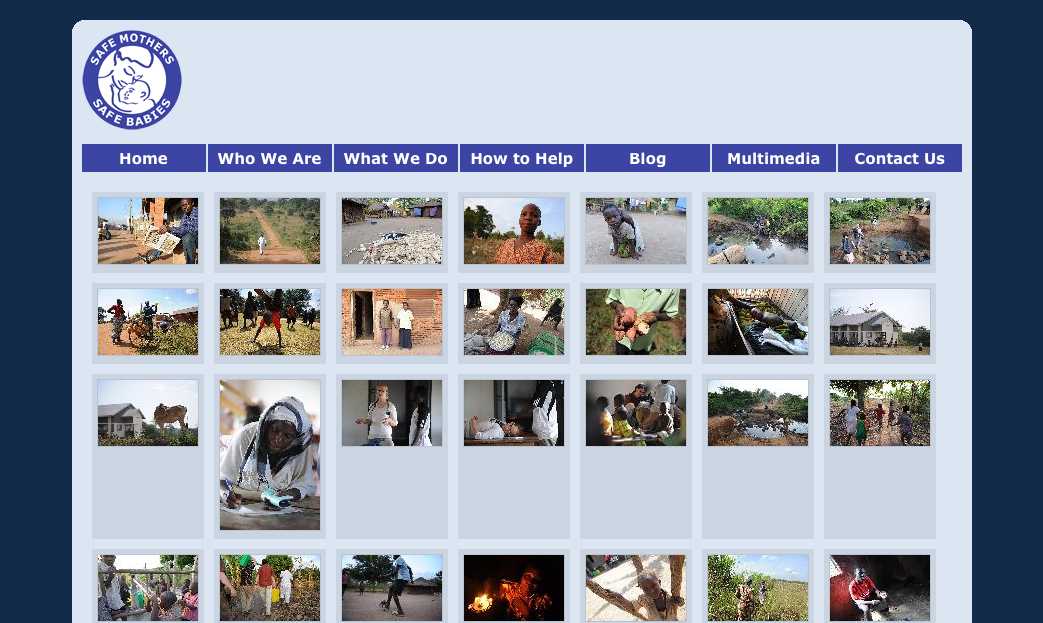
Interesting photos, but I am not sure what they are about. There are no labels on each photo to help me out, so I start looking for clues. At that point a new problem emerges. See it?
Seven nav links aligned pretty closely with seven columns of images. Without a closer examination, some folks might think that the nav links are related somehow to the content aligned beneath them—that they are column headings. Human beings are are meaning-makers, so we stretch and strain to figure out the relationship, to define a connection that isn’t really there. Confusion or at least a loss of time is the likely result. In worse cases, it might actually lead you to assume something that isn’t so—that the last column shows actual photos of the group’s headquarters or something, for example.
It struck me that this is a type of visual “tombstoning”—an unintentional (and often humorous) alignment of headings in newspaper or magazine layouts. Here’s an example from an About.com article on tombstoning:

Really? Dead Bugs Drink Wine? Were they dead before or after they drank it? Either way, that’s pretty interesting… but not what the authors or editors intended!
There’s obviously a lot more to say about The Principle of Proximity, but it’s good to keep in mind that:
It is not enough to group things that should be grouped.
You must also avoid grouping things that should not be grouped.
And if you’re interested in helping SAFE dig up and replace those visual tombstones, drop them a line—I’m sure they’d appreciate it!
I just did a nice MySQL dump of about 10,000 spam comments, just from the last week here. Hundreds of them are getting through Akismet, and they’re dang smart, too.
So, we’ve axed ‘em. Went in and disabled all comments on all posts. I might have to build in a human check. Or we might leave comments off. We’ve loved interacting with all you people, but comments are a funny thing. I’m not sure any of us will miss them.
If you’d like to get in touch, find us on twitter, or shoot me an email at [email protected].
In helping a colleague prepare for a usability test, I found Jared Spool’s latest UIE Tips article timely and totally in synch with my own experience. Three questions NOT to ask during user research (paraphrased and embellished):
Thanks Jared—good reminders.
Hoping to write much more about the thousands of decisions that went into this, but for now come see our latest work on beta.lds.org. We’ll be adding features and new pages in big monthly bursts, with a funeral for the current site planned for October(ish)..
So here’s the results of that password changing survey. Let me preface this by saying that this survey was done purely to satisfy our curiosity. We are NOT looking to this survey to help make any decisions here at the Church. We acknowledge that this survey was not scientific and thus the results need to be taken with a grain of salt. That said, I still think that we learned some interesting things. Just don’t go around quoting statistics from this survey and expect them to stand up to scrutiny.
Another point that I want to make clear is that this survey doesn’t really address how secure our passwords are. We know that the best passwords are truly random characters and numbers without any logical order and the longer the better. Our survey doesn’t specifically figure out if you’re using a “secure password.” We only tired to figure out what happens when it comes time to change that password.
Question #1: When forced to change a password I…
42.98% – Just increment a number. Password1, Password2, Password3, etc
8.77% – Change a topic. Ford1, Chevy1, BMW1, etc
23.68% – Some other pattern (explain in comments below)
21.05% – Come up with a completely unique password
3.51% – Other
There really weren’t that many surprises in this question. I had anticipated that an overwhelming majority of people would use some sort of pattern. Only 21% of us come up with a unique password every time we change our password. That means that 75% of us are using some form of an “easy to remember” password.
Again, please don’t use this to infer a sense of the of general security of a system. “Easy to remember” ≠ “easy to guess.” An incremented password of th55myp55wrd3 is more secure than the unique password of stapler. That said if someone figures out the root portion of the incremented password that gives them a much smaller number of possibilities to try.
Question #2: How do you remember the new password?
69.30% – I use a pattern so it’s fairly easy to remember
10.53% – I have to write it down for a while, but eventually toss the paper
6.14% – I have to write it down and keep it until the next change
14.04% – Other
Based on the answers to the first question, it wasn’t surprising to see that most of us don’t need to write our passwords down. We know that writing passwords down is one of the least secure ways of remembering it. I think that is why we develop these patterns. We know that writing it down is bad, but remembering a bunch of random characters is hard, so we adapt.
From the comments it appears that many of us are using password management software like 1Password, LastPass, etc. Personally, I’ve been looking into these programs and they seem like a good solution. The theory is that they allow you to set a truly random password for each site. So no two sites use the same password. Sounds great, as long as every system (computer, mobile, etc.) you use has that software installed. The other downside is that if your laptop/mobile phone is stolen they only need to crack your master password to get access to everything. But I suppose that it’s easier to remember one complex password than hundreds of them.
Question #3: If you didn’t have to change your password (or at least MUCH less frequently) you would…
35.09% – Still do whatever easy option I did above
35.96% – Make a semi-complex password that would be more secure
28.95% – Make a considerably more complex password that would be more secure
Here’s one question that surprised me a bit. I’ll admit that I assumed most people would continue to do whatever is easiest. We’re human, we’re lazy, we’re creatures of habit. Surprisingly, nearly 65% of you would use a more complex (read: more secure) password if we didn’t have to change it so frequently. That’s probably the biggest take away from this survey. Changing passwords is supposed to make a system more secure, but making those changes too frequently could have the opposite effect.
Question#4: How often are you forced to upgrade?
2.63% – Every few weeks
6.14% – Every month
8.77% – > 1 month ≤ 2 months
50.88% – > 2 months ≤ 3 months
31.58% – More then 3 months
Question #5: Personal desire for security
5.36% – I don’t think the stuff in my account is that sensitive so I don’t need a complex password
41.07% – I understand why I need security, but I can’t try to remember a new complex password every X months, so I make it easy for me.
50.00% – If I could have the same password for > 1 year I would make it complex and thus more secure.
3.57% – I’d keep my password easy no matter what. My ability to remember is more important then my account security.
So this was probably a question we should have worked through a bit more. Personally, I would have answered with both the 2nd and 3rd options if possible, but we just kind of threw this together. Still the take away from this question is that we understand why we need to be secure, but we need to access stuff, so we compromise. But, if we didn’t have to change so frequently we’d compromise less.
FRONT-END DEVELOPERS
You know who you are. You’re probably geeking out in jQuery as you’re reading this. If you can slice up a PSD, write clean and accessible markup, and javascript my face off – We Need You Yesterday.
We’re looking for 2 front-end developers (expert in HTML/CSS/Javascript). The contract is for 3 months in the Salt Lake City area and starts immediately. If you’re good, we might just keep you.
Send me an email with your resume and some examples of your work. Now get to it!
craig . hobson @ ldschurch . org
For those of you in SLC and not heading to Austin this week, come join us this Thursday at the Stimulate SLC Hack Night. Bring your laptops and sketchbooks and collaborate with a few dozen creative hackers.
Huge disclaimer: Stimulate isn’t affiliated with NT or the LDS Church, but Chris and I organized it.
There’s limited space so get in here. All the info’s at Hulabalub.
A friend of mine hunts down dangerous fugitives for a living.
Bill is a U.S. Marshall and is very good at what he does. A few months ago, I saw him walking with a bandage on his hand. Curious, I asked him what happened. Maybe he cut it doing some yard work? “Well”, he said, ”I had to smash through a car window to pull out a fugitive who tried to escape.” “Really?” I replied, “The worst injuries I get at work are a slight cramp in my pinky from too many mouse clicks.”
Bill and I go to the range every once in a while and shoot the breeze (no pun intended). I enjoy picking his brain as I like the Chuck Norris-esque of his job and am sure he pulls out a roundhouse kick from time to time. I asked him about what helps track these guys down. Without giving detail, he explained the importance of research. Bill spends more time learning about the fugitive, their habits, family, their likes, dislikes, etc… than anything. The more information he has, the easier it is to anticipate their next move.
How many times have you had a client approach you with the need for X as soon as possible and it needs to “look good”? Only after asking them who will be using it and what the site’s objectives are do they even think about it.
The problem is, they want results and research doesn’t come in a shiny package. It is up to us as designers to persuade them to understand its importance… even if that means a roundhouse kick (Disclaimer: Don’t actually roundhouse kick a client, however, if needs be, show a picture of yourself doing a roundhouse kick so they understand).
With that said, Bill could spend all his time researching and never catch anyone if he never went to work. The key is to gather a comfortable amount of user research so we have a clear focus before embarking on our designs.
Just like Bill and his hopeless fugitives, the more we know about our users, the better we can anticipate their next move.
Ok, so it’s circa 2002 and I’m watching a new detective show on TV about a guy with OCD. As I ponder how a person can possibly function with so many issues, my mom calls.
“Hi, it’s your mom.”
“Hi Mom.”
“You busy?”
I glance earnestly toward the stream of electrons across the room. “Uh, I guess not.”
“Great, can you help me with a computer thing?”
“Oh, um, sure.”
“Well I just got ‘Word Perfect’ and used it to write a letter to your uncle Jim and now I can’t find it. I think my computer removed it.”
“Oh, well did you look in the recycle bin?”
“Where’s that?”
“It’s on your desktop.”
“On the computer?”
“Yeah. There’s an icon on the desktop called “Recycle Bin.”
“You mean the little picture of the trash can?”
“Yeah, the part of the computer that it sits on is called the ‘Desktop.’” Anyway, double click on the Recycle Bin.”
“Open it up?”
“Yeah.”
“Ok, it’s open.”
“Is anything in there?”
“Yeah, ‘The Internet’ and ‘Setup’ and two little pictures of paper.”
“Ok, does one of those pictures have the name that you gave the letter?”
“I don’t think my letter had a name. It was just a letter I was writing.”
“Mom, why aren’t you using the email I set up for you?”
“I don’t want to use it. It’s too complicated.”
“But I set up an ico… um, one of those little pictures on the desktop for you. All you have to do is open it and click ‘New Message like I showed you.’ I even set up all of your contacts for you. Uncle Jim is in there and everything.”
“I just want help finding the letter I wrote.”
Sigh “Ok, fine… Is ‘Word Perfect’ open now?”
“How do I know that?”
“Well, you know the bar at the bottom of the computer where the ‘Start’ button is?”
“Yeah.”
“Well to the right of it, is there another button on the bar with a picture of a blue circle with a pen in it?”
“No.”
“Is there a button there at all?”
“There’s a picture that looks like a speaker.”
“Huh? No, I mean on the left side of that bar, right next to the ‘Start’ button.”
“What about it?”
“Is there a big button there?”
“Yes.”
“Ok, what does it say?”
“Document one dash Microsoft dot dot dot.”
“Ok, try clicking on that.”
“Oh! There it is! Oh son, you’re so good at this stuff. Thank you!”
“You’re welcome.”
“Ok, goodb… Wait! One more thing. Could you tell me how to get a photo from my new camera into this letter?”
“Oh crap! Mom, I totally forgot I have to go pick up a friend of mine at the airport! Let’s talk later.”
“Ok, well thanks again.”
“Bye.”
At the end of my last article, Erik commented “We’re all suffering from Stockholm Syndrome.” I thought it was a perfect way to describe our relationship with computers.
Those us us who work in tech love our tools with all their complexity. We relish in the fact that we know all the keystrokes for doing every little task in our favorite apps. We are secure in our investment of so much time and energy and effort to learn all the tricks and nuances of our computers.
We fool ourselves by thinking traditional computing is easy.
It isn’t.
Those who malign the Apple iPad for not being more like the computers they’re used to are suffering from a severe case of Stockholm Syndrome.
*Disclaimer: My mother is a smart lady. She has a bachelors from a major university, she’s a leader in her community and now uses computers every day for her job. She’s pretty typical of most non-tech folks I know. And yes, she might read this at some point.
I was sitting in a meeting recently with several clients and we were discussing how to create a solution for a business need. You know the scenario. I was trying to extract understanding from the clients so I could design a solution. Have you ever started squirming when one of them goes up to the whiteboard and starts drawing little boxes and circles to create a user interface? Do you get that feeling in your gut that this person is trying to do your job and prescribe what you should create? We designers tend to get testy about that sort of thing. We want to ensure we maintain control of the design so that we can enforce quality. It’s a good desire, but the push and pull of client interaction can be distressing at times.
But for me, this meeting was a breeze. There was a tense discussion between the clients, and the complexity of the business rules they were discussing would make the IRS cower. The paint-like smell of whiteboard markers filled the room and there were scribbles of UI layouts strewn across six whiteboards. Me? I wanted to put my feet on the conference table. Everything was going quite well.
The designer-client interaction was working for me because our project team had established a strong UI framework for our app. As the clients were drawing visual constructs of functionality, they were using our widgets, patterns, and themes. They were comfortable enough with the UI framework that they could rely on it to represent their ideas—it made designing the solution much simpler. It was easier for me to decipher what they were attempting to explain because they were designing with the designers’ paintbrushes.
Trust me on this one. If your app is anything bigger than tiny, take the time to create a framework. Here are some pointers.
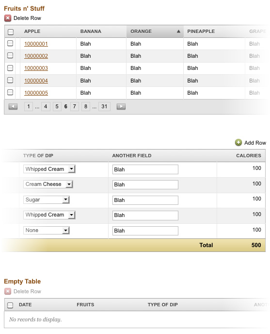
Here is part of ours that describes data table models (filled with dummy data, of course). Imagine that the title for each table was something like “Tables that Need X Functionality” and each would have example data to reinforce its intended use.
If you’re collaborating with other designers, it’s critical for everyone to own and honor the frameworks. If you need to create an exception or an entirely new construct, run it by the team and do your best to reduce visual deviation. If you’re a small team, consider a weekly design review. If your team is larger, a daily design scrum may be necessary.
In time, the app you are building will help your clients recognize your design standards. But putting them all in one place gives them (and you) a library of possibilities. For us, our clients began to appreciate the consistency in the application, and became our allies in enforcing it. They began to crave uniformity in app-wide user interactions.
This may just sound like more work and an extra chunk of code to manage, but rest assured that it will serve you well. The bigger your project gets, the more critical a framework is. This will reduce the subjectivity of your design discussions and give you something to hold to when a client wants to get crazy with a particular piece of functionality. This has served us well and I’ll continue to put my trust in UI frameworks.