New portfolio from Chicago-based We Can’t Stop Thinking. Some beautiful concepts and work despite the sad, tired use of Flash for layout and navigation.
I’m happy to announce the launch of radio.lds.org, our site for the Mormon Channel radio station. I led the design efforts, while many dozens of others contributed to the development and implementation of the site.
While not without its flaws, the site is a big success internally for a number of design-related reasons:
After planning to put the site in the current lds.org look and feel, once we put content into the template we realized that the Audio Visual department of the Church needed something much more unique and brandable. Late in the game, I designed a fresh layout, and delivered new CSS and image files to development that required just 1 HTML change to the lds.org template (bonus points if you can figure that out). Despite the ubiquity of standards-driven code in our field, this move baffled everyone on our project team, seeing the entire look of the site change with a new CSS file. There are few things you can do to build trust on a project team as powerful as showing this type of design wizardry. People seriously look like you just used the Force.
The switch from old look to new look took about 1 week. Whiteboard to Photoshop to CSS, and the AV department was thrilled. With just CSS, we were able to provide AV with a much better website for their channel, while keeping additional development costs to literally 10 minutes.
I rewrote the lds.org fly-out menus with jQuery, replacing 480 lines of JavaScript (written 3 years ago by Aaron Barker) with 44 lines of jQuery.
There are dozens of other great features behind the scenes on this site, and again tons of other people helped make it happen. Congrats to our IT teams, and the AV teams and production crews on this huge cache of new content that’s now available worldwide.
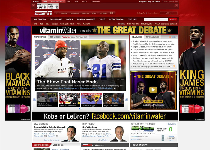
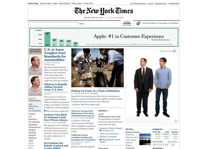
Interesting examples today of innovative internet advertising. In this economy™, companies are finding ad space on the cheap, and Vitamin Water and Apple have two similar but very different approaches:
On ESPN.com today, Vitamin Water has 5 ad spaces for their “Great Debate” campaign pitting LeBron against Kobe. Too bad these ads aren’t as good as their TV ads (“You can’t check him!”), and not nearly as awesome as Nike’s Jim Henson throw-back (“whooo!”). Each ad by itself looks fine, but the 4 ads together overwhelm the page and is uninspired and tired, if not annoying.
Apple, on the other hand, took over NYTimes.com today with a totally different approach. They’ve got 3 ad spaces here, and each ad interacts with each other. The PC and Mac characters point up to the bar graph, and the Hair Growth Academy guys start pitching in with their opinions mid-way. They’re clearly having some fun here, and employing a much more interesting and engaging experience.
Apple clearly takes the cake on this one, and my guess is they’ll see a better return on those ad dollars as viewers’ eyes stay on their ads for longer and that little Apple logo gets burned ever so deeper into our brain matter.
I’m going to go ahead and call this the best Layer Tennis yet. Aaron Draplin, floor manager of the DDC, vs. famed Ohio graphic designer Chris Glass. One for the ages. More of a collaboration than a battle, witness the evolution of a brand for the newly minted International Design Workers Federation.
One of the coolest things at last week’s 99% Conference was the Cool Hunting videos they showed during breaks. Above, an inside look at Grafica Fidalga, a print shop in NYC. Love it.
Also see PapaBubble and Baggu Bags. Incidentally, the conference stuffed a Baggu bag with candies and a poster, so it was cool to see and hold products from these little spots. Nice touch.
“Digg sends a tremendous amount of traffic to sites that make it to the top of their front page, but it’s the worst kind of traffic: mindless, borderline illiterates. Good riddance, really.”
Ignite SLC is next Thursday – it’s an O’Reilly event that gathers over a dozen speakers, allows 20 slides each and just 15 seconds per slide. All local. Design + tech. Looks fun.
Joel Splosky’s How to be a Program Manager is a near spot-on description of our Design Manager / Interaction Designer position here, minus the pesky HTML/CSS role we keep clinging to.. UE + functional spec + customer liaison.
“A person who works six hours a day but with total focus has an enormous advantage over a 12-hour-per-day workaholic who’s ‘multi-tasking’ all day, answering every phone call, constantly checking Facebook and Twitter, and indulging every interruption.
It’s time we upgraded our work ethic for the age we’re living in, not our grandparents’ age. Hard work is still a virtue, but now takes a distant second place to the new determinant of success or failure in the age of Internet distractions: Control of attention.”
Pitchfork’s posted 51-100 of their 100 Best Tracks of 2008. This isn’t only a great list, they’ve finally added handy little MP3 players to hear or download tracks on the list. I guarantee you haven’t heard of over half of these artists. Go explore and find some new faves.
My tops: The Veronicas (87), Justice (76), Sigur Rós (71), The Whitest Boy Alive (64), Q-Tip (61), and some freakin’ Vampire Weekend at 56.