Jeffrey Kalmikoff, new design director at digg.com, sounds off on The anatomy of useful feedback, including some excellent suggestions for making design reviews productive:
Knowing there’d be the probability of a high volume of feedback and limited time to respond via both communicatively and creatively, I asked for feedback to come in a particular format to make it as easy as possible for my team to digest.
He also suggests including as many non-designers as possible in your reviews, to spread enthusiasm and gain valuable feedback:
I find collaboration with non-designers to be so important in design. Designers have a tendency to see things thought a different lens than most people, which can be counter-productive when trying to find solutions across all use cases
See his full post for more. Good to see design reviews going well somewhere, and it’s got me thinking of how to make them better over here..
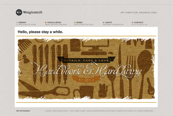
Naz Hamid has a new article on Weightshift called Stuck between an App and a Website, and its a thoughtful look at designing to the project and the humans using it:
Get to know your client well, do the research, do what is right, not what is now and trendy and because Apple/Facebook/xxxxxx does it. Listen, communicate, design well.
It’s all too easy to get wrapped up in a look, a design or an aesthetic. The science fiction of my youth left those impressions but ultimately, it was the human element — the stories that mattered the most, that left the lasting impression. In the end, we’re all trying to make machines more rounded, more curved, more organic, more human.
By the way, I hadn’t seen Naz’s new design but it’s equally impressive:
One reason for the chirping crickets around here is the insane amount of work we have going on here at the LDS Church. We have major projects going on in every department of the church, and its keeping the 40 or so of us pretty busy.
So busy, in fact, that we’ve been able to shed the pesky hiring freeze and open up several spots. If you’re an active member of the LDS Church, are willing to work in Salt Lake City, and match up with the following requirements, send me an email at jobs@northtemple.com.
Design Manager
Our Design Manager role coordinates all user experience design in one of our many portfolios of projects. You’ll need experience managing people (read: geeks), and experience in a Creative Director or similar role. Check out this really formal job description for more info.
HTML/CSS Coder
We’re looking for contractors who can work 30-40 hours a week, on-site, cutting our Photoshop files into standards-compliant HTML and CSS. Send me an email if you know your stuff, and especially if you have experience interacting with or supporting development teams.
“It is our function as artists to make the spectator see the world our way not his way.”
Excerpt from a manifesto written by Mark Rothko, Adolph Gottlieb and Barnett Newman, published June 13, 1943, in the New York Times. Via The Footnotes of Mad Men.
Our friend and former colleague Tim Zheng is on the just-announced lineup for Ignite SLC #3, set for August 20. He’ll be giving a finely polished discourse entitled “Chinese People in 5 Minutes.” A few of us hit Ignite #2 earlier this year and loved it. Tim, just be sure to finally answer the question, What does Chinese Dragon eat?
Of course it is totally understandable to take the ideas of those that pay our bills as gospel. But we should also be reminded that those same people hired us for our expertise. If they just wanted someone to follow orders, they’d probably have hired someone else.
This is especially true in our jobs here on North Temple Street, where design instruction can come from the same people who write actual Church doctrine. I fear too few of us stand up for our own truths, the truths of proportion and color and composition.
While our customers – and yours certainly – are well versed in the gospels of their own sphere, we are the trained experts of design. Often these people who demand that the page doesn’t scroll or whatnot haven’t a clue as to how their message should be communicated.
Instead, let us assert our expertise. Carefully take the customers’ feedback, adjust the design as you see fit, and with confidence explain why those decisions were necessary. In the end, you’ll have progressed the design in ways that improve the product – and not the egos – of your customers.
I feel really stupid for not making progress on a silly website when they’re growing grass in the desert in China.
NYTimes – “Dunhuang, an oasis town deep in the Gobi Desert along the famed Silk Road, has become a center of China’s drive to lead the world in wind and solar energy.”
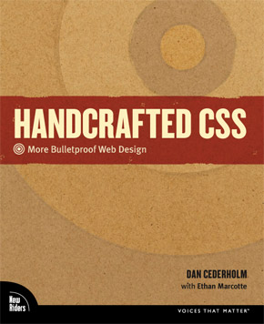
Handcrafted CSS, a new book from Dan Cederholm and Ethan Marcotte, looks to add to the smallish pile of useful CSS books on my shelf. The others are in a large pile in the community library at work.
“This book will show how craftsmanship can be applied to flexible, bulletproof, highly efficient and adaptable interfaces that make up a solid user experience.”
That we had to wait two years for the iPhone’s text selection and pasteboard is a good example of one aspect of the Apple way: better nothing at all than something less than great.
... it’s simply incomprehensible to some people that it might be better to have no text selection/pasteboard implementation while waiting for a great one than to have a poor implementation in the interim.
Is it better to release something mediocre than to wait to release something great? Too often I hear this excuse: “this is better than what we have now.” This is a tempting excuse to spew out of your mouth, because no one can argue with it. Of course it’s better. It’s easy to be better. But is it great? Is it awesome? Are you cheating your customers or viewers of something that would blow their minds?
What do you think? Is it better to release early and often, improving on a”good” idea in public? Or is it better to wait until an idea strikes this beautiful chord of greatness and then unleash it on the world?
It hits on some great points of self promotion that apply to not only announcing something, but making sure that your bright light isn’t hid under a bushel.
It’s not enough to do great work at work, but you must also let people know about what you’ve done, specifically your boss. The same is true of your … projects.
... If someone asks you about your project, can you explain its awesomeness, and why he should use it? If not, why are you bothering? And if you can, are telling everyone you can about it? If not, why are you bothering?
Often your boss will only hear negative feedback about your work. People just don’t go out of their way to tell your boss if you’re doing a great job. Often they’ll tell you, but meanwhile your boss hasn’t heard squat.
Can you explain your awesomeness to your boss? Are you telling them about it every week?
Same goes for the project you’re working on. Can you explain its awesomeness? If you can’t, why are you working on it? Get your awesomeness straight, or shut it down. And when it’s awesome, make sure peoples know about it.
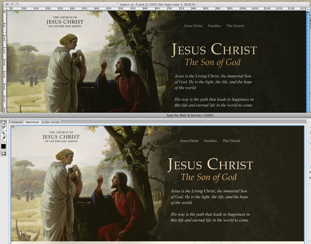
I have been plagued with this problem for literally 4 years. I’ll work on a design in Photoshop for days, only to save the dang thing for the web and get a washed out, off color piece of crap result. Finally, today, I have the answer: one change of the Proof Setup setting will finally match your working space with your output images.
See below. The rich dark chocolates and deep reds of the Carl Bloch painting are washed out when you Save for Web in Photoshop:
OK so sure, most can’t tell the difference. Still infuriating.
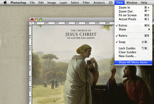
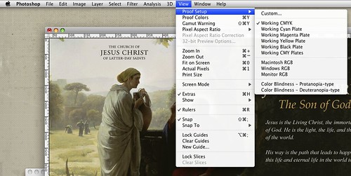
Chris mentioned the above image was a bit washed out, and when met with a fury of whining from yours truly about the issue, calmly pointed me to the View menu (Photoshop CS4). You have to first click “Show All Menu Items” (reason #54 why you should never hire an interface designer with Adobe on their resume). You then are greeted with “Proof Setup” at the very top:
There you have the problem: Photoshop ships with the Proof Setup as “Working CMYK.” Because if you use Photoshop you must be a print designer.
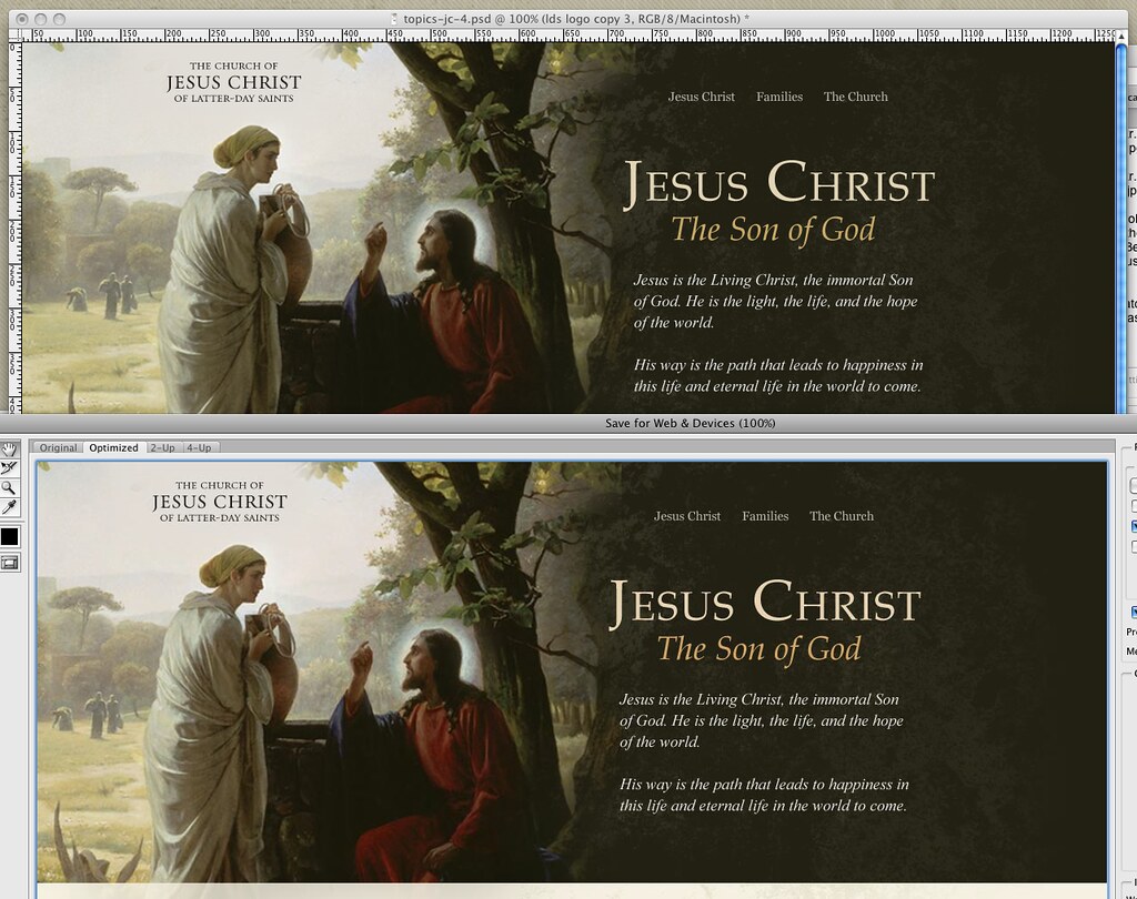
For those of us who aren’t just print designers, simply change it to match your project and machine. In my case, Macintosh RGB, and voila:
Unfortunately, your new view of a current document will now be washed out. But at least it reflects reality! Now you can fix it accurately, and if you save your workspace, your settings should apply for all new projects, ridding you of this problem forever.
Google, you may now point everyone with Photoshop color problems to this article.
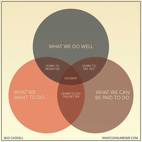
We can’t determine how to make enough money from the things we want to do, and do really well. I’m constantly surprised at what can be monetized. And on the web, there’s a market for almost anything. But this problem requires you to rapidly iterate your positioning and the type of clients you serve. Often, we’ll get transfixed on a single direction early on (because we’re desperate to solidify our business) and we’ll miss our chance to radically experiment with the market.
A short and sweet synopsis of what we should all be striving for, not just if you have your own business.