interface archives

case study

The mistake of over-designing

In our quest to design simple, intuitive, and efficient things, we must be careful to not over-design. I have run into several examples recently where I believe the designer (or more often, the business employing them) is trying too hard—too hard to be everything, too hard to have too many options, too hard to up-sell, too hard to be original or innovative, too hard to be too simple—and has failed. A fine line is walked between questioning traditions and standards for irrelevance, age, or oversight, and respecting them for their tenure of existence. A delicate balance must be struck between production costs, competition, patents, marketing, aesthetics, work-flow, and usability. While we most often are not the one with the final say, I believe it’s a designer’s duty to satisfy a project’s many requirements simultaneously while diligently advocating usability—resisting and preventing the mistake of over-designing.

posted by wade on Monday, Jun 29, 2009

Safari 4 Beta is faster but no one knows

Refresh this page. Now do it again and this time note the moment that fifty-percent of the page is loaded. Got it? Do you know when it was? What about speed? Can you give me an idea how fast the page is loading? What if you were on a slow connection like the wifi I use on the bus to commute to work? Would you know if the page was loading fast or slow? Would you have an idea of how long you were going to have to wait? Should you switch to another tab and continue reading the news because it’s going to be a while?

If you were using Safari, you’d have an answer for me; other browsers leave you in the dark.

Well, at least that’s how it used to be (save Safari Mobile). Safari 4 Beta was released this morning and with it came a gaggle of exciting new features (including a Web Inspector and Console that can now hang with Firefox’s Firebug plugin). Unfortunately, Apple also removed one of Safari’s greatest features.

While the standard loading indicator for web browsers is a spinning icon, the great minds that designed Safari’s interface decided to innovate and instead take advantage of the functionless (after you have entered a URL and struck the return) address bar and animated a progress meter behind the text. Instead of a nearly useless icon that communicates little more than that the browser is running, Safari’s indicator simply and effectively let’s you know both how much has loaded and how fast it’s loading.

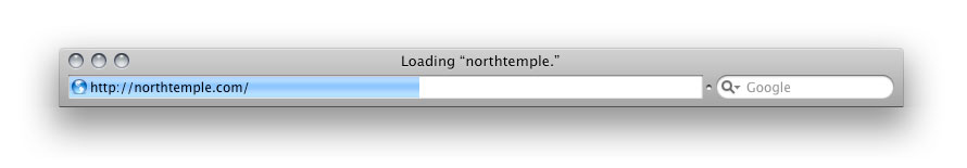
With Safari 3, the browser’s state is clear. With the requested site’s title prefixed by the word “Loading” at the top of the browser and the progress meter status indicator, the state of the browser and the action taking place is immediately obvious to the user. Even viewing this static screenshot, having not physically interacted with the browser and requested the page yourself, you are able to quickly and accurately discern this.

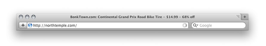
The state of Safari 4 Beta on the other hand is a mystery. I have requested northtemple.com but the browser still displays the title of the previous site. The only indicator that the new site is loading is the small animated “spinner” on the right side of the address bar. Both versions of Safari display the requested URL prefixed by the word “loading” in the Status Bar in the footer, but most users do not have this bar turned on.

Here’s to hoping that it’s absence is just an oversight in the beta.

posted by wade on Tuesday, Feb 24, 2009

Gmail is now skinnable. It hasn’t been rolled out to GAFMD accounts yet, but looks like it’s available to all standard users. Most of the themes are actually pretty nice; although I won’t see them much as I rarely use a web-client for email. For when I do though, these are some nice new options. The best change is simply how they tightened up the interface. They don’t provide the option of creating your own yet. I wish the themes persisted across the other apps (calendar, docs, etc).

posted by wade on Thursday, Nov 20, 2008

Could this be simplified?

(Firetruck water panel at the Draper Fire Station.)

posted by rick on Thursday, Feb 28, 2008

“When I create interfaces for clients, I ask for feedback on everything. I want to be edited, I want that push-back because it makes the design better, which is the only goal. (but, of course, it makes me better too). It’s amazing how many times we end up scratching something that was in the original interface because we realized that it’s just not providing core value.

Without an editing step, you don’t get to the point where you ask ‘is this really necessary?’. You never get to ‘but is this providing core value that we can’t live without?’. In addition, without an editing phase you improve much, much slower. Without editing you start drinking your own kool-aid.”
from Joshua Porter’s Interfaces need Editors

posted by emmy on Wednesday, Oct 17, 2007