
I’ve tweeted these, posted them on my own site, and I’ll repost them here yet again ‘cause they’re so incredibly well-designed: The New UK coins, which contain “the Shield of the Royal Arms … cleverly split among all six [coin] denominations.”

I must be completely oblivious to the world around me. I just now noticed (as I looked on the side of an amazon box that was delivered today – which only had the arrow) that the arrow by itself looks like a smiley mouth. Coincidence? I think not…
See the FedEx logo, as another sneaky example of subliminal (or at least clever) messaging from within the shapey depths a logo.
(I cannot lie. I did not figure out the fedex one on my own.)

No images, pure typography… the result? Seed Conference site. As Jon Hicks put it, “A truly inspirational site, showing how Times New Roman can look great in the hands of someone that knows what they’re doing.”
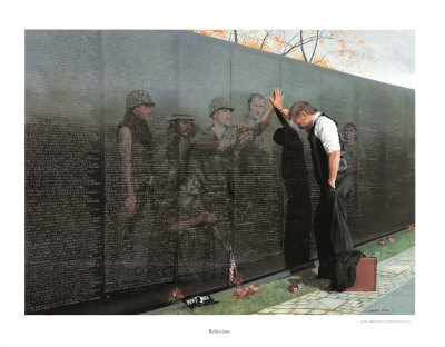
When Rob Foster, Todd Ericksen and I went to Washington DC to attend a Tufte Conference we made a point to stop by the Vietnam Vetrans Memorial . It was just after twighlight and there were only soft lights illuminating the memorial. The dim lighting set the mood and invited you to look harder to see the detail of the names. You couldn’t help but to find yourself touching the stone and feeling the names of the fallen as you walked along side the memorial. We went to several other monuments and memorials and heard tourists chattering and even yelling, and then to come to this one and hear only the wind in the trees was a very spiritual experience. You were compelled to whisper and show reverence for the hallowed ground on which you walked. As close to the feeling of the temple as I have felt outside of those walls.
This memory was brought about by a link from Cameron to the Interactive Vietnam Veterans Memorial A great way to interact with the wall and see the actual names if you aren’t able to see them in person. The ability to add photos and stories to each name is another great method of making it a very personal experience.
(Art is “Vietnam Reflections” by Lee Teter)

An iBerry?

Where several of us have been since Tuesday.
The Web App Summit was great! Can’t wait to share the things we learned…
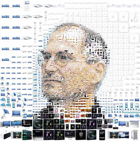
This looks like something only Cameron could pull off.
Via Core77.

Sunrise in Salt Lake.
It’s been a while since we’ve posted something about God’s handiwork, so here’s a beautiful sunrise coming over the Wasatch Mountains captured by my sister Katie on her way home from the late shift. Way to keep an eye out and a camera handy, Sis…


Saturday Supercar Spotting:
Saw this today in the parking lot at IKEA in Draper. I am pretty sure it was a kit car, but still pretty awesome.

“The designer, Rian Hughes, was researching old wood type, but instead found the lettering at the beginning and end of each reel of microfiche far more appealing. Based on the intro and outro messages, Dukane (named after a Microfiche reader) has the battered and scratched quality of mistreated film stock.”

The Rolleiflex The MiniDigi AF 5.0. For the astute (or perhaps style conscious) digital photographer.

Jason Fried (from 37signals) suggests that you question your work
“These are questions we ask each other before, during, and sometimes after we work on something. That something can be as small as a couple-hour project or as big as something that takes a few weeks or more. Either way, it’s important to ask questions like this in order to make sure you’re doing work that matters.”

We have a few cyclers in the group that might find this useful.

The New Encyclopedia of Modern Bodybuilding by Arnold Schwarzenegger seen in Chris Mayfield’s bookshelf. I wasn’t even sure he could read, let alone write a book (Arnold… not Chris =)

Got a built-in iSight or webcam? Choose webcam mode and navigate this site with hand gestures.

Accessibility for Currency…
The new US five dollar bill goes into circulation tomorrow. This interactive feature on the US Treasury site touts the design features of the new bill, including a gigantic purple “Low Vision 5” on the back. Nice interactive piece, but does anybody else think that the “5” looks totally out of place on an otherwise beautiful bill? Can’t accessibility be beautiful?

For Chris. Fitness light switch. (via ibelieveinadv)


Jon Tan’s site is freaking awesome. The logo is all html text, and the entire site scales with a touch of the font size. Check it. (via moll)