
Sundown at Larkin Cemetary, Sandy UT, on Memorial Day 2007.
Evidence of intelligent design?
Love you Grandma & Grandpa. We’ll see you later.

You’re killin’ me, Jesse. Stop with the gorgeous redesigns.

IKEA. Anyone up for some Swedish meatballs tonight? I’ll be heading down there.

Delicious: Miguel Ripoli breaks out the big stick and whips up maybe the best overall site I’ve seen this year. This site appeals to me on so many levels, despite his usage of the Cameronism “veritable” (from whom I stole this link, btw). Check out this page and this page for additional morsels. Nice work, Miguel.

Inspired!!

Yeah, but is that the best Adobe (?!) can do?
Creating substitute icons might be nerdy ... but lookin’ at the official ones, I feel a yawn comin’ on…

Adam Betts releases CS3 icon replacements. Jason Dilworth says (and I’m thinking I agree) that icon replacement surpasses even his own nerdery.
But what’s nerdier – replacing icons or blogging about it?
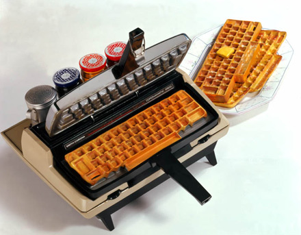
“Because breakfast isn’t nerdy enough, I present to you the Keyboard Waffle Iron.”
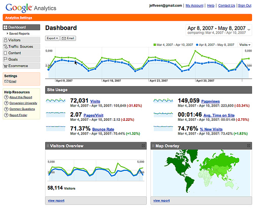
The new Google Analytics.
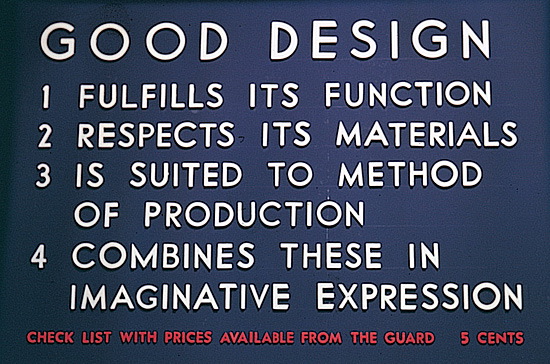
Definition of Design by Eliot Noyes (1910-1977) created for his exhibition at MoMA. Well-designed objects, he believed, were modern and sensible in character, and avoided the pretentious styling of the day.
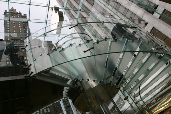
Inside the Apple store in New York, NY
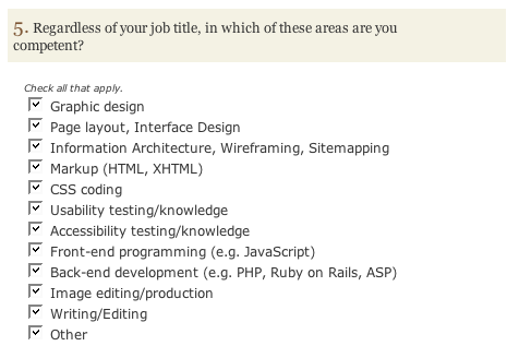
On A List Apart’s Web Design Survey, question #5, how many did you check off? If you checked more than 7 or 8, give us a call, and you’ll be able to check off 11 or 12 on question #6..
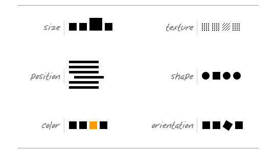
Excellent piece by Andy Rutledge in today’s ALA on Contrast and Meaning, which includes the above illustration of the primary forms of contrast. I love this subject, which Rutledge says “can pay healthy dividends in your design work.”
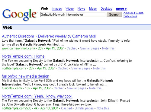
It looks like we inadvertantly Google bombed Cameron as the Galactic Network Interwebster I think it is now required for him to give his site a space theme.

for chris.. “Greg Long of San Clemente flies down the face of what might be the biggest wave ever ridden at Dungeons, South Africa.” (via)

Notice anything weird with this picture? This morning at the gym I was resting in between some grueling sets of dumbbell squats and glanced up at the tv in the mirror and saw this apple ad and it just looked wrong! Then I noticed another layer of brilliance of those ads. I noticed that every ad they had intentionally placed the apple guy on the right hand side. I’m sure this is old information to all of you but to me the fact that if felt so wrong in a split second was a great test of the consistency of these ads.

Luke Wroblewski wrote a nice piece last year over at UX Matters on Refining Data Tables. He points out a few helpful techniques of filtering data in a table, including above, where “a user might expand a collapsed group of filters by clicking a link labeled something like Search Options, thereby displaying the filters only when the user needs them to refine the search results.” Thanks for the tip Bri.

And they called it Zion.
Picture taken standing atop Angle’s Landing in Zion’s National Park


Gil pointed me to this cool write-up over at ColourLovers spotlighting the colors of the 2007 Grammy Award Winning Albums. Love the Chili Peppers, but those are all sweet schemes. Related: Adobe Kuler color scheume widget for OS X..