“A king brings six men into a dark building. They cannot see anything. The king says to them, “I have bought this animal from the wild lands to the East. It is called an elephant.” “What is an elephant?” the men ask. The king says, “Feel the elephant and describe it to me.” The man who feels a leg says the elephant is like a pillar, the one who feels the tail says the elephant is like a rope, the one who feels the trunk says the elephant is like a tree branch, the one who feels the ear says the elephant is like a hand fan, the one who feels the belly says the elephant is like a wall, and the one who feels the tusk says the elephant is like a solid pipe. “You are all correct”, says the king, “You are each feeling just a part of the elephant.”
“The story of the elephant reminds me of the different view of design that people of different backgrounds, education, and experience have. A visual designer approaches UX design from one point of view, the interaction designer from another, and the programmer from yet another. It can be helpful to understand and even experience the part of the elephant that others are experiencing.” The Psychologist’s View of UX Design by Susan Weinschenk on UX Magazine.
posted by
shane
on Tuesday, Jan 31, 2012
“The world needs more UX. Without the knitting that UX performs for organizations and their customers, we’ll likely end up with continued wanton proliferation of technology rather than the thoughtful, iterative progress and leaps of innovation that good UX practice nurtures.”
This one hits home for me today. From Chris Baum in the latest Boxes and Arrows email newsletter. (I looked for a specific link on their site for a specific web page to cite, but couldn’t find one.)
posted by
ted
on Tuesday, Feb 09, 2010
case study
Interfaces are one of the principal sources from which a person learns about his or her work. That understanding gets turned into diagrams, charts, and maps that, whether accurate or not, come to define the work that person does each day.
My initial meetings with Michael were a bit intimidating. It’s not that he himself was overbearing or anything, it’s just that our conversations eventually filled me with a bit of apprehension – a feeling of “woah, this project could totally kick me around”. See, Michael was a new client who needed a piece of software to help his office do their daily work, and he sat down with me several times to make it clear that their process was insanely complex. Gulp.
Now, I’m a designer, which means I’m supposed to be overly confident about my ability to solve a client’s problems. And at the beginning I was, but as Michael reiterated time and time again how difficult his daily work was, I couldn’t help but believe him, at least in part, and that belief haunted me. With every iteration of the project, as we introduced new functionality and explored additional requirements, I winced inwardly, thinking “here comes the tough part.”
This would be a great time for me to introduce a horrific challenge and then brag about how I beat it to a pulp, but unfortunately that won’t be the case today. It turns out Michael’s project actually turned out to be really straightforward. The logic behind his office’s business process was pretty simple, and as we worked together on a software solution, that simplicity came forward – to our surprise – and made both our lives easier. At first, Michael expressed a bit of concern that we’d overlooked something essential. This seemed too easy. But as he and his staff used the application over time, they became convinced that it was all there. Their work really was that simple.
That got me thinking – why was Michael’s simple process hidden behind so much perceived complexity? How was that confusing layer of muck put in place, and when?
Of course, there are tons of variables involved here, and to say that a single factor was wholly responsible for this counterfeit complexity would be a joke. Even so, as I searched for answers about the origin of a lot of business process misunderstandings, I kept slamming into the office’s previous software and its confusing user interface.
The most dangerous thing I saw in the old UI was a knack for misrepresenting information relationships. Due to confidentiality restraints, I won’t be able to share the actual information that was being turned upside down, but let me give you an example:

Alright, alright, this is an obvious one. The figure misrepresents the relationship between “colors” and the rest of the words. Now, because everyone knows about colors (duh!), the mistake is easy to detect and resolve.

It’s easy for us, a bunch of fully-grown, well-trained professionals, to tell that blue, green, red, and yellow all fit within the category of “colors”. Congratulations. However, what would happen if I taught my newborn about color using the first figure? How do you think that would go? Is there a chance some confusion would ensue?
The UI that Michael’s office was using every day to do their work was teaching them the wrong info relationships over and over again. They’d been using it for over five years, and during that time, they had hired and trained several new employees. Their training had been centered around learning to use the old application. Consequently, they had learned their new job inaccurately in essential ways. Their UI was lying to them, and they were eating it up.
You see, as designers we understand one facet of the knowledge-UI relationship quite well. We depend on our clients’ brains to produce the kinds of info diagrams that can teach us about the design problem at hand, and we hope that this understanding becomes solidified and is eventually projected onto our final UI. That’s how we make software.
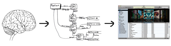
However, it had never occurred to me that this relationship could also be reversed until I saw it with my own eyes in Michael’s office. For years he and his staff had looked at their old UI, learned from it, formed elaborate diagrams based on what they learned, and then stored them in their brains forevermore. That’s how we capture concepts.
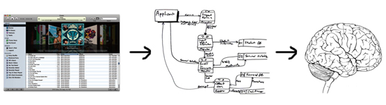
So there it is. User interfaces are one of the principal sources from which a person learns about his or her work. That understanding gets turned into diagrams, charts, and maps that, whether accurate or not, come to define the work that person does each day.
This brings a new dimension of responsibility to our table as interaction designers. Not only do we need to worry about our interfaces being simple, or elegant, or usable, or accessible; we also have to make sure they’re honest. Do they accurately portray our clients’ processes? Do they faithfully represent the relationships between different bodies of information? Do they tell the truth, or do they lie? Ultimately, whatever they say is going to define how our users think of their work, how they understand it, and how they do it.
posted by
davidlindes
on Monday, Feb 01, 2010
Think for a moment about your daily routine. You probably wake up to an alarm clock of some sort. You may or may not eat breakfast. You get ready and dressed for work and commute using either public transportation or your own vehicle. Maybe you’re one of the lucky ones whose commute is to the home office. You sit at a desk and work on a computer. Perhaps you work outdoors or down in a hole. You go out to lunch or bring your own. You travel home at the end of the day and spend time with family, go out with friends, or watch TV alone.
Whatever your routine, you live in a world filled with user experiences. From the toaster that makes your bread golden brown to the wireless mouse that selects text or graphics on the screen, you have the opportunity to appreciate (or hate) design every day. How does this affect you? Are the majority of your experiences transparent, or do you have several daily complaints? Have you ever made an effort to change a painful experience or publicly applauded a fantastic one?
What I’d like to know from our readers is what you feel makes a truly great user experience—the defining factors that create happiness, efficiency, ease, and simplicity.
posted by
rick
on Tuesday, Oct 21, 2008

While Apple has a healthy amount of attention on profit, product features, and competition, they seemed to pause this week to make a clear statement about their company. Steve Jobs passed around a Macbook chassis in their media event and Jony Ive, SVP of Design, emphasized careful craftsmanship in their product showcase. Apple has communicated what drives their company. They, the CEO and his fellow business-minded executives, respect the balance of form and function and embrace beauty and innovation. They notice nuances and foster a culture of design excellence. Leaders that love design are the foundation of an experience-driven organization.
posted by
clifton
on Wednesday, Oct 15, 2008
