“In typography neither the old style nor the new style matters; quality does.”Jan Tschichold, On Typography (1957) — Jason Santa Maria provides a nice little piece about Tschichold’s change of heart, from his youthful days of san-serif only typographic rebellion in Nazi Germany to his latter years of classical inspiration as the head designer for Penguin Press. Tschichold’s writing and design work is something that every designer should be familiar with.

Use the best available ampersand. Nice charts over at SimpleBits on the different fonts & ampersands available by default on Mac, XP and Vista.
The Girl Effect. Do not skip the video. I love the typography on the site and the logo/nav on the top left.
Typographers and their handwriting. Draw your own conclusions.

Beautiful P22 Operina Pro. 1284 glyphs! Go to page 3 of the glyphs and scroll to the bottom. Mmmm.
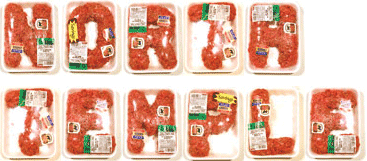
Robert J. Blolesta’s Value Pac.
Alphabet made of raw hamburger. Each character hand-shaped, packaged, and photographed individually.
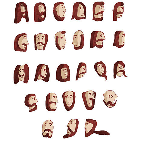
The Beard font via core77
For me, this site presents the best of both worlds…Hot cars and cool typography. It’s heaven on the intertubes.

No images, pure typography… the result? Seed Conference site. As Jon Hicks put it, “A truly inspirational site, showing how Times New Roman can look great in the hands of someone that knows what they’re doing.”

“The designer, Rian Hughes, was researching old wood type, but instead found the lettering at the beginning and end of each reel of microfiche far more appealing. Based on the intro and outro messages, Dukane (named after a Microfiche reader) has the battered and scratched quality of mistreated film stock.”

Jon Tan’s site is freaking awesome. The logo is all html text, and the entire site scales with a touch of the font size. Check it. (via moll)
“It is doubtful that anyone who doesn’t want to be an apprentice will ever become a master.”Jan Tschichold in The Form of the Book: The Importance of Tradition in Typography.
There so many ways to resize type on the web, but I find this one not only produces excellent results, but also seems to be the least complicated of the bunch.
A few noteworthy articles over at Design Observer:
Curse of The ‘D’ Word
Steven Heller’s discussion of the taboos surrounding the term “decorator”: “A designer who decorates yet does not know how to effectively control, modulate or create ornamental elements is doomed to produce turgid work.”
Type Means Never Having To Say You’re Sorry
A nice primer to John’s internal typography workshop this week, Jessica Helfand cringes at Futura and other type mistakes: “It’s not the designer’s voice that concerns me here so much as the designer’s understanding of history — a body of knowledge that once acquired, can be edited, modified, even jettisoned at will, but only after giving it a good, hard think.”
“Grace in typography, comes of itself when the compositor brings a certain love to his work. Whoever does not love his work cannot hope that it will please others.”Jan Tschichold (1902-1974)
Smashing Magazine recommends 40+ excellent free fonts (via Real Art).
“The good type designer realises that, for a good new fount to be successful, it has to be so good that only a few recognise its novelty.”Stanley Morrison, designer of Times Roman
(via The Foundry)
“The abnormality of our time, that which makes it contrary to nature, is its deliberate and stated determination to make the working life of men & the product of their working hours mechanically perfect, and to relegate all the humanities, all that is of its nature humane, to their spare time, to the time when they are not at work.”Eric Gill, in “An Essay on Typography (1936)”, describes the situation of the working man in the Industrial age. His description seems to paint a pretty good picture for where we are today (80 years later).