“CSS is the weakest link in the web developers toolbox. The problem goes deeper than CSS’s lack of variables. Unlike the “function” in programming, CSS has no fundamental building block.”Chris Eppstein, the author of Compass writes up a solid argument for the need of abstraction in stylesheets. I’ve been toying around with Compass and the Sass language over the past few weeks and things look very promising.
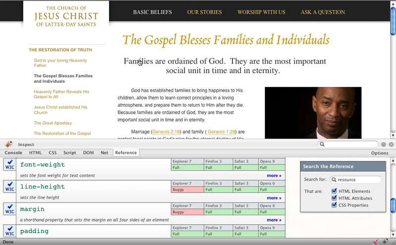
Firescope is a free Firefox add-on from Sitepoint that puts a Reference tab into Firebug. This tab gives an overview of the level of browser support for a selected element and any styles applied to it, plus a link to more information on Sitepoint about elements and attributes. Looks very handy for troubleshooting… Download took about 3 seconds, plus a re-start of Firefox.
case study
Hot and graceful jQuery dropcaps
Dropcaps are a staple of magazine and newspaper design, but aren’t always the easiest to implement on the web. Using this little jQuery and CSS tutorial, you can easily add hot little dropcaps to your web articles without bothering your developers. This method will also let you sleep at night knowing your caps will degrade gracefully, displaying just fine in browsers without CSS or JavaScript enabled.
Please note, this tutorial is for those who are familiar with jQuery and CSS. No basics taught here. Also nerd alert.

Here we have a flippin’ sweet dropcap on an article page for the new Combating Pornography website we’re building (launching early 2009).
Tadd recently noted that he’s been using some nice CSS 2 selectors in the new General Conference design. In his example, he’s styling the initial character of the article with CSS typography. Noble indeed.
However, I am more of a type snob and wanted my dropcap to be set in Caecilia, matching some other type found throughout this new site.
(Yes, this means saving 26 images of dropcaps in Photoshop. Luckily this took me all of 10 mins. As for translated sites, more on that below.)
So our task is to style the initial character with a background image, with hand-adjustable pixel spacing around each individual letter, and in a way that degrades as gracefully as Audrey Hepburn if she were a nerded-out website.
I also don’t want to bother the developers (who read this blog – hi Mindie!) to put a <span> around the initial character, and I really don’t want to beg them to throw a different class on that span depending on which letter of the alphabet that character is.
Sound like a daunting task? It’s not.
HTML it up
First let’s make sure the HTML is set up nice and easy:

Here we have the initial paragraph from Michael Gardner’s article on Hope, Healing, and Dealing with Addiction (here is the full comp so you have some context). No spans, no special classes. Easy fo’sheezy on the developers.
jQuery action
Next we hook up our page with some jQuery, and start the show.
<head>

<script src="scripts/jquery.js" type="text/javascript"></script>

<script type="text/javascript" charset="utf-8">
$(document).ready(function(){

});
</script>
</head>
Inside our jQuery block, we’ll first grab the first paragraph in our article (in my case, inside my “body” div), and add a class of “dropcap” so we can remove the indent and refer to it later:
$(document).ready(function(){
    p1= $("#body p:first");
    p1.addClass("dropcap");
});
Next, we need to grab the text from the first paragraph. We do this by taking the actual paragraph element from our p1 object, and asking it for its content using a standard JavaScript function, “textContent.” We also want to strip out any leading spaces or quotes, using some regular expression magic:
$(document).ready(function(){
    p1= $("#body p:first");
    p1.addClass("dropcap");
    p= p1[0].textContent.replace(/^\s+/, "").replace(/^"/, "").replace(/^'/, "");
});
Next we need the initial character from that paragraph (whic we know is alpha-numeric), using the standard function “charAt.”
$(document).ready(function(){
    p1= $("#body p:first");
    p1.addClass("dropcap");
    p= p1[0].textContent.replace(/^\s+/, "").replace(/^"/, "").replace(/^'/, "");
    c= p.charAt(0);
});
Now comes the money. In one statement, we will replace the html inside our jQuery object (p1) with a new block of code that wraps the initial character in a span, adds a class of “dropcap-” + the initial letter (don’t forget the lowercase), and adds a style with a background image for that specific letter. Check it.
$(document).ready(function(){
    p1= $("#body p:first");
    p1.addClass("dropcap");
    p= p1[0].textContent.replace(/^\s+/, "").replace(/^"/, "").replace(/^'/, "");
    c= p.charAt(0);
    p1.html('<span class="dropcap-'
        + c.toLowerCase()
        + '" style="background-image: url(images/drop-'
        + c.toLowerCase()
        + '.jpg)">'
        + c
        + '</span>'
        + p.substring(1, p.length));
});
Beautiful. The resulting HTML:

CSS magic
The code above adds a specific class and (gasp!) an element-level style for one reason: keep it simple for the developers (and me).
By giving each letter its own unique class, I can adjust the pixel padding as I see fit. By defining the background image on the element level, I don’t need dozens of lines of code in my CSS file to define each letter class and each letter background. jQuery does it for me.
In our CSS file, I have the following block of code to manage the paragraph:
/* dropcaps */
#body .dropcap{
    text-indent: 0;
}
.dropcap-a,
.dropcap-b,
.dropcap-c,
.dropcap-d,
.dropcap-e,
.dropcap-f,
.dropcap-g,
.dropcap-h,
.dropcap-i,
.dropcap-j,
.dropcap-k,
.dropcap-l,
.dropcap-m,
.dropcap-n,
.dropcap-o,
.dropcap-p,
.dropcap-q,
.dropcap-r,
.dropcap-s,
.dropcap-t,
.dropcap-u,
.dropcap-v,
.dropcap-w,
.dropcap-x,
.dropcap-y,
.dropcap-z {
    width: 75px;
    height: 80px;
    display: block;
    text-indent: -5000px;
    float: left;
    margin-top: 5px;
    background: transparent top center no-repeat;
}

.dropcap-a{ width: 95px;}
.dropcap-d{ width: 85px;}
.dropcap-h{ width: 85px;}
.dropcap-i{ width: 56px;}
.dropcap-j{ width: 56px; height: 85px;}
.dropcap-k{ width: 85px;}
.dropcap-m{ width: 100px;}
.dropcap-n{ width: 85px;}
.dropcap-q{ width: 85px; height: 90px;}
.dropcap-u{ width: 85px;}
.dropcap-v{ width: 85px;}
.dropcap-w{ width: 120px;}
.dropcap-x{ width: 85px;}
.dropcap-y{ width: 85px;}
I’ve removed the text-indent on this first paragraph, and defined the basic styles for each dropcap, including custom pixel widths for a few.
This method ensures that for anything not defined, like a Chinese or Spanish character, the styles won’t apply and you still have a perfectly fine-looking page no matter what your first letter is. It also means that if you were so inclined, you can define styles and images for any character (as long as your server / target browser supports those characters):

Not only is this saving me hassle, this is saving a decent amount of Java (or Ruby or PHP) code for our developers, and enables me to hand over an even more complete prototype.
Big ups to Pete Lasko, who nerded out with me and helped with some of the code.
case study
The Accessibility Checklist
I Vowed I’d Never Write
Update: The below checklist is now available in German.
I have said on numerous occasions that there is no simple checklist that, when followed, will give you an accessible site without fail. There are simply too many variables. But, what do you do when you want to create accessible pages and you have dozens or even hundreds of developers who (like most of their peers) have little to no experience with accessibility? What do you do when it just simply isn’t practical to have someone review all of your pages? In short, how do you insure that a very large organization creates pages that can be accessed by the largest audience possible without drastically increasing your budget? This is one of the questions we have been (and continue to) struggle with.
I believe that in order to solve this problem, we will need to take a multi-faceted approach. However, one element which seems inevitable is training for our designers and developers. I don’t think it’s reasonable (no matter how much I would like to try) to make our devs and designers into accessibility experts, so what can we do? If we can’t yet achieve excellent accessibility, what about simply doing better than we are doing now?
When I wrote the below checklist, I attempted to answer the question, “What concise pieces of advice can I give to designers that will have the greatest impact on accessibility in the majority of cases?”
Again, this list is not the perfect solution, nor is it the only solution, but I believe it is a good first step, and it gives our developers and designers a place to start from.
It is my hope that most of the below points should be easily understood, but on our internal WIKI, we will also be providing links from most checkpoints to supporting documentation that gives more details. For everyone else, I recommend WebAIM or failing that, Google.
A printable version is available here.
Accessibility Checklist
Markup
- Separate structure from presentation and use proper markup for that structure. For example, mark up lists as lists (
<ul>,<ol>,<dl>) rather than text with a<br>tag after each list item. - HTML headings (e.g.
<h1>) are very helpful for blind users. Properly mark up the sections of a page and body copy with HTML headings rather than something such as a<p>tag with CSS styling that makes it look like a heading. - Give pages meaningful and accurate titles using the
<title>tag. - Indicate the primary human language of the document using the
langattribute in the<html>tag, and indicate any passages in a secondary language using thelangattribute on other tags wrapping the relevant text (e.g."<span lang="es">Hola</span> means Hello”). - Provide “Skip to content” links at the top of the markup order in pages with large numbers of navigational links before the main content.
- Always indicate headers in data tables using
<th>tags, and associate all data cells with their header. - Be sure tab order is logical using
tabindex, if necessary. (If your HTML is in the proper order, then usingtabindexisn’t necessary.)
Visual Appearance and Content
- Be sure your page is still usable when images are turned off. (This may include making sure that contrast is still sufficient if you happen to be using a background image and that image is removed.)
- Be sure pages remain usable when users enlarge text up to twice its original size.
- Be sure each element on a page is reachable and can be manipulated via the keyboard.
- Whenever possible, write descriptive headings and link texts which can be understood when read out of context (e.g. no “click here” links).
- For color-blind and low-vision users, be sure your content and background have sufficient contrast.
- Do not use content that flashes or blinks more than three times a second.
- Do not hide the focus indicator. When a user uses the keyboard to tab from element to element, it should always be apparent where they are.
- Do not require users to perceive font, color, or other styling changes in order to understand meaning. For instance, don’t say, “The highlighted word in the previous paragraph is the most important,” or “Items marked in red are errors and need to be corrected,” unless the word or items are indicated in some other way.
Dynamic Content
- Do not use JavaScript events that radically alter the page or load a new page when fired.
Images and Multimedia
- Be sure all images have an
altattribute, leaving the text for decorational images blank (e.g.alt=""). - Always add
alttext when images are also links. - In general, be brief with
alttext (e.g. “the Christus statue”), but provide detail when it conveys meaning (e.g. “President Hinckley’s son standing at his graveside with family in arms”). - Provide a transcript, captions, and/or sign language translation for all audio and video with speech.
- Provide a “described” version of a video when description is necessary for unsighted users to understand content. (The described audio track can either be distributed with the video content, or as an audio only file.)
- Be sure that all videos, if they don’t autoplay, have, at the very least, an accessible Play control.
- When text can be rendered just as well by the browser as it can in an image, avoid using images for text. (Image replacement techniques are often an acceptable alternate, but also consider translation requirements when using text in or as images.)
- Avoid CAPTCHAs unless you have no other choice, and even then they should be avoided. However, if you must use them, provide an audio CAPTCHA alternative.
Forms
- Always label all form fields with the
<label>tag. If a form field has no specific text label on the page, add one, and hide it with CSS or use thetitleattribute. - Use fieldsets (
<fieldset>) with legends (<legend>) to associate prompts with radio buttons and check boxes. For instance, a form asks “Gender:” and offers radio buttons that say “Male” or “Female”. Then “Gender:” should be enclosed in a<legend>tag, and all three elements (<legend>and the two radio buttons with their labels) should be enclosed in a<fieldset>tag. - Identify all input errors in text (in addition to any images or icons), and place the error notification either next to the affected field or in a prominent location such as the top of the page with an anchor link to the affected field.
- Provide help links or inline instructions for completing fields when necessary.
- Do not permit users to complete important actions without a confirmation or a way to undo.
- Avoid using HTML elements in nonstandard ways (e.g. form elements for navigation, links for form submission, etc.).
Testing
- Test all pages for markup validation (http://validator.w3.org). If your page does not pass validation, there should be a good reason for it.
- Test all pages for color blindness using simulators or browser plug-ins. (Recommended: http://colororacle.cartography.ch or http://www.vischeck.com)
- Test all pages for accessibility (http://wave.webaim.org), but only after you have done all you can to make sure it is accessible using the recommendations in this document.
- Have your pages reviewed by an accessibility expert.
The wbr tag saved my bacon today when a long email address was breaking a narrow column layout. This looks like another HTML tag I hadn’t ever used, but probably should have. I looked all around for a non-java-script CSS solution, but this little non-validating tag was the best I could do. See the linked Quirksmode article for a nice discussion of the “incompatibility soup” of solutions to this problem.
And a companion SEOmoz link: 5 HTML elements you probably never use, but perhaps should . (Note that with both of these the author and commenters do not suggest indiscriminate adoption; test it, test it, test it. But some cool stuff to explore nonetheless. Do check the comments by the way—lots of additional goodies, tips, and warnings there.)
Why once wrote about the travesty of the textarea. Let us revisit this, and reflect that in 4 years things have not improved much.
For you CSS junkies, you may find this article very handy.
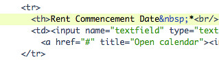
A tip from Gilbert: when designing forms with horizontal labels in a liquid layout, prevent your required *’s from wrapping by placing a (instead of a normal space) between the word and star, like this:
Bulletproof HTML: 37 Steps to Perfect Markup
This is a great article for not only seasoned veterans to refresh and remember why we code the way we do, but for novices as well, just a great resource on the very fundamentals of HTML