design archives
“A by-product of sub-par design courses is that aspiring designers today see computers as the only truly necessary tool. On the contrary. By removing the computer from the creative process, you gain much more freedom when translating your thoughts.
You learned to draw before you learned how to use a computer. Why? Because it’s easier. It’s less restricting. And it’s more creative. You want a circle here? A stroke there? No problem. Just do it. Translating the same process to a computer requires unnecessary steps that hinder your creative flow.”
An insightful quote from David Airey in his new book, Logo Design Love.
posted by
clifton
on Friday, Mar 26, 2010
For those of you in SLC and not heading to Austin this week, come join us this Thursday at the Stimulate SLC Hack Night. Bring your laptops and sketchbooks and collaborate with a few dozen creative hackers.
Huge disclaimer: Stimulate isn’t affiliated with NT or the LDS Church, but Chris and I organized it.
There’s limited space so get in here. All the info’s at Hulabalub.
posted by
jason
on Tuesday, Mar 09, 2010
““Good” beats “Innovative” nearly every time. An obsession with innovation leads executives down the wrong path. Just trying to be good would be a smarter focus.”
Former colleague Scott Berkun in a recent Business Week article. Before objecting, read the whole article; innovation will happen, but not if that is the primary goal. The primary goal should be to produce Something Good. If innovation is required to get there—great! But if there are tried and true solutions, all the better.
posted by
ted
on Tuesday, Feb 23, 2010
“I have to admit something strange: I’m amused by poorly designed websites. The worse the better. Much like some people “love to hate” movie villains, I get a peculiar satisfaction from finding myself completely lost in an ill-conceived, over-designed, steaming pile of a website. ... I think I have to enjoy it on some level, given my role as a customer experience consultant; otherwise work would be pretty difficult (see also: doctors who can’t stand the sight of blood).”
Mark Hurst, noting accurately that customer experience is harder than it looks.
posted by
ted
on Thursday, Feb 18, 2010
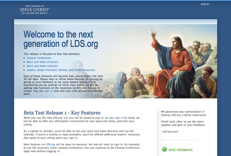
The latest design for lds.org just went beta. This release represents some long hours, lots of iteration and effort by everyone on the project team and we’d love to hear your feedback.
posted by
tyhatch
on Friday, Feb 12, 2010
case study
Lying and simplifying aren’t the same. In fact, they’re not even friends-in-law. They’re archenemies. That’s right. Think Batman and The Joker, Tonya Harding and Nancy Kerrigan, Glenn Beck and Rahm Emanuel. As designers, it’s essential that we understand this, because our lives are spent shooting for simplification. But far too often in our quest for UI Zen, we fall into the bottomless pit of lies, lies, lies.
A comment to my last case study about lying UIs left me with something to think about. Bruno Abrantes, a Portuguese designer and student, wrote the following:
If the UI abstracts complicated facts from users, causing them to make erroneous assumptions about the application that actually makes their lives simpler, then lie at will I say. This is the basis of software such as iTunes and iPhoto (my poster-child examples): … The user is lied to by the interface, since it doesn’t reflect the actual folder/file hierarchy, but the lie makes her life so much easier it’s totally worth it.
This got me thinking “Hang on a second – is lying a good thing sometimes? Is simplification one of its many forms?”
And let me tell you that while Bruno has an excellent point, and one I’ll try to expand on here, I’ve come to the conclusion that lying and simplifying aren’t the same. In fact, they’re not even friends-in-law. They’re archenemies. That’s right. Think Batman and The Joker, Tonya Harding and Nancy Kerrigan, Glenn Beck and Rahm Emanuel.
As designers, it’s essential that we understand this, because our lives are spent shooting for simplification. But far too often in our quest for UI Zen, we fall into the bottomless pit of lies, lies, lies. So how do we know when we’re lying and when we’re simplifying?
Zoom In, Zoom Out
Let’s say I’m trying to figure out where the Rock & Roll Hall of Fame is. Well, Google Maps tells me this:

There it is! I’m so close to it I can see the building’s weird shape, the names of the businesses and streets around it, and I can tell it’s way close to the water. Cool. Now, let’s zoom out a whole bunch – Google gives us this:

The map just got a whole lot simpler and abstract in order to cover a lot greater area, but I still know where my desired destination is. This is because the map remained true to the lay of the land. The Hall of Fame is still in Cleveland, and Cleveland is still northeast of Texas. They still told me the truth. That’s right. Their screen is lie-free, and that’s why I can still get to where I want to go.
Cut the Fat
However, Google filtered out a great deal of irrelevant information. They didn’t tell me the whole truth. Why? Well, because honestly, I don’t need it, and if I had it – all of it, street names and company names for the whole U.S. – the map would become one useless mass of black text. So instead, they presented me with a minimal, but still accurate representation of the info I needed. That’s called simplifying. It’s kinda groovy.
So how do we know what to keep and what to chuck? Google figured it out – they still make the Hall of Fame’s address, phone number, and directions, quite easy to get to. They know why I came to their site in the first place, and that’s essential.
If we know our users, then we can get them what they need and get all the other stuff out of the way. It’s a great way to make friends. If we don’t know our users, the odds of cutting out something essential to them or adding something irrelevant grow quite a bit, and that’s a great way to get your car keyed.
One great example of a man who knew what needed to go is our friend Jared, from those great Subway ads. He knew that,

Now that’s simplification! When we cut the right stuff from our UIs, we can feel the difference, and so can our users. Simplification leads to focus and increased efficiency. Users of good, lean UIs can go farther faster (at least at work) and have more fun while they’re at it.
On the other hand, lying can often begin through a lack of knowledge about our users and their priorities. It takes a whole lot of work to get to the bottom of what users need, and we may be tempted to take shortcuts. Sometimes, in the name of elegance, simplicity and minimalism we can cut some valuable stuff out. Let the following be a grim reminder of the possible results of such reckless behavior:

Only a designer who knows his or her app’s users will be able to successfully discern between fat and vital organs.
The Verdict
Now, let’s return to Bruno’s comment. He’s absolutely right that the decisions Apple made in iTunes and iPhoto make life easier. They abstract away irrelevant information while leaving what matters – the music, the pictures! This is a great example of simplifying.
One of the most important differences between lying and simplifying is their result. Lies are…well, misleading. They misrepresent information that is essential to the user, and that leads to nothing but frustration. Simplifying is different. Though it may not be explicit about every piece of information, it emphasizes the most important ones and leaves the rest out. This enables users to get more done.
The keys to simplifying without falling into a pit of dirty lies are simple. We need to know the underlying truth we’re trying to represent: the information, process, task, etc. If we don’t, neither will our users when they sit in front of out apps. Second, we need to understand our users’ needs intimately. We must know what they want out of their experience with our software. This will allow our solutions to remain both accurate and simple – an elegant, focused representation of the essential truth.
posted by
davidlindes
on Monday, Feb 08, 2010

Love this page layout in the latest JCrew catalogue, as featured on Coudal.com and FieldNotesBrand.com.
And I can say too that the Field Notes we got at An Event Apart have held up to the wear and tear of my back pocket better than expected.
posted by
jason
on Thursday, Feb 04, 2010
“When you treat estimates as promises instead of guesses, you bind your worth as a worker to it. If you do not meet your own deadline, you are a failure. And since nobody likes to be a failure, they’ll indulge in risky behavior to avoid it, like burning the midnight oil and checking in bad code with scanty or no tests.”
David Heinemeier Hansson, It’s not a promise, it’s a guess
posted by
jason
on Wednesday, Feb 03, 2010
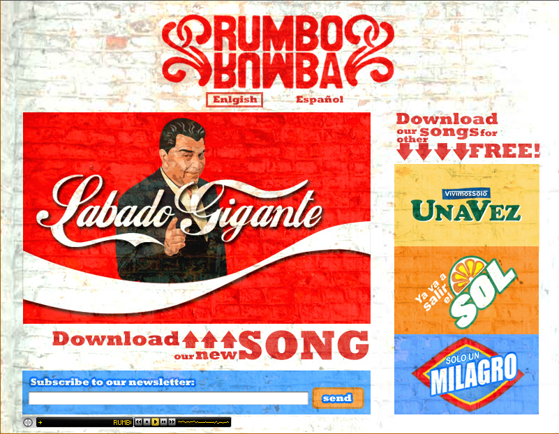
My attempt at making a web site look like the logo-plastered walls of any corner store in Guatemala. Also my attempt at Latin Alternative Rock. Listen here.
posted by
davidlindes
on Tuesday, Feb 02, 2010
case study
Interfaces are one of the principal sources from which a person learns about his or her work. That understanding gets turned into diagrams, charts, and maps that, whether accurate or not, come to define the work that person does each day.
My initial meetings with Michael were a bit intimidating. It’s not that he himself was overbearing or anything, it’s just that our conversations eventually filled me with a bit of apprehension – a feeling of “woah, this project could totally kick me around”. See, Michael was a new client who needed a piece of software to help his office do their daily work, and he sat down with me several times to make it clear that their process was insanely complex. Gulp.
Now, I’m a designer, which means I’m supposed to be overly confident about my ability to solve a client’s problems. And at the beginning I was, but as Michael reiterated time and time again how difficult his daily work was, I couldn’t help but believe him, at least in part, and that belief haunted me. With every iteration of the project, as we introduced new functionality and explored additional requirements, I winced inwardly, thinking “here comes the tough part.”
This would be a great time for me to introduce a horrific challenge and then brag about how I beat it to a pulp, but unfortunately that won’t be the case today. It turns out Michael’s project actually turned out to be really straightforward. The logic behind his office’s business process was pretty simple, and as we worked together on a software solution, that simplicity came forward – to our surprise – and made both our lives easier. At first, Michael expressed a bit of concern that we’d overlooked something essential. This seemed too easy. But as he and his staff used the application over time, they became convinced that it was all there. Their work really was that simple.
That got me thinking – why was Michael’s simple process hidden behind so much perceived complexity? How was that confusing layer of muck put in place, and when?
Of course, there are tons of variables involved here, and to say that a single factor was wholly responsible for this counterfeit complexity would be a joke. Even so, as I searched for answers about the origin of a lot of business process misunderstandings, I kept slamming into the office’s previous software and its confusing user interface.
The most dangerous thing I saw in the old UI was a knack for misrepresenting information relationships. Due to confidentiality restraints, I won’t be able to share the actual information that was being turned upside down, but let me give you an example:

Alright, alright, this is an obvious one. The figure misrepresents the relationship between “colors” and the rest of the words. Now, because everyone knows about colors (duh!), the mistake is easy to detect and resolve.

It’s easy for us, a bunch of fully-grown, well-trained professionals, to tell that blue, green, red, and yellow all fit within the category of “colors”. Congratulations. However, what would happen if I taught my newborn about color using the first figure? How do you think that would go? Is there a chance some confusion would ensue?
The UI that Michael’s office was using every day to do their work was teaching them the wrong info relationships over and over again. They’d been using it for over five years, and during that time, they had hired and trained several new employees. Their training had been centered around learning to use the old application. Consequently, they had learned their new job inaccurately in essential ways. Their UI was lying to them, and they were eating it up.
You see, as designers we understand one facet of the knowledge-UI relationship quite well. We depend on our clients’ brains to produce the kinds of info diagrams that can teach us about the design problem at hand, and we hope that this understanding becomes solidified and is eventually projected onto our final UI. That’s how we make software.
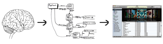
However, it had never occurred to me that this relationship could also be reversed until I saw it with my own eyes in Michael’s office. For years he and his staff had looked at their old UI, learned from it, formed elaborate diagrams based on what they learned, and then stored them in their brains forevermore. That’s how we capture concepts.
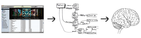
So there it is. User interfaces are one of the principal sources from which a person learns about his or her work. That understanding gets turned into diagrams, charts, and maps that, whether accurate or not, come to define the work that person does each day.
This brings a new dimension of responsibility to our table as interaction designers. Not only do we need to worry about our interfaces being simple, or elegant, or usable, or accessible; we also have to make sure they’re honest. Do they accurately portray our clients’ processes? Do they faithfully represent the relationships between different bodies of information? Do they tell the truth, or do they lie? Ultimately, whatever they say is going to define how our users think of their work, how they understand it, and how they do it.
posted by
davidlindes
on Monday, Feb 01, 2010

Check out this post from UX Magazine about keeping the realism out of UI elements (icons, buttons, etc.). Most user interfaces are not meant to be realistic and should never be, as their primary purpose is to help the end-user complete tasks with as little thinking as possible. Anything more requires additional work for the designer and the user, so why bother?
posted by
jaredlewandowski
on Monday, Feb 01, 2010
case study
Today we launched an update to the Church’s Perpetual Education Fund website. The new website features selected stories from over 40,000 individuals who have been able to better their lives through education opportunities made available to them through PEF loans.
The site also contains information about the program, and instructions for individuals who may apply for loans. The site was launched in 4 languages (English, Spanish, French and Portuguese) and will service areas around the world.
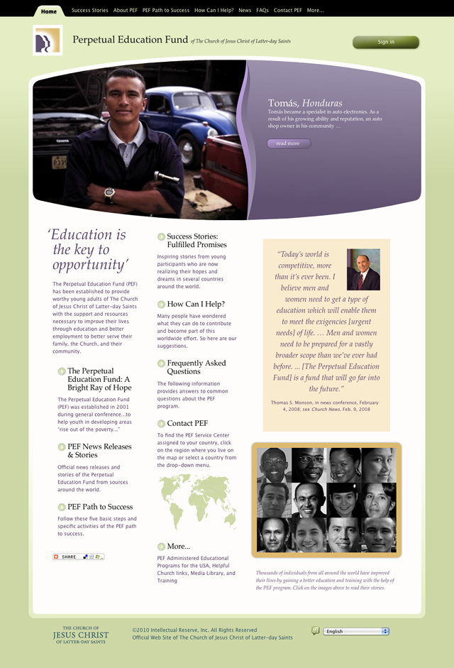
The Perpetual Education Fund is an incredible program and has a direct impact on the lives of the individuals and families who are able to benefit from it.
Please take a look at the new site!
posted by
john
on Wednesday, Jan 20, 2010
Some useful design tips for comparison shopping interfaces from Get Elastic. Brings me back to my Carpoint days at Microsoft… It’s tough to put a lot of data across multiple products into tight columns, but it can be done well. Have you seen some good examples?
posted by
ted
on Wednesday, Jan 20, 2010
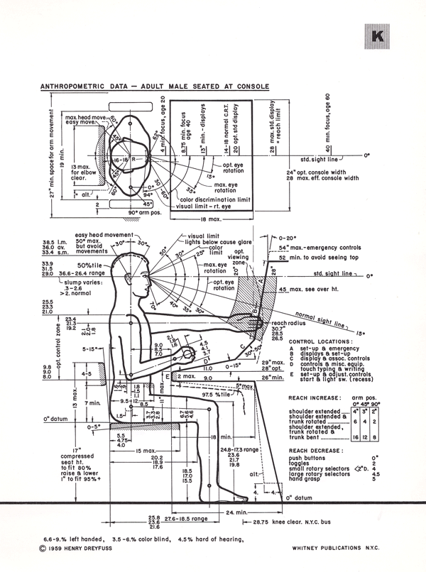
While researching for a current project, I came across a vintage folio on Human Factors in design by Henry Dreyfuss. The book contains a collection of charts and graphics developed to provide anthropometric data for the aid of the industrial designer in creating products.
A forward to the collection contains the following creed which provides a great lesson in how to determine the success of design.
“We bear in mind that the object being worked on is going to be ridden in, sat upon, looked at, talked into, activated, operated, or in some other way used by people.
When the point of contact between the product and the people becomes a point of friction, then the industrial designer has failed.
On the other hand, if people are made safe, more efficient, more comfortable—or just plain happier—by contact with the product, then the designer has succeeded.”
I also liked the fact that the aim of the book was actually about human factors, how people are. It seems that many books on the subject today are not about people, they are about how machines should be.
I appears that there is an updated version of the same text available with updated and additional charts.
posted by
john
on Tuesday, Jan 19, 2010
Somehow this eluded quite a few of us over here, but this weekend is the Altitude Design Summit in Salt Lake City (disclaimer: links to Hulabalub, a site I made). Alt is bringing together a ton of designy bloggers and enthusiasts to talk shop and style. This week, Thursday and Friday, but note that online registration is now closed, with only a handful of walk-up spots available.
Alt’s Twitter pointed us to Design*Sponge’s guide to Salt Lake City, which proves a good guide to many places we love and a handful I haven’t seen yet. Worth a look..
posted by
jason
on Tuesday, Jan 19, 2010

Funnel Wall in Dresden, via Scott Berkun. When it rains, it pours music! Fun design concept, but I’m glad I don’t live in the neighborhood.
posted by
ted
on Wednesday, Dec 30, 2009
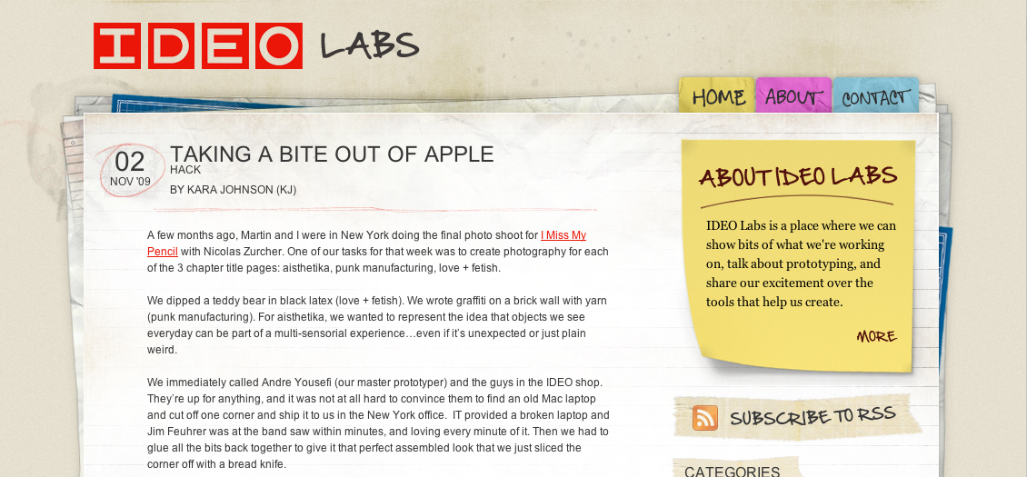
Going the hand-drawn route on a blog design can easily end up looking played out and cliche, but IDEO pulls it off admirably and authentically on labs.ideo.com, their collection of tests and prototypes.
posted by
jason
on Wednesday, Nov 25, 2009
Jeffrey Kalmikoff, new design director at digg.com, sounds off on The anatomy of useful feedback, including some excellent suggestions for making design reviews productive:
Knowing there’d be the probability of a high volume of feedback and limited time to respond via both communicatively and creatively, I asked for feedback to come in a particular format to make it as easy as possible for my team to digest.
He also suggests including as many non-designers as possible in your reviews, to spread enthusiasm and gain valuable feedback:
I find collaboration with non-designers to be so important in design. Designers have a tendency to see things thought a different lens than most people, which can be counter-productive when trying to find solutions across all use cases
See his full post for more. Good to see design reviews going well somewhere, and it’s got me thinking of how to make them better over here..
posted by
jason
on Saturday, Nov 14, 2009
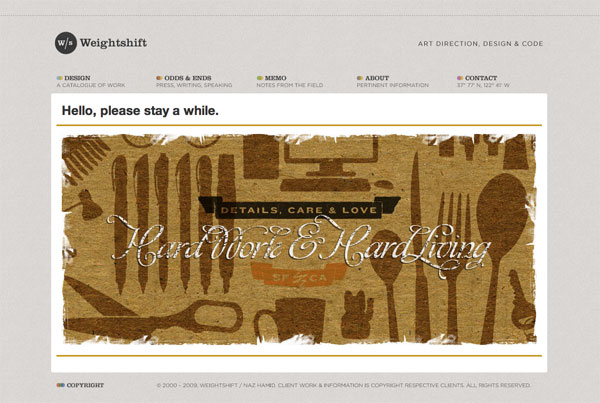
Naz Hamid has a new article on Weightshift called Stuck between an App and a Website, and its a thoughtful look at designing to the project and the humans using it:
Get to know your client well, do the research, do what is right, not what is now and trendy and because Apple/Facebook/xxxxxx does it. Listen, communicate, design well.
It’s all too easy to get wrapped up in a look, a design or an aesthetic. The science fiction of my youth left those impressions but ultimately, it was the human element — the stories that mattered the most, that left the lasting impression. In the end, we’re all trying to make machines more rounded, more curved, more organic, more human.
By the way, I hadn’t seen Naz’s new design but it’s equally impressive:
posted by
jason
on Thursday, Nov 12, 2009
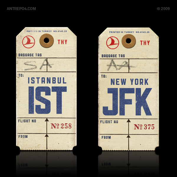
Public Gothic is a new gothic font by Antrepo with 4 fantastic variations, and it’s free.
posted by
jason
on Thursday, Nov 12, 2009