design archives
Are Porsche’s designers lazy, or have they simply been evolving perfection over the last thirty-five or so years?
Click to watch the evolution of the Porsche 911
posted by
rick
on Monday, Oct 15, 2007
UIE recently sent out a two-part article by Luke Wroblewski outlining the Top 15 things to remember when designing an online form. It’s an excellent review of solid design principles:
- Don’t hide forms when you want people to complete them.
- Be explicit about what each form is for.
- Use smart defaults whenever possible.
- Don’t treat customers like records in a database.
- Always present messages in context.
- Make sure key messages are prioritized visually on each form.
- Always give people a way to easily recover from errors.
- Be vigilant about keeping the data people enter into your forms.
- Explain why you are asking for data that may not seem relevant.
- When input fields have a high potential for errors, consider providing inline validation.
- Visually distinguish errors from the rest of a form.
- Remove any unnecessary inputs.
- Illuminate a clear path to form completion.
- Remove secondary actions whenever possible.
- Emphasize calls to action that lead to success (form completion).
For additional explanations and examples from Fairmont Hotels, Boingo, and British Airways, see Part I [covering items 1-8 above] and Part II [covering items 9-15] of the User Interface Engineering article.
posted by
ted
on Monday, Oct 15, 2007
Seth Godin gives his take on ten principles for creating a great web site.
posted by
john
on Thursday, Oct 11, 2007

Design Disturbia. There is something so alarming to me about the morphing of a Pontiac and a BMW. Not sure who is copying who but please stop it!!!
posted by
chris_mayfield
on Monday, Oct 01, 2007
Running out of things to read?
There are over 100 essays and articles on Typography available at Typotheque.
posted by
john
on Tuesday, Sep 18, 2007
Tabs, Used Right is a positive review by Jakob Nielsen of Yahoo Finance’s tabbed interface. I hadn’t heard many of these guidelines before. Most look very sensible, some I want to think about—like only using tabs to alternate between views of similar content, not as main navigation.
posted by
ted
on Monday, Sep 17, 2007
“Before long, many designers burn out by promising unrealistic turnaround on projects, working at levels that don’t accommodate a balanced life, and closing down any time for reflection on the work they’re doing and on the world around them.”
Meredith Davis talks about the dangers of being caught up in The Cult of ASAP
posted by
john
on Saturday, Sep 15, 2007

Check out this 1:35 advertisement for Halo 3, featuring a full Halo 3 situation in miniature form, complete with dramatic piano music. Think video games are for nerds, John? With epic titles out now like Gears of War, Bioshock and now Halo 3 due in a few weeks, the video game industry is outpacing the web and cinema with unparalleled art direction and creative genius. Take note.
posted by
jason
on Friday, Sep 14, 2007
“Designing is an act of giving, and a belief in the value of the work fuels the desire to express something.”
Peter Saville, from the first manifesto listed on Icon below. Reviewing these could be a very enjoyable time-sink…
posted by
ted
on Thursday, Sep 13, 2007
“The process of self-publishing isn’t as glamorous as some (myself) thought it would be.”
Cameron gives a rare peek behind the scenes of self-publishing
posted by
jason
on Wednesday, Sep 12, 2007
What: Talk and discussion on Emotional Design. Why are people willing to stand in line for days and pay hundreds of dollars for an iPhone? Why do we spend three times the money to buy a trinket in a foreign country that we would never buy at home? What elements of emotional design will you incorporate in your next project?
Where: NextPage (Draper, UT)
When: 7:00pm on Thursday, Sept 13
Who: Hosted by the local CHI chapter; discussion led by Xinru Page. All invited; no charge for admission.
For more details, visit NUCHI.
posted by
ted
on Thursday, Sep 06, 2007
“Anyone looking at a printed message will be influenced, within a split second of making eye contact, by everything on the page: the arrangement of various elements as well as the individual look of each one… before we even start reading the first word. It’s similar to the way we respond to a person’s presence before we know anything about him or her, and then later find it difficult to revise our first impression.”
Erik Spiekermann, in Stop Stealing Sheep (via)
posted by
ted
on Tuesday, Sep 04, 2007

I usually shy away from design showcases, but despite the gallery-style look of this page, PatternParty is no simple showcase. It’s equal parts delicious, flickr, and that overstuffed bookmark folder of great little design elements you’ve found over the years. PatternParty lets you upload screenshots of anything awesome and categorizes them with tags, descriptions, and ratings. It’s brand new, so forgive em if it’s a bit rough (or if the name sucks), but this is the type of “gallery” I could really spend some time with.
posted by
jason
on Tuesday, Sep 04, 2007
Facinating article in Wired magazine called Halo 3: How Microsoft Labs Invented a New Science of Play. Wired takes a close look at Bungie Studios, the makers of the massively huge Halo video game series, and how the Microsoft-owned company utilizes state of the art usability labs to test their video games. It appears Bungie is following some principles of the agile software development methodology, with constant revision and tweaking in response to an extremely detailed look into how players move through the game. It’s obvious the games would be nothing if not tested this way. Pretty interesting look into how video games are designed and refined.
posted by
jason
on Saturday, Sep 01, 2007

Superb work from one of our own here, in the newly released Mobile Web Design by Cameron Moll. Cameron breaks out all his tricks here, delivering a visually stunning and impressively researched gem of a handbook on everything mobile about design. If you’re a designer and own a mobile phone, buy this right now. Just $19 for the PDF.
posted by
jason
on Wednesday, Aug 29, 2007

Water Me When I Tilt this vase uses a natural metaphor that lets you know when the water is low. (via Core 77)
posted by
john
on Wednesday, Aug 22, 2007
In regards to the approach that Apple takes to typography and pixel rendering compared to the approach of Microsoft:
Apple generally believes that the goal of the algorithm should be to preserve the design of the typeface as much as possible, even at the cost of a little bit of blurriness.
Microsoft generally believes that the shape of each letter should be hammered into pixel boundaries to prevent blur and improve readability, even at the cost of not being true to the typeface.
It is interesting to me how philosophical approaches to design can make a difference in the minutiae of design details.
via Coding Horror
posted by
john
on Friday, Aug 17, 2007
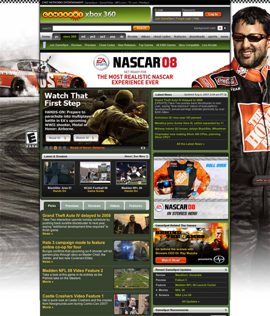
Fun and relevant integration of ads in this Gamestop.com XBox 360 page screenshot (full size). Ads don’t always have to be annoying. This is a huge full page ad, with nice integration in the top banner, but it’s relevant to the audience and for NASCAR fans it’s exciting to see the new game released. What’s more, when the page is scrolled, the side background ads don’t lose their meaning. Similar integration on the homepage and Nintendo DS pages. Well done.
posted by
jason
on Thursday, Aug 02, 2007
