john dilworth archives
northtemple journal of design ~ March Issue
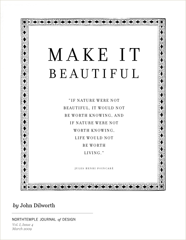
If we can all agree that we like things that are beautiful, we should also agree that we should try to make things beautiful. But what does that even mean?
posted by
john
on Tuesday, Mar 17, 2009
An interesting post from PK at BibliOdyssey with pictures from Stammbücher or “Friend’s Books.” An interesting custom from the 17th century where a person would carry a book with them containing sentimental inscriptions, quotes, and memories from one’s friends. PK calls it: Facebook in the 1750’s
posted by
john
on Tuesday, Mar 17, 2009
The Crisis of Credit by Johnathon Jarvis describes the source of our economic situation with a great use of audio, animation, and a clever voice over script.
posted by
john
on Thursday, Feb 26, 2009
The article skimmer interface from NTY is a great example of an alternative way to browse a newspaper. All I’ve ever done is “skim” the newspaper, so this seems like the NYT edition for me. (via Daring Fireball)
posted by
john
on Monday, Feb 16, 2009

Pepe’s poster entry for our Annual Design Review which takes place tomorrow.
posted by
john
on Thursday, Feb 12, 2009
Andy puts together another article on the gestalt design principles. In this one, he takes on similarity, proposing that while similar, all types of similarity are not equal.
posted by
john
on Monday, Jan 26, 2009
The Art Law Blog may provide some interesting background reading to help understand the legal complexities of copyright infringement, along with precedent, case studies, and current issues.
posted by
john
on Friday, Jan 23, 2009
A few days ago, Cameron posted an interesting quote and poster about stealing inspiration from anywhere you can find it.
It will be interesting to see how this plays out for Shepard Fairey, the street artist whose fantastic Russian constructivist inspired poster design became the iconic symbol of Obam’s historic 2008 candidacy for president. Fairey admits that he found the source image on a Google image search, but never revealed or received permission to use the image. It looks like the source image has been found , and it is a copyrighted Associated Press photo taken by Mannie Garcia where Obama was having lunch with actor George Clooney.
Who knows how this will play out, perhaps the AP will grant him retroactive permissions, or there may be copyright infringement issues and money at stake (especially considering how Fairey may have profited considerably off this image).
At first this might not seem like a big deal, everyone’s done a Google images search for some inspiration. It is however, the responsibility of the artist to credit and obtain permission when the source is identifiable and potential legal issues may ensue.
Don’t stop looking for inspiration, but don ‘t steal, it’s not hard to ask permission and even easier to give credit where credit is due.
Here’s a few links for reference:
I came across this set of articles through a twitter post by Patrick King
Update: I missed this the first time—the photographer’s web site now states that he was contacted by the Fairey’s gallery a few days ago (Jan 21, 2009) who acknowledged that the photo was the basis for the poster design.
posted by
john
on Friday, Jan 23, 2009
Apparently, there’s a National Design Policy Initiative. They’ve released a few documents this month, one is a compilation of 10 design policy proposal called Redesigning America’s Future, and the other is their 2009 Summit report. At first glance this looks really interesting.
posted by
john
on Thursday, Jan 22, 2009

If the Friend magazine isn’t your cup of tea, take some time to browse through this great gallery of vintage sci-fi novel cover designs.
posted by
john
on Friday, Jan 16, 2009
Last year, my brother Jason met Massimo Vignelli in his studio in New York and described him as the “nicest modernist you’ll ever meet”.
Mr. Vignelli has now released, in the name of education, a book where he shares a wealth of his knowledge about graphic design and typography. Everyone could benefit from reading this little book.
In the introduction he says:
“Creativity needs the support of knowledge to be able to perform at its best. It is not the intention of this little book to stifle creativity or to reduce it to a bunch of rules. It is not the formula that prevents good design from happening but lack of knowledge of the complexity of the Design profession. It’s up to the brain to use the proper formula to achieve the desired result.”
Oh, yes, the book is available as a PDF for download. (via Core 77)
posted by
john
on Monday, Jan 12, 2009

PK at BibliOdyssey (one of my favorite blogs) digs up digital images of the Ripley Scroll which reminds me that the web is more like a “scroll” than it is like “pages”. The integration of text and illustration carry you from one scene to another as the scroll is revealed. The format of the scroll is used to tell the story. The images provide visual excitement, and a rest from reading text between passages.
High resolution images of the scroll are linked from the BibliOdyssey site.
posted by
john
on Monday, Jan 12, 2009
Dr. Josh Silver, professor of physics at Oxford University designed a pair of spectacles where the optical power can be tuned individually by the wearer, eliminating the need for the optician and the whole process of lens grinding. He hopes to bring 20/20 vision to 1 million people in India next year, and has a bigger goal to offer perfect vision to 1 billion of the worlds poorest by the year 2020.
His presentation on the topic and results of their initial study can be found at the Affordable Vision Correction conference web site. It appears that there were a variety of potential solutions presented there, Josh Silver’s brilliant solution being one of them.
posted by
john
on Tuesday, Dec 23, 2008
The Font Feed comments on recent research by scientists at New York University who are proving that good typography matters. Neuro-scientists Denis G. Pelli & Katharine A. Tillman recently published a thesis in the Journal “Nature Neuroscience” advancing the theory that proper spacing is the defining factor in legibility.
I also dug up an example of previous research on the topic by these scientists. Interesting read if you like to throw a little neuroscience with into your daily design reading.
posted by
john
on Tuesday, Dec 02, 2008
On the topic of giving things time… This article from the NY Times talks about the “Slow Blogging Manifesto”, and the idea that “not all things worth reading are written quickly.”
posted by
john
on Monday, Nov 24, 2008
“In spite of the fact that our rockets have only gone as far as the moon, the world busies itself with worries and preparations for intergalactic travel.”
Kenya Hara in “Designing Design” makes a comment about the technological over-reaction which is applied without question to problems in business and society.
He argues that perhaps technology should move a little bit slower. We should allow time for trial and error to help us produce stable systems. Instead we might be damaging society by continuing to produce a flood of information through unstable and untested means.
posted by
john
on Monday, Nov 24, 2008
In this case, I don’t really think there is any competition with opticians and lens makers. If there were, this wouldn’t be an issue. What is going on here is non-consumption. You have a billion people in the world who can benefit, there’s no way that they can afford Armani frames and polycarbonate lenses. These opticians and lens makers are not in this arena, so there’s no way that they can get shoved out.
You could look at it another way also, there’s lots of money to be made for a billion people who couldn’t see to work, but now they can.
posted by john on Tuesday, Dec 23, 2008