10 New Year’s resolutions for designers
Here is a nice little article Mike Monteiro wrote in netmagazine.com on how to get the new year off to a positive start.
An excellent article from Louis Rosenfeld: Stop Redesigning And Start Tuning Your Site Instead. You and your key stakeholders need to read this.
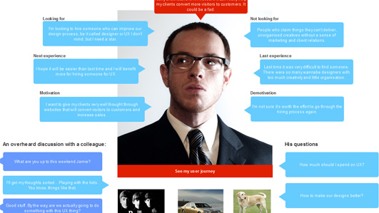
I liked this article on Breaking the UX Status Quo. Some good thoughts on enlivening various design deliverables by integrating personas and related information throughout.
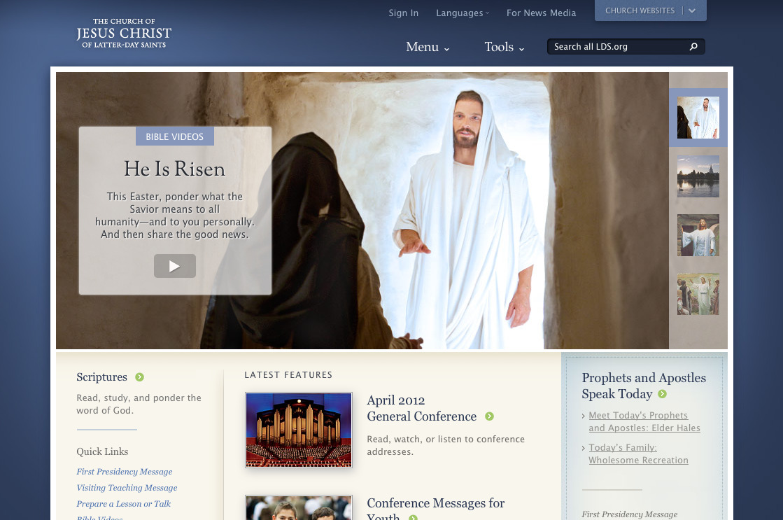
I like the subtle design changes to the banner area on LDS.org that have gone out over the last few months. This week’s Easter messages have been a good example. (I also appreciate that they got the title and alt attributes fixed, so the thumbnails on the right are more accessible to blind readers—and others who want some text to describe what they’ll get.)
“Subjecting all designs to usability studies before shipping is prudent risk-management.From a good article by Jakob Nielsen on
Radical innovation is extremely risky. Yes, you might invent the next iPhone. But you’re more likely to invent the next Newton.”
“We’ve found the most successful teams are those that spend as much time in each iteration measuring their designs as they do implementing it.”Jared Spool, in an interesting article on making agile iterations… agile! I have found the situation he describes over and over again—agile teams organizing a series of sprints, but never really iterating. They are basically doing waterfall planning, just on very short timescales. This article gives direction on how to get out of that rut. And no surprise, it relies on robust design and user research processes.
Here’s a great article by Christian Holst on an frequent need: designing country selectors. What I love most is that he’s gone beyond describing the challenges, to designing a working solution—which he then makes open source! You can try out his redesigned country selector and download the jQuery plugin.
“Speed and agility are the most important attributes any design team can have, even beating out creativity and innovation.Jared Spool, in
This is because a fast–moving process that iterates frequently gets to take advantage of the natural evolution of the design, whereas a slow moving process needs to discover innovation out of the gate, which is much more difficult.”
“We are becoming symbiotic with our computer tools, growing into interconnected systems that remember less by knowing information than by knowing where the information can be found.”Betsy Sparrow, quoted by Tim Minor in an interesting article on
“The most profound thing is that when something crazy happened, they paid attention. They didn’t throw the idea away as most of us would.”Scott Berkun on the “accidental invention” of Post-it Notes, Nutrisweet, and other cool stuff, in a really good post on the importance of working hard and paying attention.
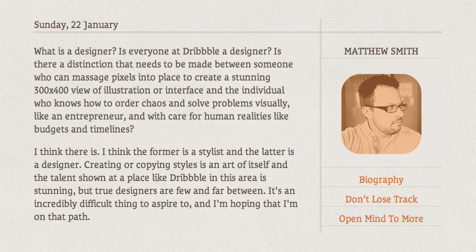
A designer above all should be a problem solver. I love Matthew Smith’s thoughts on the subject that he contributed to “The Pastry Box Project.” Enjoy™
Here is a nice little article Mike Monteiro wrote in netmagazine.com on how to get the new year off to a positive start.
“Myth #3: People don’t scroll.”From an interesting “UX Myths” site. Some interesting user experience myths de-bunked. Thanks Christian Smith for pointing me to this!
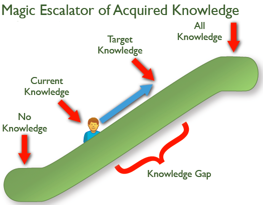
I liked this illustration of the Knowledge Gap in Jared Spool’s recent newsletter article, Riding the Magic Escalator of Acquired Knowledge.
To close the knowledge gap, you either ride the user up the escalator via training, or you bring the target knowledge down the escalator by simplifying the design. Those are really your two main choices, 99% of the time!
“Nothing could prepare me for my first trip to Rome. It wasn’t anything like the pictures. I think this is exactly the same feeling that designers have when they visit their users for the first time.”Jared Spool, extolling the virtues of field visits while introducing his most recent newsletter. (The quote is from his email and doesn’t appear in the article itself.)
Wim Crouwel, the legendary Dutch typographer and graphic designer, when asked about design in today’s world, had this to say: “[for young designers], the stimulus is coming from the new techniques, from the new wonders, from the freedom of life – and that makes it difficult I think. ...What I say to young designers is to keep your radar turning, and pick up everything that you love, but in the same time, be very sure that you find your own way in it, but not be brought off your path by all the things that happen in the world. You need to find out what you love yourself and try to stick with it and try to find your own way” – great advice.

Cool bookshelf design on Design Inspiration (via Cameron Moll).
Love the idea—though a little high for the average reader in my family!
Check out Do Lectures. Looks like some interesting content (kind of like TED Talks), but that’s not why I’m posting. Take a close look at how they handle re-sizing the window. As you change width, the screen goes through a series of at least 4 seamless transformations to adapt to the new format—hiding secondary elements, re-sizing things, re-positioning. Very impressive flexible layout. (Via UIE podcasts.)
Want to make the world a better place? I think Ghandi said “You must be the change you want to see in the world.” Anything worth doing is worth doing together. Right?
Sometimes as creatives we lose our bearings and wonder what the point is. With so much raw awesomeness, illusion, tools, and effects all around us all the time, it’s helpful to remember a few things:
We need more story and less special effect.
We need more character and less manipulation.
We need more connection and less fortification.
We need more solutions and less technology.
We need more reality and less simulation.
We need more friends and less acquaintances.
We need more teams and less heroes.
We need more neighbors and less celebrities.
We need more face-to-face friendly speaking and less facebooking.
We need more substance and less superficiality.
We need more creativity and less critical passive-aggressiveness.
We need to exercise more faith and not be driven so much by “fear of offense” or “lack of control”.
People matter more than business, innovation, or invention.
What needs to happen will happen. What innovation is needed will occur when the time is right. When it unfolds, were we part of it? Or, when a great thing is invented, will we despise it because it was not forcibly willed by us according to our own timeline?
“To become truly great, one has to stand with people, not above them.” -Charles de Montesquieu
“Let’s fight together and make history” (1:32)
“All designers should think of themselves as Ambassadors of good ideas.”Love this quote from Scott Berkun’s 5 Dangerous Ideas for Designers presentation at the DMI’s “Make It Happen” event, citing either himself or someone he heard that day.
Former colleague August de los Reyes pointed me to a 1932 typography article by Beatrice Warde posted on Design History:
Imagine that you have before you a flagon of wine. You may choose your own favorite vintage for this imaginary demonstration, so that it be a deep shimmering crimson in color. You have two goblets before you. One is of solid gold, wrought in the most exquisite patterns. The other is of crystal-clear glass, thin as a bubble, and as transparent. Pour and drink; and according to your choice of goblet, I shall know whether or not you are a connoisseur of wine. For if you have no feelings about wine one way or the other, you will want the sensation of drinking the stuff out of a vessel that may have cost thousands of pounds; but if you are a member of that vanishing tribe, the amateurs of fine vintages, you will choose the crystal, because everything about it is calculated to reveal rather than to hide the beautiful thing which it was meant to contain.
Even a tee-totaling Mormon like myself can appreciate the point: the best design is invisible. Warde applied it to typography specifically, but the same applies to design in general. Often, our goal in design should be to get out of the way, so that people can consume the content or perform the task that they came for. I think too often we get caught up up in the decoration and adornment of our own particular golden goblets, and don’t pay enough attention to the content and tasks that are so central to the experience.