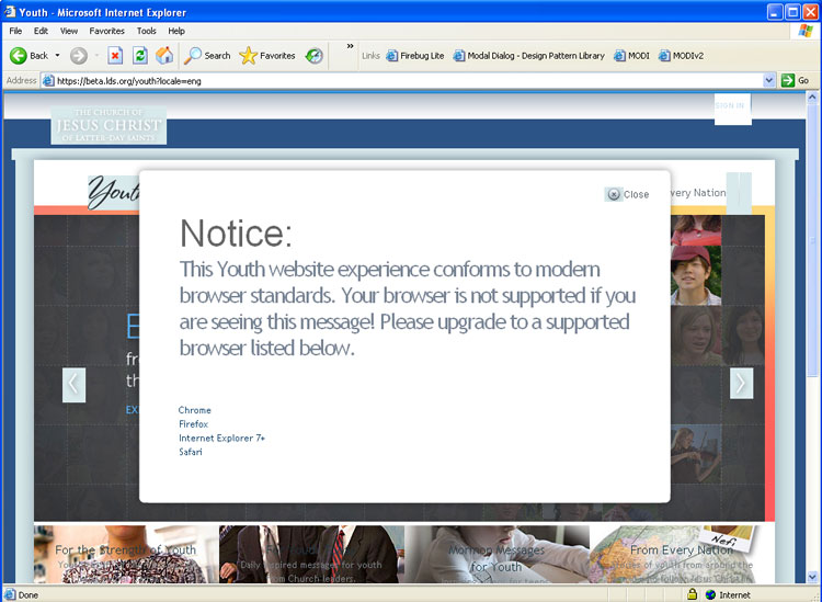
You may look at the above screenshot and see a pretty messed up looking site. You might think “wow, that sure isn’t up to the standard of the NorthTemple crew.” But beauty is in the eye of the beholder.
The screenshot is beautiful because it is the start of a new era for us. Look closely at which browser that is. That message is for users of IE6.
For the past year or so we have had the luxury of dropping IE6 for internal projects as our oganization finally made IE7 available. Yes, until December 2008 we were in one of those organizations that everybody hates, that perpetuated the evil that is IE6. We had many off the shelf systems that wouldn’t work with the newer browsers and so were kind of stuck.
But since that glorious day, you can well imagine how much pain, suffering, blood, sweat and tears not having to worry about IE6 has saved us (not to mention tithing dollars).
As of the soft launch of the Youth website pictured above, we are starting to phase out support for IE6 on our public sites as well. That beautiful screenshot above shows the message and site that IE6 users will see.
Alignment is messed up, transparent png files are not transparent, and several other things are broken. But truth be told, I can still navigate around the site and I can still read the content.
I wasn’t involved on this project or the decisions on how it was handled. But I like how they didn’t totally kill the site for IE6. Users get a much less pleasant experience, but they can still get to the content if they choose.
I’m glad that we are starting down the path to help make the internet a better place. I like that Chrome and Firefox are listed above IE7 as replacement browsers. I love that we are joiningothers in dropping support for IE6.
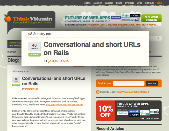
Props to our own Jason Lynes for his article over at Think Vitamin. Love the idea of conversational URLs and even though I don’t speak Rails I got a good idea of what he did.
This past week the church put on a technical conference (no not THAT conference) called SORT (no it doesn’t stand for anything). It was a two day conference held at the institute building at the University of Utah. There were over 850 attendees, 200+ classes and 6 keynotes. Yes, this was a serious conference.
Aside from the keynotes, all of the classes were given by people from inside the churches organizations. Employees from the ICS (IT) department, Family History, BYU and more. The conference ran smoother then most other conferences I have been to. They provided breakfast, lunch and snacks throughout the day. Class content ranged from beginner to advanced, from back end to front end, security to performance, and many many more topics. All in all, one of the best conferences I have attended.
I decided to punish myself (and others) by presenting at the conference. I gave 3 presentations: Intermediate jQuery, Advanced jQuery and Designing Faster Websites. The Faster Websites had so many people sign up for it that they gave it a second time slot as well so more people could see it. It’s awesome that so many people were interested in this subject to need that.
Several other NorthTemple-ites also presented.
Nic Johnson presented an HTML5 and CSS3 class (also called upon for a repeat performance the second day… without his knowledge… when he forgot his laptop at home).
Emmy Southworth and Susan Jarvis presented a two part Basic Usability Skills class where they covered the basics of usability testing.
Rob Thomas on Presentation Skills: How to Make Your Point.
Overall a great representation from our team to get these important topics in the minds of people from many disciplines.
Due to the church being understandably overly cautious about legal issues we will probably not be able to post our slides from our presentations. But I figured posting some links to stuff I mentioned would be beneficial to those who attended my presentations and others as well. This will not be the prettiest of lists, but some good information regardless.
Intermediate jQuery
Most of my presentation was a dive into the following pages. If I can get clearance to post the demos and my other optimization examples, I’ll post them.
I was glad so many people were interested in this topic. There is a lot of activity in this space lately and our users will thank us for making the extra effort.
Sprite Generators: Spritegen, Sprite me By Steve Souders. Can’t do local files, only sprites what is on the current page (not all the image files for the site).
Performance guru Steve Souders dives into current performance issues with the web’s latest hot techonolgy of font-embedding via @font-face. @font-face and performance describes how the major browsers handle font embedding for good and bad. Specifically how all browsers but Firefox show no text until the font is downloaded (FF shows the default font and then re-draws when the custom font is ready).
A must read for anyone thinking to use this new arrow in our quiver, so you can know the potential drawbacks.
Up in 120 frames. * SPOILER WARNING* If you haven’t seen the movie yet (what are you waiting for??) DO NOT click through to the larger image as you will see some plot details (don’t look too closely at the above image either).
That warning having been given, there is even more delicious goodness on the Art of Up (same spoiler warning) by Lou Romano.
Here is some of the development & production work I did on UP (2005-2008). Similar to the work from The Incredibles, (production paintings, color/lighting design and artistic direction) this was done to help inspire the look of the film.
Lost of pictures, art, drawings, videos, etc. All a wonderful glimpse behind the scenes of a great movie.
We are looking to hire two front end developer types RIGHT NOW. As in, interview on Thursday with a potential hire on Friday.
We are looking for two Senior level front end gurus who seriously know their HTML/CSS/JS stuff. One of those could be a more Junior level person with lots of potential and a sparkle in their eye.
In the month of November, Firefox 3 finally became the #2 browser on lds.org passing Internet Explorer 6. hallelujah
It’s interesting to see how the audience at lds.org appears to skew towards the techie when compared with the Internet Average (guessing that is all Omniture clients combined). More Firefox, Safari and Chrome users then the average. Less IE6 users. Then a weird anomaly of WAY more MSN Explorer users… which is just sad.
Many of the newer cool phones are moving to a touch screen only interface (iPhone, G1 [when closed], Storm, etc). They are also supporting the ability to view the same websites that we design for the desktop. This is naturally pretty cool in that they get all those bells and whistles we designed and we don’t have to create a second version of our site specifically for them.
The other day I was on my iPhone, navigating around a site where some of the links didn’t look like links and you wouldn’t think they were links by their placement. I’m going to guess that the designer thought:
These links aren’t very important
The user can use their mouse to hover over things to find what is a link and what isn’t (making the user do extra work isn’t very nice btw)
The user can tab to these links and will discover them that way (still not very nice)
Well as an iPhone user, the links were important, I didn’t have a mouse (cursor really as I can still click), and I didn’t have a tab with which to hop around. The only reason I clicked on them was because I was familiar with the site and knew they were there.
In this new world where mobile devices can see our regular sites, we need to be even more diligent in going back to basics of making sure links are easily viewable. As I mentioned above, it’s not very nice to expect a user to move their mouse over any given word to see if it is a link or not. Our senior generation can’t see subtle differences in color. Now we have devices that don’t have a mouse as we currently understand it and can’t hop between links with a tab key or joystick.
There naturally needs to be a fine line between big bold links and design. I wouldn’t want my page littered with default blue underlined links everywhere. But skewing too far to subtlety, while more aesthetically appealing, may not be very user friendly in general, and out right unusable on these newer devices.
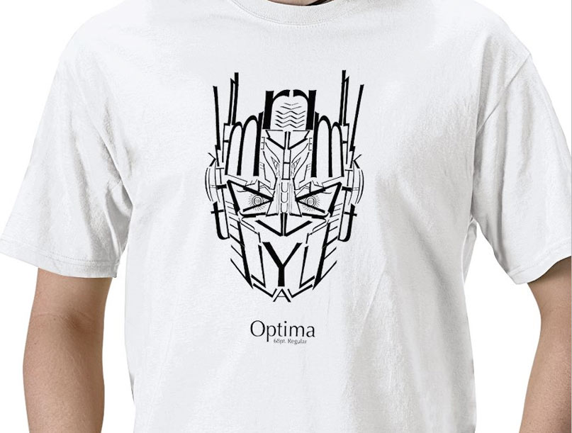
I’m one of the least typographical guys in our group. But even I can appreciate a good cross between typography and 80’s cartoons with the Optima T-Shirt :)
So the other day Tadd linked up some work in progress code which hinted that we are using the Blueprint CSS framework in some of our sites under development.
This decision went through many heated debates internally where some were excited for it, and others were repulsed.
So what were the reasons behind the need for looking into a framework?
Reflections of Christ is a wonderful project of photos depicting the life of Jesus Christ. There is just something about the images being photos instead of paintings that make them feel different to me. It brings life and reality to the scenes much as Lamb of God did when I first saw it. It is rare that a YouTube video can allow you to feel the spirit, but this one will definitely move you if you allow it to.
These photos are part of a traveling display that is currently at the Joseph Smith Memorial Building in Salt Lake City until Nov 7, 2008.
Several of us will be attending UI13 in Boston this next week. If you are attending as well, keep an eye out for our ugly mugs (except the girls of course) and make sure to say hi. We’d love to meet any other LDS designers in the community (or non-LDS that follow us), and you know… we are always hiring so ask about how what it’s like to work for the church or whatever else you want to ask :)
This is a message from Tom Valletta who is the lead developer for our Open Source effort:
Your programmers are showing!
The LDS technical community is beginning to get traction on some cool projects. The “Home Teaching and Visiting Teaching” application has code behind it now. The “Church History Timeline” does too. But because we have no designers contributing yet, our programmers are showing. Only you can prevent this opprobrium. Please get out and donate a design or two to the LDS technical community .
So if you have some free time and would like to contribute your design skills to the Church, go let Tom know. There are some great projects that are in need of some sweet design lovin’!!
In the beginning there was NCSA Mosaic, and Mosaic called itself NCSA_Mosaic/2.0 (Windows 3.1), and Mosaic displayed pictures along with text, and there was much rejoicing.
Yesterday Google Chrome was the 10th most used browser on lds.org, today (so far) it is 7th. Mind you that is only a few hundred visitors, but still fairly impressive for a < 24 hr old browser.
For no prize what-so-ever… name the other 6 browsers that are beating it… in order please =)


