case study
UIs that lie & the users who believe them
Interfaces are one of the principal sources from which a person learns about his or her work. That understanding gets turned into diagrams, charts, and maps that, whether accurate or not, come to define the work that person does each day.
My initial meetings with Michael were a bit intimidating. It’s not that he himself was overbearing or anything, it’s just that our conversations eventually filled me with a bit of apprehension – a feeling of “woah, this project could totally kick me around”. See, Michael was a new client who needed a piece of software to help his office do their daily work, and he sat down with me several times to make it clear that their process was insanely complex. Gulp.
Now, I’m a designer, which means I’m supposed to be overly confident about my ability to solve a client’s problems. And at the beginning I was, but as Michael reiterated time and time again how difficult his daily work was, I couldn’t help but believe him, at least in part, and that belief haunted me. With every iteration of the project, as we introduced new functionality and explored additional requirements, I winced inwardly, thinking “here comes the tough part.”
This would be a great time for me to introduce a horrific challenge and then brag about how I beat it to a pulp, but unfortunately that won’t be the case today. It turns out Michael’s project actually turned out to be really straightforward. The logic behind his office’s business process was pretty simple, and as we worked together on a software solution, that simplicity came forward – to our surprise – and made both our lives easier. At first, Michael expressed a bit of concern that we’d overlooked something essential. This seemed too easy. But as he and his staff used the application over time, they became convinced that it was all there. Their work really was that simple.
That got me thinking – why was Michael’s simple process hidden behind so much perceived complexity? How was that confusing layer of muck put in place, and when?
Of course, there are tons of variables involved here, and to say that a single factor was wholly responsible for this counterfeit complexity would be a joke. Even so, as I searched for answers about the origin of a lot of business process misunderstandings, I kept slamming into the office’s previous software and its confusing user interface.
The most dangerous thing I saw in the old UI was a knack for misrepresenting information relationships. Due to confidentiality restraints, I won’t be able to share the actual information that was being turned upside down, but let me give you an example:

Alright, alright, this is an obvious one. The figure misrepresents the relationship between “colors” and the rest of the words. Now, because everyone knows about colors (duh!), the mistake is easy to detect and resolve.

It’s easy for us, a bunch of fully-grown, well-trained professionals, to tell that blue, green, red, and yellow all fit within the category of “colors”. Congratulations. However, what would happen if I taught my newborn about color using the first figure? How do you think that would go? Is there a chance some confusion would ensue?
The UI that Michael’s office was using every day to do their work was teaching them the wrong info relationships over and over again. They’d been using it for over five years, and during that time, they had hired and trained several new employees. Their training had been centered around learning to use the old application. Consequently, they had learned their new job inaccurately in essential ways. Their UI was lying to them, and they were eating it up.
You see, as designers we understand one facet of the knowledge-UI relationship quite well. We depend on our clients’ brains to produce the kinds of info diagrams that can teach us about the design problem at hand, and we hope that this understanding becomes solidified and is eventually projected onto our final UI. That’s how we make software.

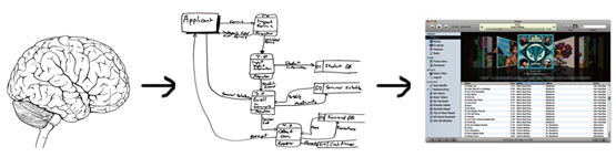
However, it had never occurred to me that this relationship could also be reversed until I saw it with my own eyes in Michael’s office. For years he and his staff had looked at their old UI, learned from it, formed elaborate diagrams based on what they learned, and then stored them in their brains forevermore. That’s how we capture concepts.

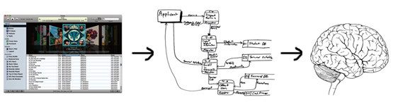
So there it is. User interfaces are one of the principal sources from which a person learns about his or her work. That understanding gets turned into diagrams, charts, and maps that, whether accurate or not, come to define the work that person does each day.
This brings a new dimension of responsibility to our table as interaction designers. Not only do we need to worry about our interfaces being simple, or elegant, or usable, or accessible; we also have to make sure they’re honest. Do they accurately portray our clients’ processes? Do they faithfully represent the relationships between different bodies of information? Do they tell the truth, or do they lie? Ultimately, whatever they say is going to define how our users think of their work, how they understand it, and how they do it.
10 comments
Great article Dave. Makes me wonder if parts of my own work or process are more complicated than they need to be… What would I see if I could do an ethnographic study of myself?
comment by Ted Boren one day later
Great insight… I work in a local government agency and find that government likes to complicate the simple.
I try to simplify the methods we use and I get tons of flack for not complicating it enough. My users often think things need to be more cluttered with every menu option on the home page. Its nice to see that I am not the only one that thinks simple is easier and better. And also rethinking the business process should be done continually even in a non-profit government agency.
comment by Eran one day later
comment by 2 days later
This is a must-read… Forwarding to my designer friends…
comment by Ege Özcan 2 days later
Very true. Clients often explain their (perceived) requirements by giving us a tour of their existing interface rather than talking about the underlying business processes. Sometimes they don’t know why it works the way it does but still assume the new system should work that way too.
comment by Matt Obee 2 days later
Great writeup I must say, and I’d like to offer you my 2 cents.
Interpreting an UI and extrapolating workflows and concepts from it is done everyday, and not necessarily a bad thing I think. If the UI abstracts complicated facts from users, causing them to make erroneous assumptions about the application that actually makes their lives simpler, then lie at will I say. This is the basis of software such as iTunes and iPhoto (my poster-child examples): the user doesn’t need to know where and how the music or photo files are stored in her file system, the application takes care of that and presents a unified list of music/photos. The user is lied to by the interface, since it doesn’t reflect the actual folder/file hierarchy, but the lie makes her life so much easier it’s totally worth it.
Now in your particular case, the filthy lies the UI told its users actually made their job more complicated (was this done on purpose by the previous UI Designer?), but what I’d like to know is how most people around the office reacted to the new, simpler software. DId they welcome it with arms wide open, or did some of them get frustrated because the simpler approach was such a far cry from their already established mental models?
By the way, much congratulations over the fact that you wrote a post which actually invites thought-provoking discussion!
comment by Bruno Abrantes 2 days later
Wonderful article – thanks for sharing. I’ve run into this experience with clients (and their customers) many times. Sometimes it seems like my job (as a UX consultant) is to take things apart and then put them back together again.
I think this is illustrated vividly when you try to use 2 or 3 products that are essentially doing the same thing, for example the To Do management systems Things and OmniFocus. Both are based on the same underlying principle (say Getting Things Done) yet they present and organize information really differently. When I switch between them I have an almost physical feeling of rearranging my brain. I think great UX designers are able to readily rearrange their minds to see the same things in many different ways.
Thanks for articulating this so nicely – now I’ll tweet about it!
comment by Hagan Rivers 2 days later
Great point, Bruno. The kind of thing that iTunes and iPhoto do (and the iPad is going to do) I would call abstraction – they keep the user away from information the user does not care about. Hurray for that.
The issue is when a UI misrepresents information that is essential to the user. That’s what I consider lying.
Finally, perhaps one of the greatest pitfalls we face as interaction designers is the risk of mistaking lying for abstraction. Wow, I sense another article coming on…
BTW, the users of the new system are initially unpleasantly surprised by the simplicity of the app. But then the happiness that can only come from software that doesn’t suck settles on them, and we become good friends.
comment by Angel David Lindes 2 days later
I recently won a project where the client had an extremely complex, fault riddled, Excel spreadsheet to perform a simple task. I asked him if dragging items from a list and dropping them onto another pane to arrange them would effectively do the same thing. It did. My little consulting company was one of 3 competing for the job, my competitors were large, and we were all in the same price range (or so I was told) and my simplification is what won me the project.
As far as I know, my competitors were all planning to build him an app that would just automate his painfully aweful process.
But I’m shocked at how many programmers would just automate or duplicate a crappy process and the number of users & clients who actually resist simplification.
comment by John MacIntyre 2 days later
This article is very insightful. We can always hope that our users are evaluating their own data and process to determine if their tools meet the need though I believe you have identified a truism in software. Users don’t think their tools are wrong for their job and so they see them as a part of the definition of what their job entails. However this scenario can be resolved with a “changing of the guard” in the management of those who are using the software. It has been my experience that whenever management changes regardless the new manager goes about evaluating the efficiency of the work in relationship to the process, tools, and data. If you have leader who has been working with a piece of software for ten years they might be so comfortable with it that they overlook its ‘lies’ in favor of familiarity. They may hate their tool, but better the enemy you know than the unknown. Anyway great article.
comment by Aaron Kibbie 2 days later
Comment preview
comment by you less than a minute ago