case study
How we rebuilt Northtemple
I am my own worst client. Designing for yourself is always an interesting exercise, and I find that not only am I increasingly more difficult to work with, but lately the process is taking longer than ever. It may be just as awkward as a doctor operating on himself, or a hair dresser cutting her own hair, or a baby changing her own diaper. Our process for rebuilding Northtemple was about as exasperating. Here’s how we did it.
Northtemple started two years ago as the public face of our little six-member design group, as a way to contribute to the design community and shed light on our efforts as designers at the LDS Church.
We’ve now grown to over 30 designers, and our group dynamic has changed pretty dramatically. The site needed to change with us.
As well, the need to band our group together culturally has never been greater. Working for a church, we are expected to apply our creative strengths in a very conservative environment. Yet that often crazy, eccentric creativity is what makes us who we are, and an environment of stuffy ties and dresses (no, not worn together) is rarely friendly to those tendencies. Our group has been a reliable refuge from those surroundings, and we look to each other to recharge our creative batteries.
So our goal with this redesign was to solve some of these issues: build a site that better represents our group and better reflects and reinforces our culture and personalities. A creative watering hole, if you will.
We also wanted to improve the content. While a stream of inspiring linkage is often perfect for surf’s up Fridays, we wanted to better establish our designers’ talents and knowledge of design, and expand beyond a regurgitation blog (while adding revolutionary features like an archive and comments). So we aimed to refocus the site on great content, and build a community around it to discuss design and how we all become better designers.
Frustrations
Heading up the redesign, I went through several months of casual design iteration to try to find this new look. Nothing fit. I tried playful, I tried conservative. I tried building upon our fixed footer, and I tried ditching it. Nothing worked, and I grew increasingly frustrated at the process.
The identity was the hardest part to nail down, as our identity hits on this mixture of creativity and religious seriousness or reverence. None of these first iterations hit it.
Pirates
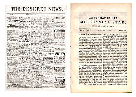
Finally, last month I buckled down and dove in. I had an epiphany of sorts as to how the site should look and feel, so I went crazy on it. And it felt great. I had this big idea that the site should hearken back to the early days of Mormon publications, with the same energy and passion that those early writers had with their self-published newspapers and magazines, like the Deseret News and Millennial Star.
I even found a sweet new type family – Mayflower, from Veer. It was old world, and the italic was perfect.
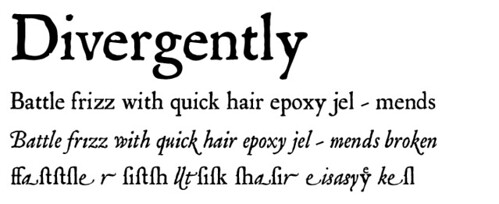
I put it all together, wore it out in Photoshop, and was pumped. Here’s how the header came out:

Then I realized something. Not only did this new masthead look like a big-budget Johnny Depp film, but the site had become the exact opposite of what I wanted: stuffy, conservative, and serif.
Disgusted, I went back to the drawing board.
The Battle
Struggling over this same problem for months now, I finally hit upon something key. Everything about the site, and our group for that matter, was this battle. A tug of war between creative and conservative. Between the suit and tie and wakeboarding on the weekends. Between Mo’ Tab and NIN. Between good and evil? Maybe not so dramatic, but the battle was there.
It finally occurred to me that we should embrace the struggle, and illustrate the internal battle that has defined us individually and as a group.
That realization in hand, I set out to visualize the struggle. It should be creative and conservative. Irreverent and religious. Rebellious, but just slightly.
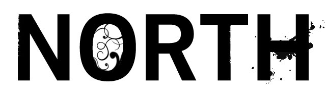
I started with the logo. I went huge, and it felt dirty. Dirty, but good.
I separated the NORTH from the TEMPLE so as to put a bit of space between the two – after all, the site isn’t a temple site, just our location on North Temple Street in Salt Lake City. Yet by book-ending the content like this, it helps bring the two together and define who we are.
For the logotype, I chose Trade Gothic, after being inspired by Jason Santa Maria’s post on If you were a typeface. It was perfect. Thick and authoritative, and even somewhat conservative. Responsible. Yet it’s still a sans, and is characteristically modern and versatile. Sweet.

To further reinforce the duality of our personalities, I styled the logo with a bit of mess, a bit of wear, and just to confuse matters more, a bit of flourish.
Behind the words I mashed together bright images to bring even more definition to the personality. It’s both warm and cold. Bright and dark. It’s crazy, but presentable.
Do you recognize anything familiar in there?
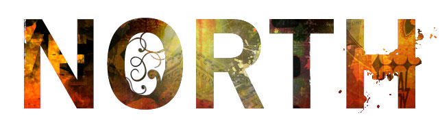
Success! This was right. Finally, it felt good. It felt like us.
Obviously I wasn’t done there. But simply getting the logo right set me on a path to make a million other decisions on the site, from the front page typography to the journal and about pages. Those tiny design decisions are so much easier to make once you have a solid direction and a solid understanding of what you’re designing. If you can’t get a handle on the personality of the site, you will flail about like I did for so many months. Defining the site’s personality, and finding ways to illustrate it, will set you on a path to build a complete site that’s just right.